- Power BI forums
- Updates
- News & Announcements
- Get Help with Power BI
- Desktop
- Service
- Report Server
- Power Query
- Mobile Apps
- Developer
- DAX Commands and Tips
- Custom Visuals Development Discussion
- Health and Life Sciences
- Power BI Spanish forums
- Translated Spanish Desktop
- Power Platform Integration - Better Together!
- Power Platform Integrations (Read-only)
- Power Platform and Dynamics 365 Integrations (Read-only)
- Training and Consulting
- Instructor Led Training
- Dashboard in a Day for Women, by Women
- Galleries
- Community Connections & How-To Videos
- COVID-19 Data Stories Gallery
- Themes Gallery
- Data Stories Gallery
- R Script Showcase
- Webinars and Video Gallery
- Quick Measures Gallery
- 2021 MSBizAppsSummit Gallery
- 2020 MSBizAppsSummit Gallery
- 2019 MSBizAppsSummit Gallery
- Events
- Ideas
- Custom Visuals Ideas
- Issues
- Issues
- Events
- Upcoming Events
- Community Blog
- Power BI Community Blog
- Custom Visuals Community Blog
- Community Support
- Community Accounts & Registration
- Using the Community
- Community Feedback
Register now to learn Fabric in free live sessions led by the best Microsoft experts. From Apr 16 to May 9, in English and Spanish.
- Power BI forums
- Forums
- Get Help with Power BI
- Desktop
- Different Conditional formatting rules for each va...
- Subscribe to RSS Feed
- Mark Topic as New
- Mark Topic as Read
- Float this Topic for Current User
- Bookmark
- Subscribe
- Printer Friendly Page
- Mark as New
- Bookmark
- Subscribe
- Mute
- Subscribe to RSS Feed
- Permalink
- Report Inappropriate Content
Different Conditional formatting rules for each value in x-axis
I have a column chart with region on the X-axis (A,B,C,D,E). Each region has a different percent requirement (i.e. A=5%, B=4%, etc). Is there a way to have diverging conditional formatting that is set differently for each value in the X-axis, in case for each region. Basically, I want to show green if below and red if above a different number for each column. Also, would this type of conditional fomatting be possible in a line chart that shows each region in the legend and date in the X-axis?
Thanks in advance!
Solved! Go to Solution.
- Mark as New
- Bookmark
- Subscribe
- Mute
- Subscribe to RSS Feed
- Permalink
- Report Inappropriate Content
You should be able to use SELECTEDVALUE(Target[Target]) instead of MAX if that makes more sense.
If you want to you could build out the DAX further to add some error checking:
IF(HASONEVALUE(StoreID), Measure)
Please @mention me in your reply if you want a response.
Copying DAX from this post? Click here for a hack to quickly replace it with your own table names
Has this post solved your problem? Please Accept as Solution so that others can find it quickly and to let the community know your problem has been solved.
If you found this post helpful, please give Kudos C
I work as a Microsoft trainer and consultant, specialising in Power BI and Power Query.
www.excelwithallison.com
- Mark as New
- Bookmark
- Subscribe
- Mute
- Subscribe to RSS Feed
- Permalink
- Report Inappropriate Content
Hi @delsner ,
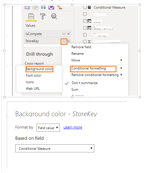
You create measure like DAX below, choose Background color under Conditional Formatting for your goal field (In your scenario, it is [Region]. ), format by "Field value" based on [Conditional Measure] . See more: Use conditional formatting in tables.
Conditional Measure =

VAR _Ave= AVERAGE(Table1[Value])

RETURN

IF(MAX(Table1[Value])>= _Ave, "Red", "Green")
Best Regards,
Amy
Community Support Team _ Amy
If this post helps, then please consider Accept it as the solution to help the other members find it more quickly.
- Mark as New
- Bookmark
- Subscribe
- Mute
- Subscribe to RSS Feed
- Permalink
- Report Inappropriate Content
@delsner , You should able swap conditions.
Or create a color measure like give below with you need and used that in conditional formatting after choosing "Field" option.
Color Date = if(FIRSTNONBLANK('Date'[Date],TODAY()) <today(),"lightgreen","red")

Color Date =
var _min =minx(allselected(Date,Date[Year])
return
 Switch( true(),
 FIRSTNONBLANK('Date'[Year],year(TODAY()))-_min =0 ,"lightgreen",
  FIRSTNONBLANK('Date'[Year],year(TODAY()))-_min =0 ,"blue",
 "red")

if(FIRSTNONBLANK(Table[Value],"true")= "true","green","red")
Color Field - Color Measure - Conditional formatting - refer for steps
https://radacad.com/dax-and-conditional-formatting-better-together-find-the-biggest-and-smallest-num...
https://docs.microsoft.com/en-us/power-bi/desktop-conditional-table-formatting#color-by-color-values
https://exceleratorbi.com.au/conditional-formatting-using-icons-in-power-bi/
https://community.powerbi.com/t5/Desktop/FORMAT-icon-set-for-use-in-a-data-card/td-p/811692
Microsoft Power BI Learning Resources, 2023 !!
Learn Power BI - Full Course with Dec-2022, with Window, Index, Offset, 100+ Topics !!
Did I answer your question? Mark my post as a solution! Appreciate your Kudos !! Proud to be a Super User! !!
- Mark as New
- Bookmark
- Subscribe
- Mute
- Subscribe to RSS Feed
- Permalink
- Report Inappropriate Content
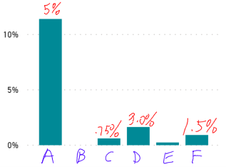
Thanks @amitchandak . Maybe I wasn't clear enough in my explaination. I'm going to make it simplier now. The column chart I have is below. The values for the columns are % sales from old customers. The numbers in red are the targets for each store. I want the column for each store to be either green, yellow, or red depending on if each store is below, between, or above its' value.
- Mark as New
- Bookmark
- Subscribe
- Mute
- Subscribe to RSS Feed
- Permalink
- Report Inappropriate Content
Please @mention me in your reply if you want a response.
Copying DAX from this post? Click here for a hack to quickly replace it with your own table names
Has this post solved your problem? Please Accept as Solution so that others can find it quickly and to let the community know your problem has been solved.
If you found this post helpful, please give Kudos C
I work as a Microsoft trainer and consultant, specialising in Power BI and Power Query.
www.excelwithallison.com
- Mark as New
- Bookmark
- Subscribe
- Mute
- Subscribe to RSS Feed
- Permalink
- Report Inappropriate Content
Thanks @AllisonKennedy Could you kindly give my an example of what a measure like that would look like? I've included a picture of what I'm trying to do. There are 6 different stores and each store has a different target amount. Thanks!
- Mark as New
- Bookmark
- Subscribe
- Mute
- Subscribe to RSS Feed
- Permalink
- Report Inappropriate Content
You'll need to provide a bit more info about your data model, column and table names, relationships, etc if you want detailed help from the community.
I would also recommend storing the Target values as a table in Power BI, something like:
| StoreID | Target |
| A | 5% |
| B | 1% |
| C | .75% |
| D | 3% |
| E | 1% |
| F | 1.5% |
Then use that Target table in a measure, similar to:
IF([Sales%]>MAX(Target[Target]), "Green", "Red")
Note this doesn't account for between, in order to do that you will need to define what you mean by 'between', either as a percentage of the target, or as another column in the target table.
Hope that makes sense.
Please @mention me in your reply if you want a response.
Copying DAX from this post? Click here for a hack to quickly replace it with your own table names
Has this post solved your problem? Please Accept as Solution so that others can find it quickly and to let the community know your problem has been solved.
If you found this post helpful, please give Kudos C
I work as a Microsoft trainer and consultant, specialising in Power BI and Power Query.
www.excelwithallison.com
- Mark as New
- Bookmark
- Subscribe
- Mute
- Subscribe to RSS Feed
- Permalink
- Report Inappropriate Content
That makes sense @AllisonKennedy . The sales% for each store is a measure, which is calculated as SUM(Sales)/SUM(Total Sales). I created the table as you suggested with StoreID and Target. I understand your formula of IF([Sales%]>MAX(Target[Target]), "Green", "Red"). However, that formula when added as conditional formatting only makes Store A red since it's the only one above 5%. I'm assuming that the column chart isn't looking for the MAX of the Target of each respective store, but the MAX of all Targets. What formula would I need so that I get something like this:
I think there's something I'm missing. Thanks again.
- Mark as New
- Bookmark
- Subscribe
- Mute
- Subscribe to RSS Feed
- Permalink
- Report Inappropriate Content
Hi,
Share the link from where i can download your PBI file.
Regards,
Ashish Mathur
http://www.ashishmathur.com
https://www.linkedin.com/in/excelenthusiasts/
- Mark as New
- Bookmark
- Subscribe
- Mute
- Subscribe to RSS Feed
- Permalink
- Report Inappropriate Content
You should be able to use SELECTEDVALUE(Target[Target]) instead of MAX if that makes more sense.
If you want to you could build out the DAX further to add some error checking:
IF(HASONEVALUE(StoreID), Measure)
Please @mention me in your reply if you want a response.
Copying DAX from this post? Click here for a hack to quickly replace it with your own table names
Has this post solved your problem? Please Accept as Solution so that others can find it quickly and to let the community know your problem has been solved.
If you found this post helpful, please give Kudos C
I work as a Microsoft trainer and consultant, specialising in Power BI and Power Query.
www.excelwithallison.com
- Mark as New
- Bookmark
- Subscribe
- Mute
- Subscribe to RSS Feed
- Permalink
- Report Inappropriate Content
Thanks @AllisonKennedy I got it to work. I used your solution. The problem was in my relationship. I needed to set it as Both for Cross filter direction. I was also able to build in the yellow range.
Helpful resources

Microsoft Fabric Learn Together
Covering the world! 9:00-10:30 AM Sydney, 4:00-5:30 PM CET (Paris/Berlin), 7:00-8:30 PM Mexico City

Power BI Monthly Update - April 2024
Check out the April 2024 Power BI update to learn about new features.

| User | Count |
|---|---|
| 110 | |
| 94 | |
| 82 | |
| 66 | |
| 58 |
| User | Count |
|---|---|
| 151 | |
| 121 | |
| 104 | |
| 87 | |
| 67 |


