- Power BI forums
- Updates
- News & Announcements
- Get Help with Power BI
- Desktop
- Service
- Report Server
- Power Query
- Mobile Apps
- Developer
- DAX Commands and Tips
- Custom Visuals Development Discussion
- Health and Life Sciences
- Power BI Spanish forums
- Translated Spanish Desktop
- Power Platform Integration - Better Together!
- Power Platform Integrations (Read-only)
- Power Platform and Dynamics 365 Integrations (Read-only)
- Training and Consulting
- Instructor Led Training
- Dashboard in a Day for Women, by Women
- Galleries
- Community Connections & How-To Videos
- COVID-19 Data Stories Gallery
- Themes Gallery
- Data Stories Gallery
- R Script Showcase
- Webinars and Video Gallery
- Quick Measures Gallery
- 2021 MSBizAppsSummit Gallery
- 2020 MSBizAppsSummit Gallery
- 2019 MSBizAppsSummit Gallery
- Events
- Ideas
- Custom Visuals Ideas
- Issues
- Issues
- Events
- Upcoming Events
- Community Blog
- Power BI Community Blog
- Custom Visuals Community Blog
- Community Support
- Community Accounts & Registration
- Using the Community
- Community Feedback
Register now to learn Fabric in free live sessions led by the best Microsoft experts. From Apr 16 to May 9, in English and Spanish.
- Power BI forums
- Forums
- Get Help with Power BI
- Desktop
- Re: Different Colors Datesbetween Measure
- Subscribe to RSS Feed
- Mark Topic as New
- Mark Topic as Read
- Float this Topic for Current User
- Bookmark
- Subscribe
- Printer Friendly Page
- Mark as New
- Bookmark
- Subscribe
- Mute
- Subscribe to RSS Feed
- Permalink
- Report Inappropriate Content
Different Colors Datesbetween Measure
Hello,
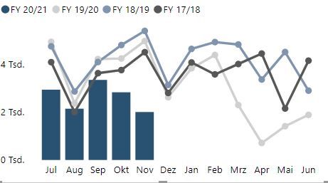
i have four measures to calculate the different financial years. The measures are the same, only the time horizon is different.

Solved! Go to Solution.
- Mark as New
- Bookmark
- Subscribe
- Mute
- Subscribe to RSS Feed
- Permalink
- Report Inappropriate Content
Hi @Wedding55 ,
My mistake since you are using months (that aggregate more than one date) you need to use the MAX instead of a selectedvalue:
Condittional Formatting = IF(MAX(Tabelle[Date]) >= TODAY();1;0)
Regards
Miguel Félix
Did I answer your question? Mark my post as a solution!
Proud to be a Super User!
Check out my blog: Power BI em Português- Mark as New
- Bookmark
- Subscribe
- Mute
- Subscribe to RSS Feed
- Permalink
- Report Inappropriate Content
Hi @MFelix
i tried your measure in the test file. The measure is working (see table on the right side. For December there is "1".
But the colors in the chart are not changing. Can you see what is wrong?
Here is the Link to the file.
https://www.dropbox.com/s/lg8avqqabjahyrd/Test.pbix?dl=0
The check for higher than today is ok. Maybe i can change it to Max-Date - 2 because we only have data for 2 more months than the fixed data.
- Mark as New
- Bookmark
- Subscribe
- Mute
- Subscribe to RSS Feed
- Permalink
- Report Inappropriate Content
Hi @Wedding55 ,
My mistake since you are using months (that aggregate more than one date) you need to use the MAX instead of a selectedvalue:
Condittional Formatting = IF(MAX(Tabelle[Date]) >= TODAY();1;0)
Regards
Miguel Félix
Did I answer your question? Mark my post as a solution!
Proud to be a Super User!
Check out my blog: Power BI em Português- Mark as New
- Bookmark
- Subscribe
- Mute
- Subscribe to RSS Feed
- Permalink
- Report Inappropriate Content
Thanks for your Help. Its working 🙂
- Mark as New
- Bookmark
- Subscribe
- Mute
- Subscribe to RSS Feed
- Permalink
- Report Inappropriate Content
Please excuse the delayed answer. I wasn`t in the office.
Its not the exaxt thing im searching for. I uploaded the test file on dropbox. See Link. I hope it works.
https://www.dropbox.com/s/jd6gpquzgppqy89/Test.pbix?dl=0
You can see there is Data until december 2020. But normally i update the file after each month. In this case the data until october is fix and the data for november and december is the forecast. Next month (in december) i update the file with the fixed november data and the data for december and january is the forecast. And the forecat i need the mark in different colors.
Is this possible? Thanks in advance 🙂
Best Regards
- Mark as New
- Bookmark
- Subscribe
- Mute
- Subscribe to RSS Feed
- Permalink
- Report Inappropriate Content
Hi @Wedding55 ,
The solution I provide check if the date is higher than today and if yes returns 1 otherwise 0 then you can use this to make the condittional formatting.
Only question here is if you want to compare with todays date or with the updated date of the file but the principle is the same.
How do you determine if that particular month is actual or not by the updated date or today's date?
Regards
Miguel Félix
Did I answer your question? Mark my post as a solution!
Proud to be a Super User!
Check out my blog: Power BI em Português- Mark as New
- Bookmark
- Subscribe
- Mute
- Subscribe to RSS Feed
- Permalink
- Report Inappropriate Content
Hi @Wedding55 ,
Are the current data and the forecast data from the same column in the table?
If yes, we can create a calculate column and two measures to meet your requirement.
1. Create a column to determine whether the current date belongs to the forecast month or the existing month.
column =
var _today_month = MONTH(TODAY())
var _date_month = MONTH('Table'[Date])
var _today_year = YEAR(TODAY())
var _date_year = YEAR('Table'[Date])
return
IF(
    _today_month<_date_month&&_today_year>=_date_year,1,0)
2. Then we can create two measures, put them in Values.
Current value =
CALCULATE(SUM('Table'[value]),FILTER('Table','Table'[column]=0))
Forecast value =
CALCULATE(SUM('Table'[value]),FILTER('Table','Table'[column]=1))
If it doesn’t meet your requirement, could you please provide a mockup sample based on fake data?
It will be helpful if you can show us the exact expected result based on the tables.
Please upload your files to OneDrive For Business and share the link here. Please don't contain any Confidential Information or Real data in your reply.
Best regards,
Community Support Team _ zhenbw
If this post helps, then please consider Accept it as the solution to help the other members find it more quickly.
BTW, pbix as attached.
- Mark as New
- Bookmark
- Subscribe
- Mute
- Subscribe to RSS Feed
- Permalink
- Report Inappropriate Content
Hi @Wedding55 ,
How about the result after you follow the suggestions mentioned in my original post?
Could you please provide more details or expected result about it If it doesn't meet your requirement?
If you've fixed the issue on your own please kindly share your solution. If the above posts help, please kindly mark it as a solution to help others find it more quickly.
Best regards,
Community Support Team _ zhenbw
If this post helps, then please consider Accept it as the solution to help the other members find it more quickly.
- Mark as New
- Bookmark
- Subscribe
- Mute
- Subscribe to RSS Feed
- Permalink
- Report Inappropriate Content
Hi @Wedding55 ,
Not really understanding what is the colour change that you need to have. What is the information you want to highlight, is it part of one of the lines is it the bar chart?
Regards
Miguel Félix
Did I answer your question? Mark my post as a solution!
Proud to be a Super User!
Check out my blog: Power BI em Português- Mark as New
- Bookmark
- Subscribe
- Mute
- Subscribe to RSS Feed
- Permalink
- Report Inappropriate Content
Hi @MFelix ,
i want to highlight automatically the last two month in the bars (see Screenshot).
Thanks in advance.
- Mark as New
- Bookmark
- Subscribe
- Mute
- Subscribe to RSS Feed
- Permalink
- Report Inappropriate Content
Hi @Wedding55 ,
Don't know how you have your model setup in terms of dates and I assume you want to check if the date is higher than today then is forecast. Add the following code:
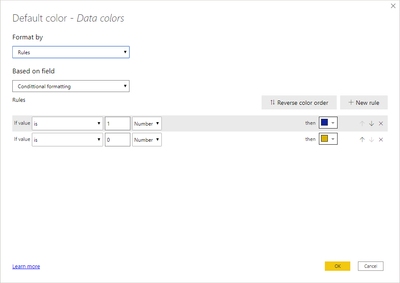
Condittional formatting = IF(SELECTEDVALUE('Table'[Date]) >= TODAY(); 1 ;0)Now just setup the condittional formatting on the bar part:
Regards
Miguel Félix
Did I answer your question? Mark my post as a solution!
Proud to be a Super User!
Check out my blog: Power BI em PortuguêsHelpful resources

Microsoft Fabric Learn Together
Covering the world! 9:00-10:30 AM Sydney, 4:00-5:30 PM CET (Paris/Berlin), 7:00-8:30 PM Mexico City

Power BI Monthly Update - April 2024
Check out the April 2024 Power BI update to learn about new features.

| User | Count |
|---|---|
| 114 | |
| 100 | |
| 78 | |
| 75 | |
| 52 |
| User | Count |
|---|---|
| 144 | |
| 109 | |
| 108 | |
| 88 | |
| 61 |


