- Power BI forums
- Updates
- News & Announcements
- Get Help with Power BI
- Desktop
- Service
- Report Server
- Power Query
- Mobile Apps
- Developer
- DAX Commands and Tips
- Custom Visuals Development Discussion
- Health and Life Sciences
- Power BI Spanish forums
- Translated Spanish Desktop
- Power Platform Integration - Better Together!
- Power Platform Integrations (Read-only)
- Power Platform and Dynamics 365 Integrations (Read-only)
- Training and Consulting
- Instructor Led Training
- Dashboard in a Day for Women, by Women
- Galleries
- Community Connections & How-To Videos
- COVID-19 Data Stories Gallery
- Themes Gallery
- Data Stories Gallery
- R Script Showcase
- Webinars and Video Gallery
- Quick Measures Gallery
- 2021 MSBizAppsSummit Gallery
- 2020 MSBizAppsSummit Gallery
- 2019 MSBizAppsSummit Gallery
- Events
- Ideas
- Custom Visuals Ideas
- Issues
- Issues
- Events
- Upcoming Events
- Community Blog
- Power BI Community Blog
- Custom Visuals Community Blog
- Community Support
- Community Accounts & Registration
- Using the Community
- Community Feedback
Register now to learn Fabric in free live sessions led by the best Microsoft experts. From Apr 16 to May 9, in English and Spanish.
- Power BI forums
- Forums
- Get Help with Power BI
- Desktop
- Difference between time period & relative date
- Subscribe to RSS Feed
- Mark Topic as New
- Mark Topic as Read
- Float this Topic for Current User
- Bookmark
- Subscribe
- Printer Friendly Page
- Mark as New
- Bookmark
- Subscribe
- Mute
- Subscribe to RSS Feed
- Permalink
- Report Inappropriate Content
Difference between time period & relative date
Hi,
I have few questions regarding dashboard.
First, If I have sales by orderDate bar chart (see attached image). how to calculate month to month difference for sales(M/M Sales or Q/Q Sales, W/W Sales etc) in PowberBI?
Second, In Tableau it has relative date that allows to display last n time period data. For example, want to display last 2 week sales or last 12 months sales. How this can happen in powerBI?
Third, how can I display x axis label as the below chart. Also how to have label for each week and M/M sales on the top of bar.
Many Thanks!
- Mark as New
- Bookmark
- Subscribe
- Mute
- Subscribe to RSS Feed
- Permalink
- Report Inappropriate Content
Hi @Anonymous ,
Point1
Please refer to suggestion mentioned here.
Point2
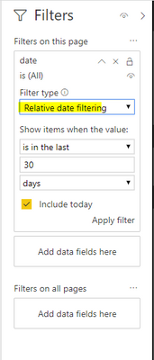
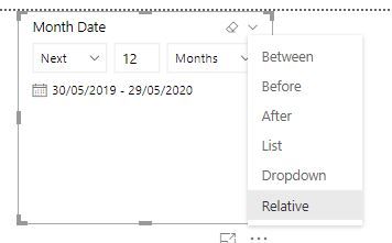
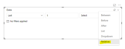
Both slicer and Visual/Page/Report level filters provide "Relative" option.
Point3
To show data label on the top of bar, please set its "position" to "Outside End" under format pane.
If you want to display data label formatted as KPI indicator, as drawn in above screenshot, I'm afraid it is not achievable now.
Best regards,
Yuliana Gu
If this post helps, then please consider Accept it as the solution to help the other members find it more quickly.
- Mark as New
- Bookmark
- Subscribe
- Mute
- Subscribe to RSS Feed
- Permalink
- Report Inappropriate Content
Hi Gu,
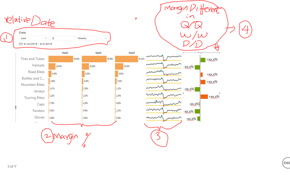
We are moving from Tableau to PowerBI, and struggling with PowerBI very badly. I need your help and appreicate your help!!! I still have questions regarding Difference between current time period and Prev time period, and time filters. Please see attached image which is what I am looking for. I want to two times fileters (slicers). One main time slicer includes three value: Quarterly, Weekly and Daily. This slicer can filter all charts. For example, when select quaterly filter, the trend chart will display overall Quarterly mergin% trend for each subcategory. Second sub slicer is relative date. I want to it only works for yellow bar char(marge% by subcategory). when select this year,month or week, the chart only displys current year,month week data. If select last 3 weeks, it displaly three seperated bar charts for past 3 weeks. Just as showed in the below image.
I have the following quesions for powerBI. first, I created a yellow bar (margin% by subcategory) in powerBI, the relative date slicer doen'st work for this bar. When I select last n time period, the chart showed blank or still only single chart. Second, How can I set up a main silicer which include Quaterly, Weekly an Daily to control all charts in the dashboard. Third, how can I do part4 in the image. I saw your example M/M% in your last repley. I tried it, and it didn't work out in this case.
Could you please use Adventureworks sample dataset( margin%, subcategory and order date) demo your answers.
Many thanks!!!
- Mark as New
- Bookmark
- Subscribe
- Mute
- Subscribe to RSS Feed
- Permalink
- Report Inappropriate Content
so 3 points:
1 - I think we'd need to see your data, but you can deffo do the min/max difference etc within a measure.
2 - Powerbi has this functionality in the slicer visual, using the little dropdown you can pick lots of difffent options. the visual has to recognise your data as a date though for this to work. Also, if you cant see the drop down, make the visual bigger.
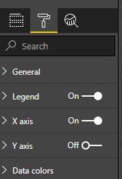
3 - you X-Axis is already showing? week14, week15 etc. if you mean the Y-Axis, go into the format tab for the visual and use the toggle to turn it on.
- Mark as New
- Bookmark
- Subscribe
- Mute
- Subscribe to RSS Feed
- Permalink
- Report Inappropriate Content
Hi good morning Gu,
Thanks for reply. In the image that is from Tableau. In power BI Same chart, x axis only show in week numbers(please see attachment). I want to show week 1, week2, not just 1,2.
Helpful resources

Microsoft Fabric Learn Together
Covering the world! 9:00-10:30 AM Sydney, 4:00-5:30 PM CET (Paris/Berlin), 7:00-8:30 PM Mexico City

Power BI Monthly Update - April 2024
Check out the April 2024 Power BI update to learn about new features.

| User | Count |
|---|---|
| 117 | |
| 105 | |
| 69 | |
| 67 | |
| 43 |
| User | Count |
|---|---|
| 148 | |
| 103 | |
| 103 | |
| 88 | |
| 66 |

