- Power BI forums
- Updates
- News & Announcements
- Get Help with Power BI
- Desktop
- Service
- Report Server
- Power Query
- Mobile Apps
- Developer
- DAX Commands and Tips
- Custom Visuals Development Discussion
- Health and Life Sciences
- Power BI Spanish forums
- Translated Spanish Desktop
- Power Platform Integration - Better Together!
- Power Platform Integrations (Read-only)
- Power Platform and Dynamics 365 Integrations (Read-only)
- Training and Consulting
- Instructor Led Training
- Dashboard in a Day for Women, by Women
- Galleries
- Community Connections & How-To Videos
- COVID-19 Data Stories Gallery
- Themes Gallery
- Data Stories Gallery
- R Script Showcase
- Webinars and Video Gallery
- Quick Measures Gallery
- 2021 MSBizAppsSummit Gallery
- 2020 MSBizAppsSummit Gallery
- 2019 MSBizAppsSummit Gallery
- Events
- Ideas
- Custom Visuals Ideas
- Issues
- Issues
- Events
- Upcoming Events
- Community Blog
- Power BI Community Blog
- Custom Visuals Community Blog
- Community Support
- Community Accounts & Registration
- Using the Community
- Community Feedback
Register now to learn Fabric in free live sessions led by the best Microsoft experts. From Apr 16 to May 9, in English and Spanish.
- Power BI forums
- Forums
- Get Help with Power BI
- Desktop
- Re: Device state on a time line
- Subscribe to RSS Feed
- Mark Topic as New
- Mark Topic as Read
- Float this Topic for Current User
- Bookmark
- Subscribe
- Printer Friendly Page
- Mark as New
- Bookmark
- Subscribe
- Mute
- Subscribe to RSS Feed
- Permalink
- Report Inappropriate Content
Device state on a time line
Hi everyone,
I working on a sensor that sent the state of a device "Marche"= On or "Arrêt"=Off
I calculated the state duration by doing the difference between two states :
(Duration = Begin date of the state declaration - Begin date of the next state declaration")
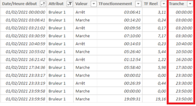
So for each row, I have a state, a starting date and a duration.
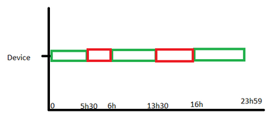
What I'm trying to do is to visualize the state of my device during the day. Something like this :
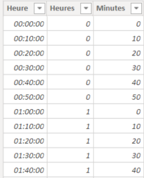
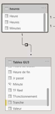
So in order to create a x-axis with hour, I have created a Hour Table (with a 10min incrementation) and I linked it to my table.
But from this point, I don't know where to go, every visual that I've tried did not work...
An extract of my Hour table :
And how I've linked it :
Would you have any idea guys ? 🙂
Thank you !
Solved! Go to Solution.
- Mark as New
- Bookmark
- Subscribe
- Mute
- Subscribe to RSS Feed
- Permalink
- Report Inappropriate Content
Hi @GregB49 ,
You need to try the Timeline visualization:
https://appsource.microsoft.com/en-us/product/power-bi-visuals/wa104381377?tab=overview
Then you just need to add a column wiht the end time of each of your start and stop.
Overall visualization will look like this:
Regards
Miguel Félix
Did I answer your question? Mark my post as a solution!
Proud to be a Super User!
Check out my blog: Power BI em Português- Mark as New
- Bookmark
- Subscribe
- Mute
- Subscribe to RSS Feed
- Permalink
- Report Inappropriate Content
Hi @MFelix,
Thank you for your reply, actually I managed to find this solution by my own by testing many things.
And it is with "As timeline" so you're completely right sir !
I had some trouble to display just a day when the duration was longer than 24h but with a bit of magic, here it is :
Thanks again,
- Mark as New
- Bookmark
- Subscribe
- Mute
- Subscribe to RSS Feed
- Permalink
- Report Inappropriate Content
Hi @GregB49 ,
You need to try the Timeline visualization:
https://appsource.microsoft.com/en-us/product/power-bi-visuals/wa104381377?tab=overview
Then you just need to add a column wiht the end time of each of your start and stop.
Overall visualization will look like this:
Regards
Miguel Félix
Did I answer your question? Mark my post as a solution!
Proud to be a Super User!
Check out my blog: Power BI em PortuguêsHelpful resources

Microsoft Fabric Learn Together
Covering the world! 9:00-10:30 AM Sydney, 4:00-5:30 PM CET (Paris/Berlin), 7:00-8:30 PM Mexico City

Power BI Monthly Update - April 2024
Check out the April 2024 Power BI update to learn about new features.

| User | Count |
|---|---|
| 107 | |
| 100 | |
| 80 | |
| 63 | |
| 58 |
| User | Count |
|---|---|
| 148 | |
| 111 | |
| 94 | |
| 84 | |
| 67 |


