- Power BI forums
- Updates
- News & Announcements
- Get Help with Power BI
- Desktop
- Service
- Report Server
- Power Query
- Mobile Apps
- Developer
- DAX Commands and Tips
- Custom Visuals Development Discussion
- Health and Life Sciences
- Power BI Spanish forums
- Translated Spanish Desktop
- Power Platform Integration - Better Together!
- Power Platform Integrations (Read-only)
- Power Platform and Dynamics 365 Integrations (Read-only)
- Training and Consulting
- Instructor Led Training
- Dashboard in a Day for Women, by Women
- Galleries
- Community Connections & How-To Videos
- COVID-19 Data Stories Gallery
- Themes Gallery
- Data Stories Gallery
- R Script Showcase
- Webinars and Video Gallery
- Quick Measures Gallery
- 2021 MSBizAppsSummit Gallery
- 2020 MSBizAppsSummit Gallery
- 2019 MSBizAppsSummit Gallery
- Events
- Ideas
- Custom Visuals Ideas
- Issues
- Issues
- Events
- Upcoming Events
- Community Blog
- Power BI Community Blog
- Custom Visuals Community Blog
- Community Support
- Community Accounts & Registration
- Using the Community
- Community Feedback
Register now to learn Fabric in free live sessions led by the best Microsoft experts. From Apr 16 to May 9, in English and Spanish.
- Power BI forums
- Forums
- Get Help with Power BI
- Desktop
- Dense Stacked Column & Line Chart based On Date Hi...
- Subscribe to RSS Feed
- Mark Topic as New
- Mark Topic as Read
- Float this Topic for Current User
- Bookmark
- Subscribe
- Printer Friendly Page
- Mark as New
- Bookmark
- Subscribe
- Mute
- Subscribe to RSS Feed
- Permalink
- Report Inappropriate Content
Dense Stacked Column & Line Chart based On Date Hierarchy.. but including Hour
Hi all,
I'm having an issue with this Column/Line chart that I need to be dense and not requiring to scroll horizontally. Using a Date Hierarchy on the shared axis works beautifully, but the twist is that I need it to be an hourly chart instead of a daily one. When I add the hour below the Date and drill down, the graph loses its 'dense' look (see screenshots below).
Anyone who knows how to fix this? Or should I look for custom visualizations to make this happen? Could you recommend one?


Thank you! 🙂
Solved! Go to Solution.
- Mark as New
- Bookmark
- Subscribe
- Mute
- Subscribe to RSS Feed
- Permalink
- Report Inappropriate Content
Hi @zudar ,
Sorry for that if you drill down, the X-axis type cannot configure to continuous, it will show the detail.
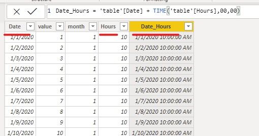
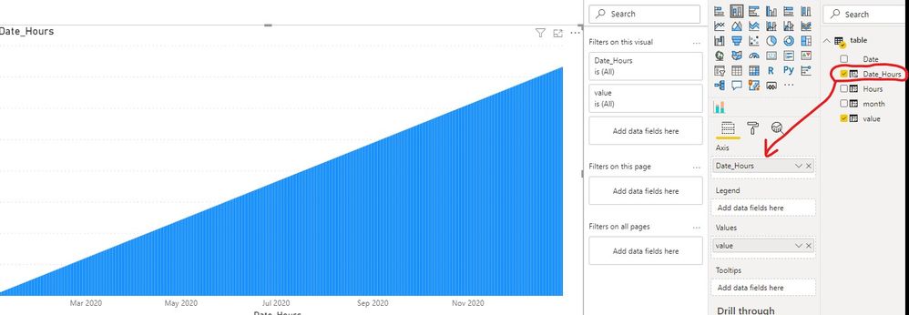
So maybe you can combine the Date column and Hour column to one column, and use the new column to be the X-axis.
Date_Hours = 'table'[Date] + TIME('table'[Hours],00,00)
If you have any question, please kindly ask here and we will try to resolve it.
Best regards,
Community Support Team _ zhenbw
If this post helps, then please consider Accept it as the solution to help the other members find it more quickly.
BTW, pbix as attached.
- Mark as New
- Bookmark
- Subscribe
- Mute
- Subscribe to RSS Feed
- Permalink
- Report Inappropriate Content
@zudar , do want you drill down or drill expanding ?
https://docs.microsoft.com/en-us/power-bi/consumer/end-user-drill
Microsoft Power BI Learning Resources, 2023 !!
Learn Power BI - Full Course with Dec-2022, with Window, Index, Offset, 100+ Topics !!
Did I answer your question? Mark my post as a solution! Appreciate your Kudos !! Proud to be a Super User! !!
- Mark as New
- Bookmark
- Subscribe
- Mute
- Subscribe to RSS Feed
- Permalink
- Report Inappropriate Content
Thanks for the response.
I actually don't want to drill at all. Or better put: I don't want my end-users having to drill down and up. I really need to have an hourly column, it's a strict requirement for this graph. But I need to have a lot more columns to be seen at one glance than what I'm getting right now.. (the second screenshot I posted).
- Mark as New
- Bookmark
- Subscribe
- Mute
- Subscribe to RSS Feed
- Permalink
- Report Inappropriate Content
Hi @zudar ,
Sorry for that if you drill down, the X-axis type cannot configure to continuous, it will show the detail.
So maybe you can combine the Date column and Hour column to one column, and use the new column to be the X-axis.
Date_Hours = 'table'[Date] + TIME('table'[Hours],00,00)
If you have any question, please kindly ask here and we will try to resolve it.
Best regards,
Community Support Team _ zhenbw
If this post helps, then please consider Accept it as the solution to help the other members find it more quickly.
BTW, pbix as attached.
- Mark as New
- Bookmark
- Subscribe
- Mute
- Subscribe to RSS Feed
- Permalink
- Report Inappropriate Content
Hi, It really was that simple! Thank you!
Helpful resources

Microsoft Fabric Learn Together
Covering the world! 9:00-10:30 AM Sydney, 4:00-5:30 PM CET (Paris/Berlin), 7:00-8:30 PM Mexico City

Power BI Monthly Update - April 2024
Check out the April 2024 Power BI update to learn about new features.

| User | Count |
|---|---|
| 118 | |
| 107 | |
| 70 | |
| 70 | |
| 43 |
| User | Count |
|---|---|
| 148 | |
| 104 | |
| 104 | |
| 89 | |
| 66 |


