- Power BI forums
- Updates
- News & Announcements
- Get Help with Power BI
- Desktop
- Service
- Report Server
- Power Query
- Mobile Apps
- Developer
- DAX Commands and Tips
- Custom Visuals Development Discussion
- Health and Life Sciences
- Power BI Spanish forums
- Translated Spanish Desktop
- Power Platform Integration - Better Together!
- Power Platform Integrations (Read-only)
- Power Platform and Dynamics 365 Integrations (Read-only)
- Training and Consulting
- Instructor Led Training
- Dashboard in a Day for Women, by Women
- Galleries
- Community Connections & How-To Videos
- COVID-19 Data Stories Gallery
- Themes Gallery
- Data Stories Gallery
- R Script Showcase
- Webinars and Video Gallery
- Quick Measures Gallery
- 2021 MSBizAppsSummit Gallery
- 2020 MSBizAppsSummit Gallery
- 2019 MSBizAppsSummit Gallery
- Events
- Ideas
- Custom Visuals Ideas
- Issues
- Issues
- Events
- Upcoming Events
- Community Blog
- Power BI Community Blog
- Custom Visuals Community Blog
- Community Support
- Community Accounts & Registration
- Using the Community
- Community Feedback
Register now to learn Fabric in free live sessions led by the best Microsoft experts. From Apr 16 to May 9, in English and Spanish.
- Power BI forums
- Forums
- Get Help with Power BI
- Desktop
- Re: Define quadrant filter for scatter chart / qua...
- Subscribe to RSS Feed
- Mark Topic as New
- Mark Topic as Read
- Float this Topic for Current User
- Bookmark
- Subscribe
- Printer Friendly Page
- Mark as New
- Bookmark
- Subscribe
- Mute
- Subscribe to RSS Feed
- Permalink
- Report Inappropriate Content
Define quadrant filter for scatter chart / quadrant chart
Hey there,
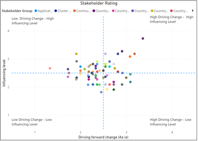
we use a scatter chart / quandrat chart to visulaize data by two dimension. The axis scales are each from 0 to 4. We have added median lines which divide the chart into 4 quadrants. It looks like this:
Now we would like to filter by each quadrant. There is no direct option by I thought I could set up a pre-defined slicer for each quadrant. If you want to filter by the lower left quadrant the x & y value should be between 0 and 2.5. When you want to filter for the lower right quadrant the x value should be between 2.6 and 4 and y value equal/between 0 and 2.5. A similar approach would need to be applied for the upper two quadradts. Does anyone know whether there is a way to define such pre-defined slicer for each quadradt? Thank you very much in advance for your help.
Solved! Go to Solution.
- Mark as New
- Bookmark
- Subscribe
- Mute
- Subscribe to RSS Feed
- Permalink
- Report Inappropriate Content
Hi, @Mathze03
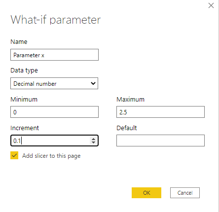
According to your description and sample data, I think that the “What-If” parameter in the Power BI can help you to achieve the filter according to the quadrant.
For example, if you want to filter the lower left quadrant, you can create two “What-If” parameters and add the slicers like this:
Then you can create a measure like this:
Flag =

var _maxx=MAX('Parameter x'[Parameter x])

var _minx=MIN('Parameter x'[Parameter x])

var _maxy=MAX('Parameter y'[Parameter y])

var _miny=MIN('Parameter y'[Parameter y])

return

IF(

    MAX('Table'[x])<=_maxx&&MAX('Table'[x])>=_minx

    &&

    MAX('Table'[y])<=_maxy&&MAX('Table'[y])>=_miny,1,0)
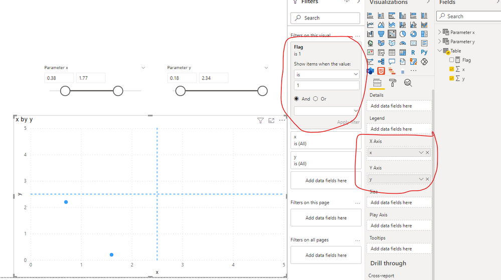
Then you can add the visual filter to this scatter chart like this:
And you can get what you want.
You can download my test pbix file below
Thank you very much!
Best Regards,
Community Support Team _Robert Qin
If this post helps, then please consider Accept it as the solution to help the other members find it more quickly.
- Mark as New
- Bookmark
- Subscribe
- Mute
- Subscribe to RSS Feed
- Permalink
- Report Inappropriate Content
Thank you very much for your help!!! That is super useful and does the magic!!!
Helpful resources

Microsoft Fabric Learn Together
Covering the world! 9:00-10:30 AM Sydney, 4:00-5:30 PM CET (Paris/Berlin), 7:00-8:30 PM Mexico City

Power BI Monthly Update - April 2024
Check out the April 2024 Power BI update to learn about new features.

| User | Count |
|---|---|
| 111 | |
| 97 | |
| 80 | |
| 69 | |
| 59 |
| User | Count |
|---|---|
| 150 | |
| 119 | |
| 104 | |
| 87 | |
| 67 |


