- Power BI forums
- Updates
- News & Announcements
- Get Help with Power BI
- Desktop
- Service
- Report Server
- Power Query
- Mobile Apps
- Developer
- DAX Commands and Tips
- Custom Visuals Development Discussion
- Health and Life Sciences
- Power BI Spanish forums
- Translated Spanish Desktop
- Power Platform Integration - Better Together!
- Power Platform Integrations (Read-only)
- Power Platform and Dynamics 365 Integrations (Read-only)
- Training and Consulting
- Instructor Led Training
- Dashboard in a Day for Women, by Women
- Galleries
- Community Connections & How-To Videos
- COVID-19 Data Stories Gallery
- Themes Gallery
- Data Stories Gallery
- R Script Showcase
- Webinars and Video Gallery
- Quick Measures Gallery
- 2021 MSBizAppsSummit Gallery
- 2020 MSBizAppsSummit Gallery
- 2019 MSBizAppsSummit Gallery
- Events
- Ideas
- Custom Visuals Ideas
- Issues
- Issues
- Events
- Upcoming Events
- Community Blog
- Power BI Community Blog
- Custom Visuals Community Blog
- Community Support
- Community Accounts & Registration
- Using the Community
- Community Feedback
Register now to learn Fabric in free live sessions led by the best Microsoft experts. From Apr 16 to May 9, in English and Spanish.
- Power BI forums
- Forums
- Get Help with Power BI
- Desktop
- Dates improperly aggregating in visualization
- Subscribe to RSS Feed
- Mark Topic as New
- Mark Topic as Read
- Float this Topic for Current User
- Bookmark
- Subscribe
- Printer Friendly Page
- Mark as New
- Bookmark
- Subscribe
- Mute
- Subscribe to RSS Feed
- Permalink
- Report Inappropriate Content
Dates improperly aggregating in visualization
Community,
I have a very simple question. So simple in fact that I cannot for the life of me find an answer on this forum or on youtube. I am attempting to show a bar graph where I am counting a number of incidient tickets.
In this Image January 2016 and 2017 are being counted twice in the same column. I would like two January's of different colors for each year. I am a new user please help!
Solved! Go to Solution.
- Mark as New
- Bookmark
- Subscribe
- Mute
- Subscribe to RSS Feed
- Permalink
- Report Inappropriate Content
A few things you need to fix.
1. My example of using a number (1-12) was an example if you have a Month column. Since you are using Month and Year, you need to make a unique order column for this value. I would make a calc column (query editor) that takes Year*100+Month. This will give you values like 201601 for Jan2016, 201602 for Feb2016 etc. Make sure the data type is numeric and this will allow you to sort correctly across multiple years.
2. You don't need to concantenate this unique sort order column with the Month Year column. Just select the field from the fields list, go to the Modeling tab, and choose Sort By > Unique Sort Order column.
- Mark as New
- Bookmark
- Subscribe
- Mute
- Subscribe to RSS Feed
- Permalink
- Report Inappropriate Content
Couple different options, one, create a hierarchy in your Axis by dragging in Year and then Month columns or create a new column that is essentially:
MonthYear = CONCATENATEX([Month],", ", [Year])
And use that as your Axis.
I couldn't see your image.
@ me in replies or I'll lose your thread!!!
Instead of a Kudo, please vote for this idea
Become an expert!: Enterprise DNA
External Tools: MSHGQM
YouTube Channel!: Microsoft Hates Greg
Latest book!: The Definitive Guide to Power Query (M)
DAX is easy, CALCULATE makes DAX hard...
- Mark as New
- Bookmark
- Subscribe
- Mute
- Subscribe to RSS Feed
- Permalink
- Report Inappropriate Content
So does day/month/year all have to be in seperate columns? Right now the date is only in one column and reads 1/21/2017 as an example. When I drag in this date column Power BI seems to automatically break out the day/month/year which ultimately doubles up the month of Jan.
I dont know how I would create the hierarchy without first seperating the columns. Also I will look into your formula. DAX is new to me as well and still getting used to it. Not familiar with the forumlas yet.
- Mark as New
- Bookmark
- Subscribe
- Mute
- Subscribe to RSS Feed
- Permalink
- Report Inappropriate Content
Hi @Viper1o34,
I am not able to view your image.
However, in your scenario, you can create the following columns, replace 'Date' table and 'Date'[DateKey] column with your owns in the DAX formulas below.
MonthNumber = MONTH('Date'[DateKey])
Year = YEAR('Date'[DateKey])
Month = SWITCH([MonthNumber],
1,"Jan",
2,"Feb",
3,"Mar",
4,"Apr",
5,"May",
6,"Jun",
7,"Jul",
8,"Aug",
9,"Sep",
10,"Oct",
11,"Nov",
12,"Dec",
"Invalid Month Number"
)
MonthYear = CONCATENATE('Date'[Month],CONCATENATE(",",'Date'[Year]))
This way, you can put the MonthYear into Axis and get your expected result.
Thanks,
Lydia Zhang
If this post helps, then please consider Accept it as the solution to help the other members find it more quickly.
- Mark as New
- Bookmark
- Subscribe
- Mute
- Subscribe to RSS Feed
- Permalink
- Report Inappropriate Content
Lydia,
Is there a video I can look at regarding the formulas? In your first formula example
MonthNumber = MONTH('Date'[DateKey])
I dont know what a "date key" is or how it should be used. Also when creating this there is not more than a single table. In the background data there is only one spreadsheet that contains the information I need. I do not have a seperate "Date" table that has a relationship with the ticket numbers I am counting. Do I need to create one?
In the forums I have seen many users referring to multiple tables. I come from using Tableau where I could simply drop and drag the data or write a simple formula.
Also is there a help number I can call here? There is nothing online where I can talk to a real person to troubleshoot small issues like this. If there is please PM me.
- Mark as New
- Bookmark
- Subscribe
- Mute
- Subscribe to RSS Feed
- Permalink
- Report Inappropriate Content
Hi @Viper1o34,
You don't need to create other tables, just right click your table in Report view, then select "New Column" to create calculated olumns using the following formulas.
MonthNumber = MONTH('Tablename'[Report Date])
Year = YEAR('TableName'[Report Date])
Month = SWITCH([MonthNumber],
1,"Jan",
2,"Feb",
3,"Mar",
4,"Apr",
5,"May",
6,"Jun",
7,"Jul",
8,"Aug",
9,"Sep",
10,"Oct",
11,"Nov",
12,"Dec",
"Invalid Month Number"
)
MonthYear = CONCATENATE('TableName'[Month],CONCATENATE(",",'TableName'[Year]))
Then put MonthYear into Axis of your visual.
Or you can use Vvelarde's method to create your visual.
Thanks,
Lydia Zhang
If this post helps, then please consider Accept it as the solution to help the other members find it more quickly.
- Mark as New
- Bookmark
- Subscribe
- Mute
- Subscribe to RSS Feed
- Permalink
- Report Inappropriate Content
Lydia,
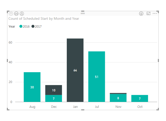
Thank you for the help. I have entered the formulas as you described them and I am still not yet to the result I need. The visualization is not properly separating the years by color. It is also not creating a new column for the new year. Rather than a stacked bar graph my goal was to have each separate month as its own bar.
For some reason it is improperly counting. December ONLY has 2016 tickets. Since we have not yet made it to December 2017 its strange it is separating this out. I do not know why it is wanting to separate December and November as these are not the correct months for the distinct color.
How do I create a chart that reads Jan 2016, Feb 2016, Mar 2016 ... Jan 2017 without stacking the colors? Also this new chart is missing data.
Specifically using the formula you provided I have September and June in the data but missing in the visiualization. Its simply ommiting these months entirely. I will provide examples from the report view below.
Current visualization:
Missing Data (June only has one entry but still it should be in the bar graph):
Lastly these bars are not in monthly order. Rather, it is defaulting to Alphabetical order. This is confusing for a viewer and I must have these in the order of the month rather than Alphabetical.
Thank you for the help so far and hopefully I can get this corrected.
Brian
- Mark as New
- Bookmark
- Subscribe
- Mute
- Subscribe to RSS Feed
- Permalink
- Report Inappropriate Content
You need to put [MonthYear] as the axis. If you have months with no data, they will not be shown by default, but by clicking on the drop down arrow on the field (in the Visuals pane) you can turn on showing values with no data. To sort string values (text) in a non alphabetical way, you need to make a column that has the sort order. So, if you make a table that has month name Jan...Dec, you would need a column that has 1...12 for the months. Then, if you select the month name field and go to the Modeling tab, you can choose "Sort By" and choose the order column.
- Mark as New
- Bookmark
- Subscribe
- Mute
- Subscribe to RSS Feed
- Permalink
- Report Inappropriate Content
Ok I did as you suggested and created a separate column with numbers aligning to the months. However this has created a new issue. I have data going from June (number 6) to December (number 12) and finally January (number 1). If I sort acending or decending I end up with my columns ordered from 12 - 1 or 1-12 wich is incorrect since this data spans 2 years. I need the months to order 6-12 then 1 for January 2017.
Below I have a picture of a decending sort. As you can see it starts at 12 (Dec 2016) and goes backwards to 6 (June 2016) with the last column 1 (January 2017). I think if the data were for only one year your method would work. However still having trouble due to this spanning multiple years. Is there a way to fix this?
- Mark as New
- Bookmark
- Subscribe
- Mute
- Subscribe to RSS Feed
- Permalink
- Report Inappropriate Content
A few things you need to fix.
1. My example of using a number (1-12) was an example if you have a Month column. Since you are using Month and Year, you need to make a unique order column for this value. I would make a calc column (query editor) that takes Year*100+Month. This will give you values like 201601 for Jan2016, 201602 for Feb2016 etc. Make sure the data type is numeric and this will allow you to sort correctly across multiple years.
2. You don't need to concantenate this unique sort order column with the Month Year column. Just select the field from the fields list, go to the Modeling tab, and choose Sort By > Unique Sort Order column.
- Mark as New
- Bookmark
- Subscribe
- Mute
- Subscribe to RSS Feed
- Permalink
- Report Inappropriate Content
Thank you. Simple math fix that worked great. You were right that I did not need to concantenate however I still had to use the formulas to break out the Month and Year fields to make your solution work. Thank you for the help!
- Mark as New
- Bookmark
- Subscribe
- Mute
- Subscribe to RSS Feed
- Permalink
- Report Inappropriate Content
- Mark as New
- Bookmark
- Subscribe
- Mute
- Subscribe to RSS Feed
- Permalink
- Report Inappropriate Content
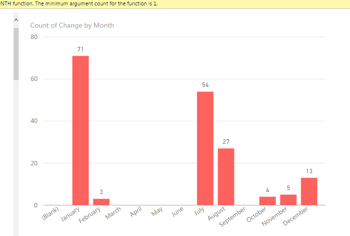
In the screenshot below my January 2016 and 2017 data is being aggregated together. I want two January columns of different colors for each sepearate year. Sample data included. No way to attach anything here and there are too many rows to display in this forum.
| Change | Summary | Customer | Status | Reported Date |
| CH10000007 | Change | CLOSE | 6/30/16 4:27 AM | |
| CH10000008 | Change,Application,Must Select CI | CLOSE | 7/1/16 6:33 AM | |
| CH10000009 | Change | CLOSE | 7/1/16 9:14 AM | |
| CH10000011 | Change,Hardware-Mainframe | CLOSE | 7/1/16 9:17 AM | |
| CH10000014 | Change,Application,Must Select CI,Password - System ID | CLOSE | 7/5/16 8:40 AM |
- Mark as New
- Bookmark
- Subscribe
- Mute
- Subscribe to RSS Feed
- Permalink
- Report Inappropriate Content
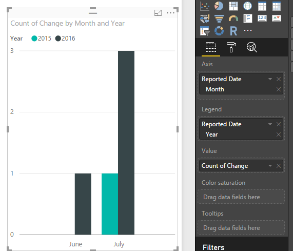
Ok, in a table visual Select
in Axis Reported Date-Herarchy--Month
in Legend Reported Date-Herarchy--Year
in Values Count of Change}
Let me know if you need more help
Lima - Peru
- Mark as New
- Bookmark
- Subscribe
- Mute
- Subscribe to RSS Feed
- Permalink
- Report Inappropriate Content
The auto date hierarchy you are encountering automatically aggregates the data based on the level of the hierarchy you are in. So, in a monthly view, you will see months 1-12 with data possibly (and in your case definitely for Jan) being counted from multiple years. The easiest way to change this is to click on the drop down arrow from the Date field in the Visuals area and select Date instead of Date Hierarchy.
However, if you want to see the data at a monthly level but distinguishing years, you will have to follow some of the methods given above.
Helpful resources

Microsoft Fabric Learn Together
Covering the world! 9:00-10:30 AM Sydney, 4:00-5:30 PM CET (Paris/Berlin), 7:00-8:30 PM Mexico City

Power BI Monthly Update - April 2024
Check out the April 2024 Power BI update to learn about new features.

| User | Count |
|---|---|
| 112 | |
| 97 | |
| 85 | |
| 68 | |
| 59 |
| User | Count |
|---|---|
| 150 | |
| 120 | |
| 99 | |
| 87 | |
| 68 |


