- Power BI forums
- Updates
- News & Announcements
- Get Help with Power BI
- Desktop
- Service
- Report Server
- Power Query
- Mobile Apps
- Developer
- DAX Commands and Tips
- Custom Visuals Development Discussion
- Health and Life Sciences
- Power BI Spanish forums
- Translated Spanish Desktop
- Power Platform Integration - Better Together!
- Power Platform Integrations (Read-only)
- Power Platform and Dynamics 365 Integrations (Read-only)
- Training and Consulting
- Instructor Led Training
- Dashboard in a Day for Women, by Women
- Galleries
- Community Connections & How-To Videos
- COVID-19 Data Stories Gallery
- Themes Gallery
- Data Stories Gallery
- R Script Showcase
- Webinars and Video Gallery
- Quick Measures Gallery
- 2021 MSBizAppsSummit Gallery
- 2020 MSBizAppsSummit Gallery
- 2019 MSBizAppsSummit Gallery
- Events
- Ideas
- Custom Visuals Ideas
- Issues
- Issues
- Events
- Upcoming Events
- Community Blog
- Power BI Community Blog
- Custom Visuals Community Blog
- Community Support
- Community Accounts & Registration
- Using the Community
- Community Feedback
Register now to learn Fabric in free live sessions led by the best Microsoft experts. From Apr 16 to May 9, in English and Spanish.
- Power BI forums
- Forums
- Get Help with Power BI
- Desktop
- Date along x-axis on scatter chart not displaying ...
- Subscribe to RSS Feed
- Mark Topic as New
- Mark Topic as Read
- Float this Topic for Current User
- Bookmark
- Subscribe
- Printer Friendly Page
- Mark as New
- Bookmark
- Subscribe
- Mute
- Subscribe to RSS Feed
- Permalink
- Report Inappropriate Content
Date along x-axis on scatter chart not displaying correctly
Hi all,
New to Power BI and trying to create a scatter chart based on the following:
X-axis - Date (in text format at the moment)
Y-axis - Movement (in inches)
Legend - 10 different 'things' we're tracking
The idea is to graph the movement of the 'things' around a zero-based midline over time.
When i try to create the scatter chart however, and i place the Date in the x-axis, it only gives me the count/count (distinct) for the date.
I don't want that, i just want the various dates, in chronological order, along the x-axis.
Can anyone give me a tip on what i need to do to display the dates separately along the x-axis in the scatter chart?
Thanks in advance
Solved! Go to Solution.
- Mark as New
- Bookmark
- Subscribe
- Mute
- Subscribe to RSS Feed
- Permalink
- Report Inappropriate Content
Hi @dnaman,
Until now, the scatter chart only support number values in X-Axis and Y-Axis. Please review this feature request and vote it. For your requirement, please use the following way.
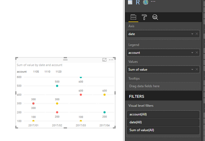
First, create a line chart, put date as x_axis, put corresponding fields as value and legend level.
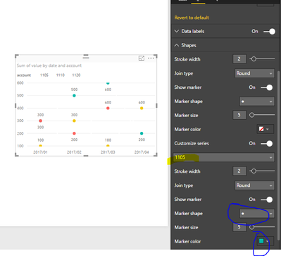
Then, set the data colors as white color(highlighted in red line) and set the shapes of chart, you can set the marker shape(highlighted in blue line), and the marker color of different legend by choosing the different value(highlighted in yellow).

You will get the following expected result.
Best Regards,
Angelia
- Mark as New
- Bookmark
- Subscribe
- Mute
- Subscribe to RSS Feed
- Permalink
- Report Inappropriate Content
Hi @dnaman,
Have you resolved your issue? If you have, mark the right/helpful reply as answer. So more members like you will benefit from here.
Thanks,
Angelia
- Mark as New
- Bookmark
- Subscribe
- Mute
- Subscribe to RSS Feed
- Permalink
- Report Inappropriate Content
Hi @dnaman,
Until now, the scatter chart only support number values in X-Axis and Y-Axis. Please review this feature request and vote it. For your requirement, please use the following way.
First, create a line chart, put date as x_axis, put corresponding fields as value and legend level.
Then, set the data colors as white color(highlighted in red line) and set the shapes of chart, you can set the marker shape(highlighted in blue line), and the marker color of different legend by choosing the different value(highlighted in yellow).

You will get the following expected result.
Best Regards,
Angelia
Helpful resources

Microsoft Fabric Learn Together
Covering the world! 9:00-10:30 AM Sydney, 4:00-5:30 PM CET (Paris/Berlin), 7:00-8:30 PM Mexico City

Power BI Monthly Update - April 2024
Check out the April 2024 Power BI update to learn about new features.

| User | Count |
|---|---|
| 111 | |
| 99 | |
| 80 | |
| 64 | |
| 57 |
| User | Count |
|---|---|
| 145 | |
| 111 | |
| 92 | |
| 84 | |
| 66 |


