- Power BI forums
- Updates
- News & Announcements
- Get Help with Power BI
- Desktop
- Service
- Report Server
- Power Query
- Mobile Apps
- Developer
- DAX Commands and Tips
- Custom Visuals Development Discussion
- Health and Life Sciences
- Power BI Spanish forums
- Translated Spanish Desktop
- Power Platform Integration - Better Together!
- Power Platform Integrations (Read-only)
- Power Platform and Dynamics 365 Integrations (Read-only)
- Training and Consulting
- Instructor Led Training
- Dashboard in a Day for Women, by Women
- Galleries
- Community Connections & How-To Videos
- COVID-19 Data Stories Gallery
- Themes Gallery
- Data Stories Gallery
- R Script Showcase
- Webinars and Video Gallery
- Quick Measures Gallery
- 2021 MSBizAppsSummit Gallery
- 2020 MSBizAppsSummit Gallery
- 2019 MSBizAppsSummit Gallery
- Events
- Ideas
- Custom Visuals Ideas
- Issues
- Issues
- Events
- Upcoming Events
- Community Blog
- Power BI Community Blog
- Custom Visuals Community Blog
- Community Support
- Community Accounts & Registration
- Using the Community
- Community Feedback
Register now to learn Fabric in free live sessions led by the best Microsoft experts. From Apr 16 to May 9, in English and Spanish.
- Power BI forums
- Forums
- Get Help with Power BI
- Desktop
- Re: Datapoints values on map chart
- Subscribe to RSS Feed
- Mark Topic as New
- Mark Topic as Read
- Float this Topic for Current User
- Bookmark
- Subscribe
- Printer Friendly Page
- Mark as New
- Bookmark
- Subscribe
- Mute
- Subscribe to RSS Feed
- Permalink
- Report Inappropriate Content
Datapoints values on map chart
Dear all
Seemingly obvious to have and yet i can't seem to find it - therefore i wonder if it is at all possible to add actual values to the Map Chart? These points show different size denending on the underlying value, but can we have value shown as a label without need to hoover over? Its very inconveniet when we have large number of points on the map. Is it by desing?
Solved! Go to Solution.
- Mark as New
- Bookmark
- Subscribe
- Mute
- Subscribe to RSS Feed
- Permalink
- Report Inappropriate Content
Hi @Ansicone,
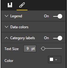
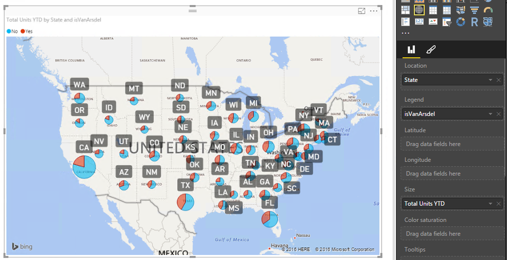
In a map visual, there is a option called Category Labels. When we turn on this option, Location values, or Latitude and Longitude values will display as labels in the map. See:
But if we want to see the whole values which used in this map, we need to hover the cursor on the data point. You can image if all values(Location, Legend, Latitude, Longitude, Size... etc) display as labels in the map, it will consume a lot of space. Then it will be hard to see data points. So only enable category labels make sense.
If you have any question, please feel free to ask.
Best Regards,
Qiuyun Yu
If this post helps, then please consider Accept it as the solution to help the other members find it more quickly.
- Mark as New
- Bookmark
- Subscribe
- Mute
- Subscribe to RSS Feed
- Permalink
- Report Inappropriate Content
Hi,
there should definitelly be the option to show values e.g. number of confirmed cases of Corona virus by regions.
Its also inconvenient I cant hide/show levels of the country - for example in Slovakia I would want to show county names even when my data are on city level. Because when I use the option to show value label, the whole map is full of city names, which is useless.
- Mark as New
- Bookmark
- Subscribe
- Mute
- Subscribe to RSS Feed
- Permalink
- Report Inappropriate Content
Why are the pie charts different sizes on the map? And how can I get them all to be the same size?
- Mark as New
- Bookmark
- Subscribe
- Mute
- Subscribe to RSS Feed
- Permalink
- Report Inappropriate Content
@v-qiuyu-msft wrote:Hi @Ansicone,
In a map visual, there is a option called Category Labels. When we turn on this option, Location values, or Latitude and Longitude values will display as labels in the map. See:
But if we want to see the whole values which used in this map, we need to hover the cursor on the data point. You can image if all values(Location, Legend, Latitude, Longitude, Size... etc) display as labels in the map, it will consume a lot of space. Then it will be hard to see data points. So only enable category labels make sense.
If you have any question, please feel free to ask.
Best Regards,
Qiuyun Yu
Hi, I am trying to display the size value in the map. I dont need the lat-long category display (not sure any one does).
Neither PowerBI map or any of the map plugins have this option.
Also inserting the size parameters into the location field would conflict with the lat-long display as well. Has there been any update since this discussion in 2016? Please advise.
- Mark as New
- Bookmark
- Subscribe
- Mute
- Subscribe to RSS Feed
- Permalink
- Report Inappropriate Content
Thanks for reply. Having a label is one thing, but this should at least be an option when there is only small amout of data per large region -for example on the first example of yours this could be a callout with the value for each of 3 slices on the pie chart (for NY). If you hid the labels this would be ideal!
Shame this is not possible but thanks for claryfying.
- Mark as New
- Bookmark
- Subscribe
- Mute
- Subscribe to RSS Feed
- Permalink
- Report Inappropriate Content
I can't find a way to do it. This community idea to make it happen is marked completed, but I don't see it, and neither do any of the commenters since it was "finished" a few months ago. I'm not sure what they had in mind.
There's a suggestion in this post on how to do it, but that only works if you want to display a column (not a measure), and it would have to have a one-to-one relationship to the locations used for your map. It also requires you have lat-long coordinates for all of your locations.
There are a few other ideas out there, some of them more relevant than others. You might find one worth adding a comment to, or start your own. If you do that, I'd reference the completed one in your post and mention that it did not meet the intent of the idea.
Helpful resources

Microsoft Fabric Learn Together
Covering the world! 9:00-10:30 AM Sydney, 4:00-5:30 PM CET (Paris/Berlin), 7:00-8:30 PM Mexico City

Power BI Monthly Update - April 2024
Check out the April 2024 Power BI update to learn about new features.

| User | Count |
|---|---|
| 110 | |
| 95 | |
| 76 | |
| 65 | |
| 51 |
| User | Count |
|---|---|
| 146 | |
| 109 | |
| 106 | |
| 88 | |
| 61 |


