- Power BI forums
- Updates
- News & Announcements
- Get Help with Power BI
- Desktop
- Service
- Report Server
- Power Query
- Mobile Apps
- Developer
- DAX Commands and Tips
- Custom Visuals Development Discussion
- Health and Life Sciences
- Power BI Spanish forums
- Translated Spanish Desktop
- Power Platform Integration - Better Together!
- Power Platform Integrations (Read-only)
- Power Platform and Dynamics 365 Integrations (Read-only)
- Training and Consulting
- Instructor Led Training
- Dashboard in a Day for Women, by Women
- Galleries
- Community Connections & How-To Videos
- COVID-19 Data Stories Gallery
- Themes Gallery
- Data Stories Gallery
- R Script Showcase
- Webinars and Video Gallery
- Quick Measures Gallery
- 2021 MSBizAppsSummit Gallery
- 2020 MSBizAppsSummit Gallery
- 2019 MSBizAppsSummit Gallery
- Events
- Ideas
- Custom Visuals Ideas
- Issues
- Issues
- Events
- Upcoming Events
- Community Blog
- Power BI Community Blog
- Custom Visuals Community Blog
- Community Support
- Community Accounts & Registration
- Using the Community
- Community Feedback
Register now to learn Fabric in free live sessions led by the best Microsoft experts. From Apr 16 to May 9, in English and Spanish.
- Power BI forums
- Forums
- Get Help with Power BI
- Desktop
- Re: Data structure / type of visual to use for com...
- Subscribe to RSS Feed
- Mark Topic as New
- Mark Topic as Read
- Float this Topic for Current User
- Bookmark
- Subscribe
- Printer Friendly Page
- Mark as New
- Bookmark
- Subscribe
- Mute
- Subscribe to RSS Feed
- Permalink
- Report Inappropriate Content
Data structure / type of visual to use for complicated data set
All,
If I have the following table:
| Date | Status | Important | Material | Critical | Total |
| 31 Dec 22 | In Progress | 2 | 2 | 2 | 6 |
| 31 Dec 22 | Overdue | 1 | 1 | 0 | 2 |
| 30 Sep 22 | In Progress | 0 | 1 | 0 | 1 |
| 30 Sep 22 | Overdue | 0 | 2 | 0 | 2 |
31 Jul 22 | In Progress | 0 | 1 | 0 | 1 |
| 31 Jul 22 | Overdue | 1 | 2 | 0 | 3 |
Which visual would I use to get a vertical bar chart that has the overdue and In Progress side by side and represented for each quarter? Or can I do this in PBI? Or is my data set messed up?
Any help is greatly appreciated!
Solved! Go to Solution.
- Mark as New
- Bookmark
- Subscribe
- Mute
- Subscribe to RSS Feed
- Permalink
- Report Inappropriate Content
Hi,
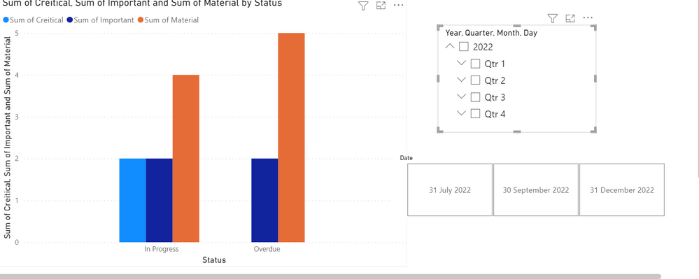
I think you can achive this by using the Bar chart or any chart to show the status and the slicer option with date hierarchy.
Let me know if this help
- Mark as New
- Bookmark
- Subscribe
- Mute
- Subscribe to RSS Feed
- Permalink
- Report Inappropriate Content
Hey Sandeep - well, no, but thanks for trying 🙂
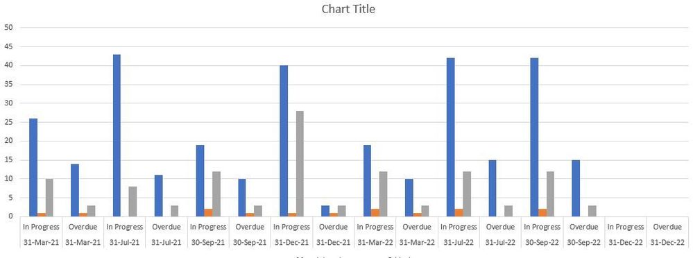
I'm trying to get something like this:
However, I'd like to get the 'InProgress' and 'OverDue' together for each color category - so there would be three side by side columns of 2 statuses. (and then just one date under those columns... that might be stretching what Excel or PBI can do...). I think it's the data structure that's not allowing for this to work.
- Mark as New
- Bookmark
- Subscribe
- Mute
- Subscribe to RSS Feed
- Permalink
- Report Inappropriate Content
Hi,
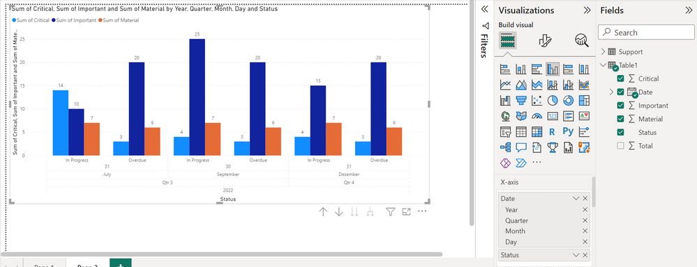
You can achieve the same with the same data,
Just use the Date and Status on X-axis and other column on Y-Axis
Hope this help
- Mark as New
- Bookmark
- Subscribe
- Mute
- Subscribe to RSS Feed
- Permalink
- Report Inappropriate Content
Hi Sandeep,
Thanks - I did get that while muddling around with the settings on the two axis. The slider was the part that made this come together. I still don't like the way the bar charts look so had to go with a line visual.
- Mark as New
- Bookmark
- Subscribe
- Mute
- Subscribe to RSS Feed
- Permalink
- Report Inappropriate Content
Hi,
I think you can achive this by using the Bar chart or any chart to show the status and the slicer option with date hierarchy.
Let me know if this help
Helpful resources

Microsoft Fabric Learn Together
Covering the world! 9:00-10:30 AM Sydney, 4:00-5:30 PM CET (Paris/Berlin), 7:00-8:30 PM Mexico City

Power BI Monthly Update - April 2024
Check out the April 2024 Power BI update to learn about new features.

| User | Count |
|---|---|
| 113 | |
| 97 | |
| 79 | |
| 73 | |
| 56 |
| User | Count |
|---|---|
| 145 | |
| 105 | |
| 104 | |
| 90 | |
| 63 |


