- Power BI forums
- Updates
- News & Announcements
- Get Help with Power BI
- Desktop
- Service
- Report Server
- Power Query
- Mobile Apps
- Developer
- DAX Commands and Tips
- Custom Visuals Development Discussion
- Health and Life Sciences
- Power BI Spanish forums
- Translated Spanish Desktop
- Power Platform Integration - Better Together!
- Power Platform Integrations (Read-only)
- Power Platform and Dynamics 365 Integrations (Read-only)
- Training and Consulting
- Instructor Led Training
- Dashboard in a Day for Women, by Women
- Galleries
- Community Connections & How-To Videos
- COVID-19 Data Stories Gallery
- Themes Gallery
- Data Stories Gallery
- R Script Showcase
- Webinars and Video Gallery
- Quick Measures Gallery
- 2021 MSBizAppsSummit Gallery
- 2020 MSBizAppsSummit Gallery
- 2019 MSBizAppsSummit Gallery
- Events
- Ideas
- Custom Visuals Ideas
- Issues
- Issues
- Events
- Upcoming Events
- Community Blog
- Power BI Community Blog
- Custom Visuals Community Blog
- Community Support
- Community Accounts & Registration
- Using the Community
- Community Feedback
Register now to learn Fabric in free live sessions led by the best Microsoft experts. From Apr 16 to May 9, in English and Spanish.
- Power BI forums
- Forums
- Get Help with Power BI
- Desktop
- Re: Data order in visualisation
- Subscribe to RSS Feed
- Mark Topic as New
- Mark Topic as Read
- Float this Topic for Current User
- Bookmark
- Subscribe
- Printer Friendly Page
- Mark as New
- Bookmark
- Subscribe
- Mute
- Subscribe to RSS Feed
- Permalink
- Report Inappropriate Content
Data order in visualisation
Hello
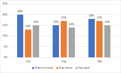
I have a chart similar to the one below where I want the 'category' (in this case 'watch a movie', 'stay home' and 'play sport') to be ranked from highest to lowest depending on the latest month's data. So as shown, in Sept, the order is correct, where as if we were looking at the chart in Aug, 'stay at home' with 17% would be displayed first (and consequently, if it was July, 'stay at home' would have been 3rd on the list)
Thanks in advance
Solved! Go to Solution.
- Mark as New
- Bookmark
- Subscribe
- Mute
- Subscribe to RSS Feed
- Permalink
- Report Inappropriate Content
Hi @aaronvincentnz ,
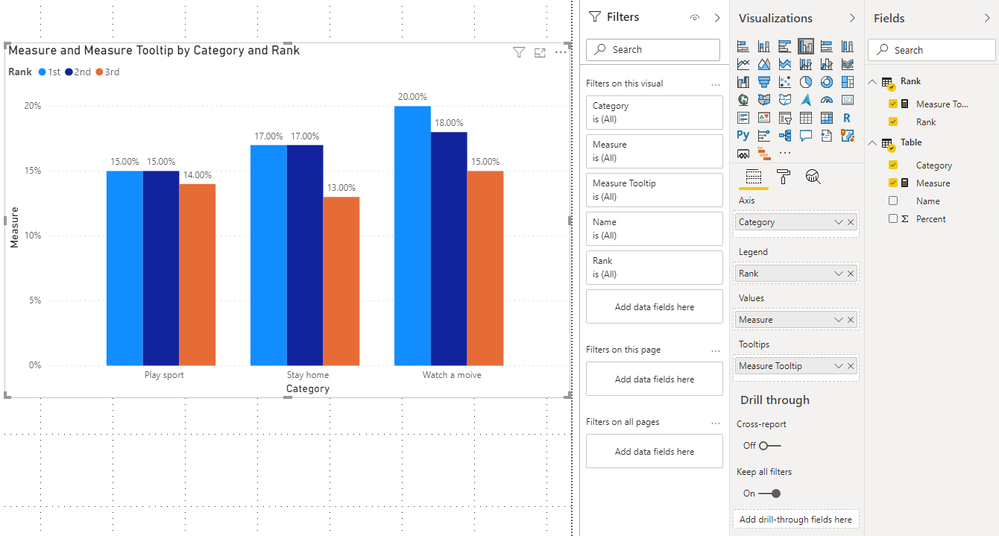
Please check if this could meet your requirements.
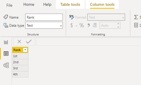
1. Enter data to create a Rank Table.
2. Create measures.
Measure =
VAR A_ =
    CALCULATE ( SUM ( 'Table'[Percent] ), 'Table'[Name] = "A" )
VAR B_ =
    CALCULATE ( SUM ( 'Table'[Percent] ), 'Table'[Name] = "B" )
VAR C_ =
    CALCULATE ( SUM ( 'Table'[Percent] ), 'Table'[Name] = "C" )

VAR M1 =
    UNION (
        ROW ( "Percent", A_, "Name", "A" ),
        ROW ( "Percent", B_, "Name", "B" ),
        ROW ( "Percent", C_, "Name", "C" )
    )
VAR Result1 =
    MAXX ( M1, [Percent] )
VAR Result2 =
    MINX ( TOPN ( 2, M1, [Percent] ), [Percent] )
VAR Result3 =
    MINX ( M1, [Percent] )
RETURN
    SWITCH (
        MAX ( 'Rank'[Rank] ),
        "1st", Result1,
        "2nd", Result2,
        "3rd", Result3
    )
Measure Tooltip =
VAR A_ =
CALCULATE ( SUM ( 'Table'[Percent] ), 'Table'[Name] = "A" )
VAR B_ =
CALCULATE ( SUM ( 'Table'[Percent] ), 'Table'[Name] = "B" )
VAR C_ =
CALCULATE ( SUM ( 'Table'[Percent] ), 'Table'[Name] = "C" )
VAR M1 =
UNION (
ROW ( "Percent", A_, "Name", "A" ),
ROW ( "Percent", B_, "Name", "B" ),
ROW ( "Percent", C_, "Name", "C" )
)
VAR Result1 =
MAXX ( M1, [Percent] )
VAR Result2 =
MINX ( TOPN ( 2, M1, [Percent] ), [Percent] )
VAR Result3 =
MINX ( M1, [Percent] )
VAR Tooltip1 =
MAXX ( FILTER ( M1, [Percent] = Result1 ), [Name] )
VAR Tooltip2 =
MAXX ( FILTER ( M1, [Percent] = Result2 ), [Name] )
VAR Tooltip3 =
MAXX ( FILTER ( M1, [Percent] = Result3 ), [Name] )
RETURN
SWITCH (
MAX ( 'Rank'[Rank] ),
"1st", Tooltip1,
"2nd", Tooltip2,
"3rd", Tooltip3
)
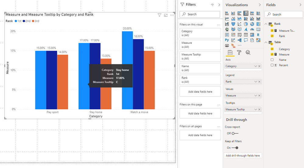
Then, you can get this:
You can check more details from here.
Best Regards,
Stephen Tao
If this post helps, then please consider Accept it as the solution to help the other members find it more quickly.
- Mark as New
- Bookmark
- Subscribe
- Mute
- Subscribe to RSS Feed
- Permalink
- Report Inappropriate Content
Thanks Stephen, whilst that solution isn't what I'm after, it will come in handy for something else I'm working on!
- Mark as New
- Bookmark
- Subscribe
- Mute
- Subscribe to RSS Feed
- Permalink
- Report Inappropriate Content
HI @aaronvincentnz ,
You have the category going across and then you are adding time. So, the visual is correct - it is telling you that for the category of "Watching a Movie" that for the three months in question these are the results.
If you are wanting to show the months by category you would need to flip this around. Make the Months in the category and the three categories as the axis. That way, you will see the top three things that happened in September. This way, you would see in Sept that it went Watch a Movie, Stay at Home, Play a Sport. And, for August you would see, Stay at Home, Watch a Movie,Play a SPort.
I would appreciate Kudos if my response was helpful. I would also appreciate it if you would Mark this As a Solution if it solved the problem. Thanks!
Did I answer your question? Mark my post as a solution!
Proud to be a Datanaut!
Private message me for consulting or training needs.
- Mark as New
- Bookmark
- Subscribe
- Mute
- Subscribe to RSS Feed
- Permalink
- Report Inappropriate Content
I have the 'reverse' as you've described with the month's on the X-axis, but just not sure how to sort it so the categories (movie/home/sport) are displayed in descending order. I prefer to have it displayed as I have in the screenshot above as you can easily tell which are the top categories whereas doing it with the month's on the X-axis, it's not as clear which are the top categories (if that makes sense)
These charts have been created in excel to illustrate my request, but if im asked which are the top categories overall (or lets say which are the most important categories), it's hard to know using the 'month' chart above (if that makes sense)
Helpful resources

Microsoft Fabric Learn Together
Covering the world! 9:00-10:30 AM Sydney, 4:00-5:30 PM CET (Paris/Berlin), 7:00-8:30 PM Mexico City

Power BI Monthly Update - April 2024
Check out the April 2024 Power BI update to learn about new features.

| User | Count |
|---|---|
| 110 | |
| 94 | |
| 80 | |
| 66 | |
| 58 |
| User | Count |
|---|---|
| 150 | |
| 119 | |
| 104 | |
| 87 | |
| 67 |


