- Power BI forums
- Updates
- News & Announcements
- Get Help with Power BI
- Desktop
- Service
- Report Server
- Power Query
- Mobile Apps
- Developer
- DAX Commands and Tips
- Custom Visuals Development Discussion
- Health and Life Sciences
- Power BI Spanish forums
- Translated Spanish Desktop
- Power Platform Integration - Better Together!
- Power Platform Integrations (Read-only)
- Power Platform and Dynamics 365 Integrations (Read-only)
- Training and Consulting
- Instructor Led Training
- Dashboard in a Day for Women, by Women
- Galleries
- Community Connections & How-To Videos
- COVID-19 Data Stories Gallery
- Themes Gallery
- Data Stories Gallery
- R Script Showcase
- Webinars and Video Gallery
- Quick Measures Gallery
- 2021 MSBizAppsSummit Gallery
- 2020 MSBizAppsSummit Gallery
- 2019 MSBizAppsSummit Gallery
- Events
- Ideas
- Custom Visuals Ideas
- Issues
- Issues
- Events
- Upcoming Events
- Community Blog
- Power BI Community Blog
- Custom Visuals Community Blog
- Community Support
- Community Accounts & Registration
- Using the Community
- Community Feedback
Register now to learn Fabric in free live sessions led by the best Microsoft experts. From Apr 16 to May 9, in English and Spanish.
- Power BI forums
- Forums
- Get Help with Power BI
- Desktop
- Re: Data not shown correctly on line graph
- Subscribe to RSS Feed
- Mark Topic as New
- Mark Topic as Read
- Float this Topic for Current User
- Bookmark
- Subscribe
- Printer Friendly Page
- Mark as New
- Bookmark
- Subscribe
- Mute
- Subscribe to RSS Feed
- Permalink
- Report Inappropriate Content
Data not shown correctly on line graph
Hi All,
I have a table with two columns Date and Balance when I visualize it as a table it is shown correctly
Report Month MI Balance
2017-01-31 XXX
2017-02-28 XXX
2017-03-31 XXX
2017-04-30 XXX
2017-05-31 XXX
2017-06-30 XXX
When I convert the table in line chart it doesn't show Jan 2017 and the line just goes one axis extra. As such line at Feb shows the value of jan and line at Mar shows the value of Feb and so on. As such the last point of the line shows the value of June but doesn't have any axis beneath.
When I set the axis to hierarchy and just choose month the line chart seems to be fine. Any idea on how to fix this?
Thank you for your help in advance.
Regards,
- Mark as New
- Bookmark
- Subscribe
- Mute
- Subscribe to RSS Feed
- Permalink
- Report Inappropriate Content
Hi @moezsajwani,
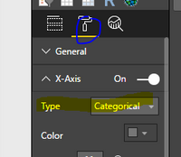
If you want to show the date and value correctly, please display date itself not in hierarchy, set the x axis in Category type(Please see the screenshot below), if you set the continuous, it will show veryday from 2017/1/31 to 2017/6/30.
Then the data will be shown correcly as follows.
Best Regards,
Angelia
- Mark as New
- Bookmark
- Subscribe
- Mute
- Subscribe to RSS Feed
- Permalink
- Report Inappropriate Content
Hi,
Thank you for your quick repsonse. I appreciate your help and sorry for the delay in responding. I was wondering if I can show the date in graph as MMMM-YY format despite my date format in table is YYYY-MM-DD. Is it possible to present different format on x-axis without changing the original table.
Secondly, If I change the the x-axis type to categorical I cannot use the forecast line. How to deal with this issue?
Appreciate your help in advance.
Regards,
Moez
- Mark as New
- Bookmark
- Subscribe
- Mute
- Subscribe to RSS Feed
- Permalink
- Report Inappropriate Content
Hi @moezsajwani,
It is impossible to present different format on x-axis directly, you need to create a new calculated column in the format using the formula.
NewDate = FORMAT(Table[DATE],"MMMM-YY")
Then use the [NewDate] as the x-axis level.
Yes, I cannot use the forecast line if we change the the x-axis type to categorical. Becasue the forecast future based on the continuous date. You can create idea here.
Best Regards,
Angelia
- Mark as New
- Bookmark
- Subscribe
- Mute
- Subscribe to RSS Feed
- Permalink
- Report Inappropriate Content
Please attach the screenshots of the graph and your table (include the whole Power BI window)
Helpful resources

Microsoft Fabric Learn Together
Covering the world! 9:00-10:30 AM Sydney, 4:00-5:30 PM CET (Paris/Berlin), 7:00-8:30 PM Mexico City

Power BI Monthly Update - April 2024
Check out the April 2024 Power BI update to learn about new features.

| User | Count |
|---|---|
| 112 | |
| 97 | |
| 85 | |
| 67 | |
| 59 |
| User | Count |
|---|---|
| 150 | |
| 120 | |
| 99 | |
| 87 | |
| 68 |


