- Power BI forums
- Updates
- News & Announcements
- Get Help with Power BI
- Desktop
- Service
- Report Server
- Power Query
- Mobile Apps
- Developer
- DAX Commands and Tips
- Custom Visuals Development Discussion
- Health and Life Sciences
- Power BI Spanish forums
- Translated Spanish Desktop
- Power Platform Integration - Better Together!
- Power Platform Integrations (Read-only)
- Power Platform and Dynamics 365 Integrations (Read-only)
- Training and Consulting
- Instructor Led Training
- Dashboard in a Day for Women, by Women
- Galleries
- Community Connections & How-To Videos
- COVID-19 Data Stories Gallery
- Themes Gallery
- Data Stories Gallery
- R Script Showcase
- Webinars and Video Gallery
- Quick Measures Gallery
- 2021 MSBizAppsSummit Gallery
- 2020 MSBizAppsSummit Gallery
- 2019 MSBizAppsSummit Gallery
- Events
- Ideas
- Custom Visuals Ideas
- Issues
- Issues
- Events
- Upcoming Events
- Community Blog
- Power BI Community Blog
- Custom Visuals Community Blog
- Community Support
- Community Accounts & Registration
- Using the Community
- Community Feedback
Register now to learn Fabric in free live sessions led by the best Microsoft experts. From Apr 16 to May 9, in English and Spanish.
- Power BI forums
- Forums
- Get Help with Power BI
- Desktop
- Re: Data depends on highlight on line chart
- Subscribe to RSS Feed
- Mark Topic as New
- Mark Topic as Read
- Float this Topic for Current User
- Bookmark
- Subscribe
- Printer Friendly Page
- Mark as New
- Bookmark
- Subscribe
- Mute
- Subscribe to RSS Feed
- Permalink
- Report Inappropriate Content
Data depends on highlight on line chart
Thank you for taking a look.
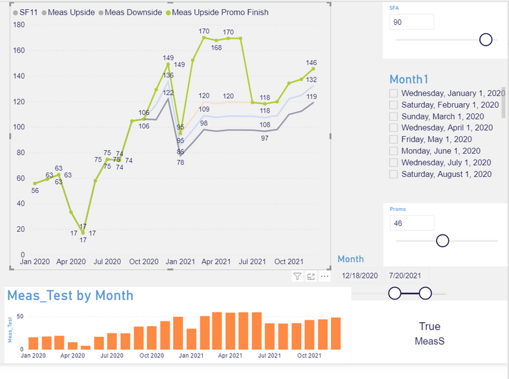
I have line chart, each line of which is a measure (Meas Upside, Downside and etc). I can select, highlight one of them (on the attached image it is green one). Question is, can I show value = highlighted measure divided by 3 , in the bottom chart (Meas_Test). Values will be changed depends on the highlight on line chart.
Solved! Go to Solution.
- Mark as New
- Bookmark
- Subscribe
- Mute
- Subscribe to RSS Feed
- Permalink
- Report Inappropriate Content
Hi @Anonymous ,
I create a simple example. Please check:
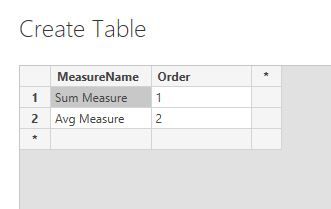
1. Create another table with your measure names by "Enter data".
2. Combine your multiple measures into one.
Measure =
SWITCH (
    SELECTEDVALUE ( MeasureName[MeasureName] ),
    "Sum Measure", [Sum Measure],
    "Avg Measure", [Avg Measure],
    [Sum Measure] // the default measure when nothing selected
)
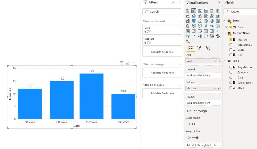
3. Create a line chart.
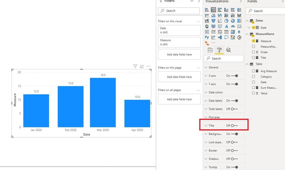
4. Create a column chart and keep "Title" off.
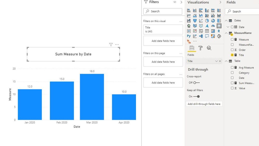
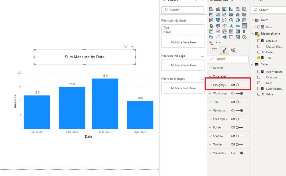
5. Create a title measure and put it into a card visual, keep "Category" off, adjust font size.
Title =
VAR Measure_ =
    SELECTEDVALUE ( MeasureName[MeasureName] )
RETURN
    IF ( ISBLANK ( Measure_ ), "Sum Measure by Date", Measure_ & " by Date" )
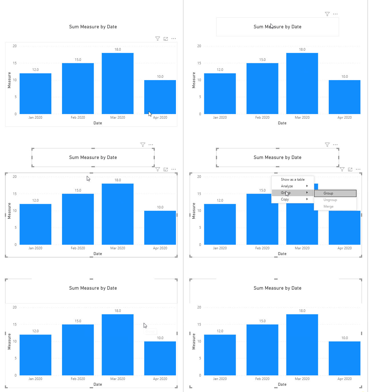
6. Group the card visual and the column visual.
(PS: I do this step because title function is not working with "Highlight" in this column chart based on my test.)
7. Test.
Best regards
Icey
If this post helps, then consider Accepting it as the solution to help other members find it faster.
- Mark as New
- Bookmark
- Subscribe
- Mute
- Subscribe to RSS Feed
- Permalink
- Report Inappropriate Content
- Mark as New
- Bookmark
- Subscribe
- Mute
- Subscribe to RSS Feed
- Permalink
- Report Inappropriate Content
Thank you for such a detailed reply, sir @Icey. It looks very optimistic I will check it out and come back to you later.
- Mark as New
- Bookmark
- Subscribe
- Mute
- Subscribe to RSS Feed
- Permalink
- Report Inappropriate Content
Hi @Anonymous ,
I create a simple example. Please check:
1. Create another table with your measure names by "Enter data".
2. Combine your multiple measures into one.
Measure =
SWITCH (
    SELECTEDVALUE ( MeasureName[MeasureName] ),
    "Sum Measure", [Sum Measure],
    "Avg Measure", [Avg Measure],
    [Sum Measure] // the default measure when nothing selected
)
3. Create a line chart.
4. Create a column chart and keep "Title" off.
5. Create a title measure and put it into a card visual, keep "Category" off, adjust font size.
Title =
VAR Measure_ =
    SELECTEDVALUE ( MeasureName[MeasureName] )
RETURN
    IF ( ISBLANK ( Measure_ ), "Sum Measure by Date", Measure_ & " by Date" )
6. Group the card visual and the column visual.
(PS: I do this step because title function is not working with "Highlight" in this column chart based on my test.)
7. Test.
Best regards
Icey
If this post helps, then consider Accepting it as the solution to help other members find it faster.
Helpful resources

Microsoft Fabric Learn Together
Covering the world! 9:00-10:30 AM Sydney, 4:00-5:30 PM CET (Paris/Berlin), 7:00-8:30 PM Mexico City

Power BI Monthly Update - April 2024
Check out the April 2024 Power BI update to learn about new features.

| User | Count |
|---|---|
| 117 | |
| 107 | |
| 70 | |
| 70 | |
| 43 |
| User | Count |
|---|---|
| 148 | |
| 106 | |
| 104 | |
| 89 | |
| 65 |
