- Power BI forums
- Updates
- News & Announcements
- Get Help with Power BI
- Desktop
- Service
- Report Server
- Power Query
- Mobile Apps
- Developer
- DAX Commands and Tips
- Custom Visuals Development Discussion
- Health and Life Sciences
- Power BI Spanish forums
- Translated Spanish Desktop
- Power Platform Integration - Better Together!
- Power Platform Integrations (Read-only)
- Power Platform and Dynamics 365 Integrations (Read-only)
- Training and Consulting
- Instructor Led Training
- Dashboard in a Day for Women, by Women
- Galleries
- Community Connections & How-To Videos
- COVID-19 Data Stories Gallery
- Themes Gallery
- Data Stories Gallery
- R Script Showcase
- Webinars and Video Gallery
- Quick Measures Gallery
- 2021 MSBizAppsSummit Gallery
- 2020 MSBizAppsSummit Gallery
- 2019 MSBizAppsSummit Gallery
- Events
- Ideas
- Custom Visuals Ideas
- Issues
- Issues
- Events
- Upcoming Events
- Community Blog
- Power BI Community Blog
- Custom Visuals Community Blog
- Community Support
- Community Accounts & Registration
- Using the Community
- Community Feedback
Register now to learn Fabric in free live sessions led by the best Microsoft experts. From Apr 16 to May 9, in English and Spanish.
- Power BI forums
- Forums
- Get Help with Power BI
- Desktop
- Data colors on chart based on rank
- Subscribe to RSS Feed
- Mark Topic as New
- Mark Topic as Read
- Float this Topic for Current User
- Bookmark
- Subscribe
- Printer Friendly Page
- Mark as New
- Bookmark
- Subscribe
- Mute
- Subscribe to RSS Feed
- Permalink
- Report Inappropriate Content
Data colors on chart based on rank
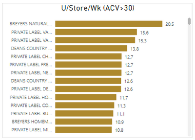
Hello - I am trying to color the bars on a chart based on the top 3rd, middle 3rd, and bottom 4rd of a measure. The chart I'm using is below and if there are 99 items, I would like the top 3rd to show as one color, the middle 3rd to be another color, and the bottom 3rd another color. The number of items and measure values will change based on the time and geography filters the user selects - so they will not always be the same. Because of this, I don't believe it can be done with the rules available as I would have to use values to dictate the colors. Sincerely appreciate any help that anyone can provide! Please let me know if there is any additional information I can provide to help get this solved. Thank you!
Table: Timeframe by SKU
Axis field: Flavor
Values: U/Str/Wk
Solved! Go to Solution.
- Mark as New
- Bookmark
- Subscribe
- Mute
- Subscribe to RSS Feed
- Permalink
- Report Inappropriate Content
Hi, @evanderpoel
Thank you for your feedback, and sorry for the misunderstanding.
Please check the link down below, and please let me know if I understood correctly this time.
https://www.dropbox.com/s/p2iny0qysrzhc4j/evanderpoel.pbix?dl=0
Hi, My name is Jihwan Kim.
If this post helps, then please consider accept it as the solution to help other members find it faster, and give a big thumbs up.
Linkedin: https://www.linkedin.com/in/jihwankim1975/
If this post helps, then please consider accepting it as the solution to help other members find it faster, and give a big thumbs up.
- Mark as New
- Bookmark
- Subscribe
- Mute
- Subscribe to RSS Feed
- Permalink
- Report Inappropriate Content
Hi, @evanderpoel
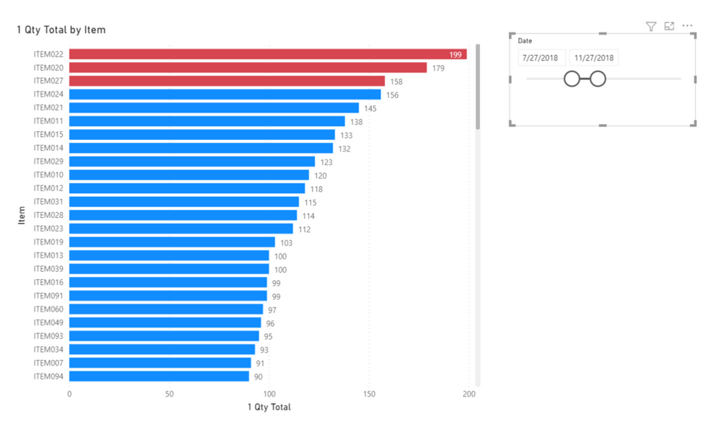
Please check the below picture and the sample pbix file's link, whether it is what you are looking for.
All measures are in the sample pbix file, and the steps are numbered in front of each measure.
Top: Red
Middle: Black
Bottom: Yellow
https://www.dropbox.com/s/p2iny0qysrzhc4j/evanderpoel.pbix?dl=0
Hi, My name is Jihwan Kim.
If this post helps, then please consider accept it as the solution to help other members find it faster, and give a big thumbs up.
Linkedin: https://www.linkedin.com/in/jihwankim1975/
If this post helps, then please consider accepting it as the solution to help other members find it faster, and give a big thumbs up.
- Mark as New
- Bookmark
- Subscribe
- Mute
- Subscribe to RSS Feed
- Permalink
- Report Inappropriate Content
Hi - Is it possible to change the formulas to say the top, middle, and bottom third of skus rather than top, middle, and bottom 3? For example, when there is 99 items, the top 33 would be one color, the middle 33 would be another color, and the bottom 33 another color. If the user change the filters and there are now 90 items, then the first 30 items would be one color, the next 30 items would be another color, and the bottom 30 items would be another color. Please let me know if this doesn't make sense. Thanks!
- Mark as New
- Bookmark
- Subscribe
- Mute
- Subscribe to RSS Feed
- Permalink
- Report Inappropriate Content
Hi, @evanderpoel
Thank you for your feedback, and sorry for the misunderstanding.
Please check the link down below, and please let me know if I understood correctly this time.
https://www.dropbox.com/s/p2iny0qysrzhc4j/evanderpoel.pbix?dl=0
Hi, My name is Jihwan Kim.
If this post helps, then please consider accept it as the solution to help other members find it faster, and give a big thumbs up.
Linkedin: https://www.linkedin.com/in/jihwankim1975/
If this post helps, then please consider accepting it as the solution to help other members find it faster, and give a big thumbs up.
- Mark as New
- Bookmark
- Subscribe
- Mute
- Subscribe to RSS Feed
- Permalink
- Report Inappropriate Content
Hi,
You could probably write a RANK measure and color based on that.
Regards,
Ashish Mathur
http://www.ashishmathur.com
https://www.linkedin.com/in/excelenthusiasts/
- Mark as New
- Bookmark
- Subscribe
- Mute
- Subscribe to RSS Feed
- Permalink
- Report Inappropriate Content
Do you have what the rank formula would be? I don't typically write formulas in powerbi, so I'm not sure how to go about doing that. Happy to send you an example of my powerbi file. Thanks!
- Mark as New
- Bookmark
- Subscribe
- Mute
- Subscribe to RSS Feed
- Permalink
- Report Inappropriate Content
Hi,
I can try. Share the link from where i can download your PBI file.
Regards,
Ashish Mathur
http://www.ashishmathur.com
https://www.linkedin.com/in/excelenthusiasts/
- Mark as New
- Bookmark
- Subscribe
- Mute
- Subscribe to RSS Feed
- Permalink
- Report Inappropriate Content
I don't think it could be dynamic though- I would have to do the work to split the measure out by three across each geography and each timeframe since the measure top / bottom will be different across each filter. I was hoping someone could write a function script to accomplish this to avoid manually doing with each data refresh.
- Mark as New
- Bookmark
- Subscribe
- Mute
- Subscribe to RSS Feed
- Permalink
- Report Inappropriate Content
Hey @evanderpoel ,
you should create 3 measures that are doing a dynamic segmentation to the desired areas.
Then you can add the 3 measures to the same graph and give each measure a different color:
I think that's the only way how you can achieve that.
- Mark as New
- Bookmark
- Subscribe
- Mute
- Subscribe to RSS Feed
- Permalink
- Report Inappropriate Content
Do you mean create the measures in my original excel file or create them in within the powerbi file? Do you have the formula for what each measure would be? Happy to send you an example of my powerbi file if that would help.
Helpful resources

Microsoft Fabric Learn Together
Covering the world! 9:00-10:30 AM Sydney, 4:00-5:30 PM CET (Paris/Berlin), 7:00-8:30 PM Mexico City

Power BI Monthly Update - April 2024
Check out the April 2024 Power BI update to learn about new features.

| User | Count |
|---|---|
| 111 | |
| 95 | |
| 77 | |
| 68 | |
| 54 |
| User | Count |
|---|---|
| 144 | |
| 105 | |
| 102 | |
| 89 | |
| 63 |


