- Power BI forums
- Updates
- News & Announcements
- Get Help with Power BI
- Desktop
- Service
- Report Server
- Power Query
- Mobile Apps
- Developer
- DAX Commands and Tips
- Custom Visuals Development Discussion
- Health and Life Sciences
- Power BI Spanish forums
- Translated Spanish Desktop
- Power Platform Integration - Better Together!
- Power Platform Integrations (Read-only)
- Power Platform and Dynamics 365 Integrations (Read-only)
- Training and Consulting
- Instructor Led Training
- Dashboard in a Day for Women, by Women
- Galleries
- Community Connections & How-To Videos
- COVID-19 Data Stories Gallery
- Themes Gallery
- Data Stories Gallery
- R Script Showcase
- Webinars and Video Gallery
- Quick Measures Gallery
- 2021 MSBizAppsSummit Gallery
- 2020 MSBizAppsSummit Gallery
- 2019 MSBizAppsSummit Gallery
- Events
- Ideas
- Custom Visuals Ideas
- Issues
- Issues
- Events
- Upcoming Events
- Community Blog
- Power BI Community Blog
- Custom Visuals Community Blog
- Community Support
- Community Accounts & Registration
- Using the Community
- Community Feedback
Register now to learn Fabric in free live sessions led by the best Microsoft experts. From Apr 16 to May 9, in English and Spanish.
- Power BI forums
- Forums
- Get Help with Power BI
- Desktop
- Data appearing in table, but not in visualizations
- Subscribe to RSS Feed
- Mark Topic as New
- Mark Topic as Read
- Float this Topic for Current User
- Bookmark
- Subscribe
- Printer Friendly Page
- Mark as New
- Bookmark
- Subscribe
- Mute
- Subscribe to RSS Feed
- Permalink
- Report Inappropriate Content
Data appearing in table, but not in visualizations
I am hoping to get some help here. I feel like I am missing something really basic.
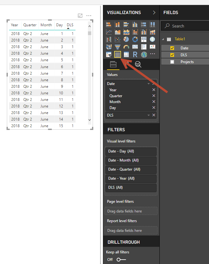
I prepared a simple 3-column sheet in Excel, selected the content, formatted as table with headers and saved. Using 'Get Info' in Power BI desktop, I imported the table, turned off auto-summary for the 'DLS' column, and checked the boxes for 'DLS' and 'Date' to send them to the dashboard for creating visualizations.
This is crazily frustrating as this should be the simplest kind of visual to set up. Thanks in advance for the help!
C
- Mark as New
- Bookmark
- Subscribe
- Mute
- Subscribe to RSS Feed
- Permalink
- Report Inappropriate Content
not any visualization tool is showing
- Mark as New
- Bookmark
- Subscribe
- Mute
- Subscribe to RSS Feed
- Permalink
- Report Inappropriate Content
for formatting and all
- Mark as New
- Bookmark
- Subscribe
- Mute
- Subscribe to RSS Feed
- Permalink
- Report Inappropriate Content
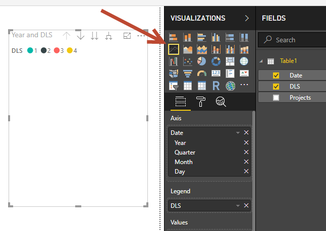
i see that you dont have any measure on the Values section when you change the visual from table to line chart.
if you want to see DLS values in the chart move it to the values section.
- Mark as New
- Bookmark
- Subscribe
- Mute
- Subscribe to RSS Feed
- Permalink
- Report Inappropriate Content
Thanks. I have tried that and it is forcing a 'Count of DLS' - which is not what I am after. I have made sure the data type is 'whole number' and that the summarization is turned off. I am literally trying to show a simple chart of 4 values over the time period of one year...

- Mark as New
- Bookmark
- Subscribe
- Mute
- Subscribe to RSS Feed
- Permalink
- Report Inappropriate Content
Hi @C_Dub,
Based on the table data which you attached in the above screenshot the DLS measure data you have it on the daily granularity level.
In the Line chart above you are trying to see month on X-axis and hence by default you need to have an aggregate to be added.
Also when you say you want see "Simple Chart of 4 Values of DLS" you can add DLS to Legend and use the count measure to display number of DLS over a period of time.
- Mark as New
- Bookmark
- Subscribe
- Mute
- Subscribe to RSS Feed
- Permalink
- Report Inappropriate Content
Sorry I am not being clear enough. Let me try again.
The DLS column has a single whole number value for each day of the year, either 1, 2, 3, or 4.
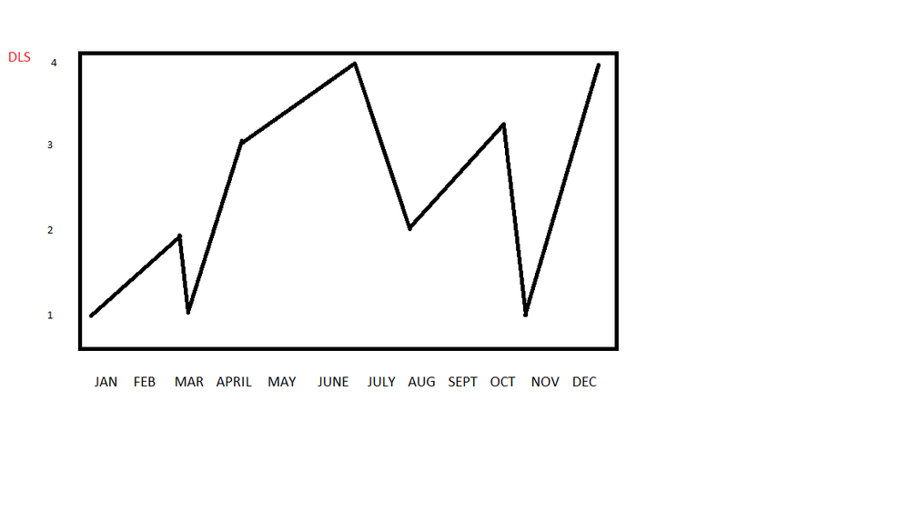
I want those values charted on a line graph over the course of a year, with time on the X axis, and 1-4 on the Y axis. I want the DLS values to register as their ACTUAL values - not a count of the values / average, etc. Just 1-4.
Like this.
- Mark as New
- Bookmark
- Subscribe
- Mute
- Subscribe to RSS Feed
- Permalink
- Report Inappropriate Content
Got you.
One more question since you have different values for each day in a month how do you want to see on a month level?
For now i have used the max(DLS) which will display the max of that month and when you go for a day level the report displays max on the specific day.
find the attached file below and see if this helps.
- Mark as New
- Bookmark
- Subscribe
- Mute
- Subscribe to RSS Feed
- Permalink
- Report Inappropriate Content
Thanks for the work! I am going to play with another couple of ideas and get back to you. I am obviously quite new at this, and despite having gone through a pretty thorough set of tutorials, I have a bit of learning to do.
@Anonymous wrote:Got you.
One more question since you have different values for each day in a month how do you want to see on a month level?
For now i have used the max(DLS) which will display the max of that month and when you go for a day level the report displays max on the specific day.
find the attached file below and see if this helps.
- Mark as New
- Bookmark
- Subscribe
- Mute
- Subscribe to RSS Feed
- Permalink
- Report Inappropriate Content
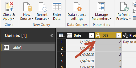
It certainly sounds as the column is in text. If you set it as whole number in Power Query you can still override it in the data sheet. Are you sure it is set to whole number when you check data sheet and that column?
- Mark as New
- Bookmark
- Subscribe
- Mute
- Subscribe to RSS Feed
- Permalink
- Report Inappropriate Content
Triple checked that...

- Mark as New
- Bookmark
- Subscribe
- Mute
- Subscribe to RSS Feed
- Permalink
- Report Inappropriate Content
First or all, you data must have only one unique value per month.
this is what you can try:
1. change your Month column back to Sum under Modeling on ribbin.
2. choose Maximum of DLS, then you have the unique value as maximum value to show.
3. you might hit order issue when display month. you can use month number instead.
- Mark as New
- Bookmark
- Subscribe
- Mute
- Subscribe to RSS Feed
- Permalink
- Report Inappropriate Content
Sorry I am not being clear enough. Let me try again.
The DLS column has a single whole number value for each day of the year, either 1, 2, 3, or 4.
I want those values charted on a line graph over the course of a year, with time on the X axis, and 1-4 on the Y axis. I want the DLS values to register as their ACTUAL values - not a count of the values / average, etc. Just 1-4.
Like this.
- Mark as New
- Bookmark
- Subscribe
- Mute
- Subscribe to RSS Feed
- Permalink
- Report Inappropriate Content
I am not sure what you want to show. My guess is you want to show DLS value 1/2/3/4 on Y line like a stair and Date as Axis. if that is the case, Power BI chart cannot show them like that since Value in Power BI so far has to be an aggretation value that cannot be 'Do not summarize'. In your case you only have one value on each day, but most of the time, the date is not unique so it is impossible to show all of the values with lines between them.
- Mark as New
- Bookmark
- Subscribe
- Mute
- Subscribe to RSS Feed
- Permalink
- Report Inappropriate Content
What is DLS stand for? Does it need to be sum by Date and show on the line chart? if so, Click the drop down beside 'DLS' and choose 'Sum'.
Helpful resources

Microsoft Fabric Learn Together
Covering the world! 9:00-10:30 AM Sydney, 4:00-5:30 PM CET (Paris/Berlin), 7:00-8:30 PM Mexico City

Power BI Monthly Update - April 2024
Check out the April 2024 Power BI update to learn about new features.

| User | Count |
|---|---|
| 111 | |
| 94 | |
| 80 | |
| 68 | |
| 59 |
| User | Count |
|---|---|
| 150 | |
| 119 | |
| 104 | |
| 87 | |
| 67 |
