- Power BI forums
- Updates
- News & Announcements
- Get Help with Power BI
- Desktop
- Service
- Report Server
- Power Query
- Mobile Apps
- Developer
- DAX Commands and Tips
- Custom Visuals Development Discussion
- Health and Life Sciences
- Power BI Spanish forums
- Translated Spanish Desktop
- Power Platform Integration - Better Together!
- Power Platform Integrations (Read-only)
- Power Platform and Dynamics 365 Integrations (Read-only)
- Training and Consulting
- Instructor Led Training
- Dashboard in a Day for Women, by Women
- Galleries
- Community Connections & How-To Videos
- COVID-19 Data Stories Gallery
- Themes Gallery
- Data Stories Gallery
- R Script Showcase
- Webinars and Video Gallery
- Quick Measures Gallery
- 2021 MSBizAppsSummit Gallery
- 2020 MSBizAppsSummit Gallery
- 2019 MSBizAppsSummit Gallery
- Events
- Ideas
- Custom Visuals Ideas
- Issues
- Issues
- Events
- Upcoming Events
- Community Blog
- Power BI Community Blog
- Custom Visuals Community Blog
- Community Support
- Community Accounts & Registration
- Using the Community
- Community Feedback
Register now to learn Fabric in free live sessions led by the best Microsoft experts. From Apr 16 to May 9, in English and Spanish.
- Power BI forums
- Forums
- Get Help with Power BI
- Desktop
- Re: Data Table Percentage Question
- Subscribe to RSS Feed
- Mark Topic as New
- Mark Topic as Read
- Float this Topic for Current User
- Bookmark
- Subscribe
- Printer Friendly Page
- Mark as New
- Bookmark
- Subscribe
- Mute
- Subscribe to RSS Feed
- Permalink
- Report Inappropriate Content
Data Table Percentage Question
Hello,
I am hoping that someone on here can guide me in the right direction with this issue.
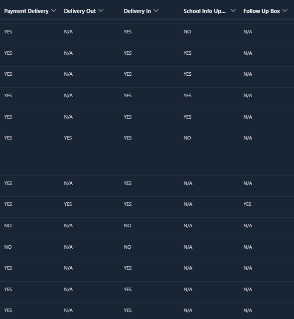
I have a data with multiple columns (QA Items) and with each column, there are only three responses: Yes, No, N/A.
I can write DAX expression measure to get the accuracy percentages for each, but where I remain stuck is how to present this in a visual, preferably in a stacked bar graph that shows the accuracy percentages (see example below for other table):
Here is a sample of part of my data table in SharePoint that I am using as a source:
Yes = It was there
No = it was not there
N/A = it did not apply
I'm at a loss as to where to go next. I was thinking if I need to create a calculated table, but I'm not very skilled on how to do that - so seeing if anyone out there has any ideas?
Solved! Go to Solution.
- Mark as New
- Bookmark
- Subscribe
- Mute
- Subscribe to RSS Feed
- Permalink
- Report Inappropriate Content
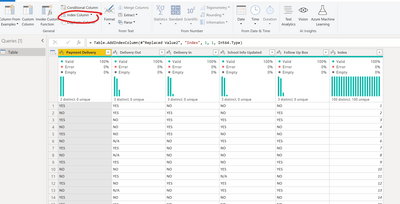
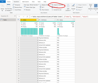
@ianallen13 I would probably unpivot the data and then create the %'s in a measure.
1. In "Transform data"/Power Query, if there is no ID column, I'd create one using "Add column" > "Index Column"
2. Then I would select all the columns except for the Index
3. Then go to "Transform" > "Unpivot Columns"
4. Now I have "Attribute" which is my headers before, and "Value" which is the data inside.
5. Close and Apply to get back to the visual layer
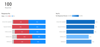
6. I created a measure to count the number of responses using the Index column,
7. Now I can create a 100% stacked bar chart,
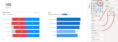
or more measures to determine the Yes % and create charts:
I've attached the PBIX so you can take a look.
Respectfully,
Zoe Douglas (DataZoe)
Follow me on LinkedIn at https://www.linkedin.com/in/zoedouglas-data
See my reports and blog at https://www.datazoepowerbi.com/
- Mark as New
- Bookmark
- Subscribe
- Mute
- Subscribe to RSS Feed
- Permalink
- Report Inappropriate Content
Hello,
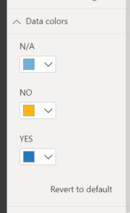
Unfortunately I do not have that option:
- Mark as New
- Bookmark
- Subscribe
- Mute
- Subscribe to RSS Feed
- Permalink
- Report Inappropriate Content
@ianallen13 yes, for that one you are limited to just picking one for each of the options. 🙂 It's the other one that has the fancy options.
Respectfully,
Zoe Douglas (DataZoe)
Follow me on LinkedIn at https://www.linkedin.com/in/zoedouglas-data
See my reports and blog at https://www.datazoepowerbi.com/
- Mark as New
- Bookmark
- Subscribe
- Mute
- Subscribe to RSS Feed
- Permalink
- Report Inappropriate Content
Sorry to sound dumb, but what is the other one? Each visual that I have chosen does not have that option for this. So far, I can do only select that when I create a table or matrix in PBI
- Mark as New
- Bookmark
- Subscribe
- Mute
- Subscribe to RSS Feed
- Permalink
- Report Inappropriate Content
Thank you! Yes, I just filtered out the N/A's and it worked perfectly. Thank you again so much for your help.
Now the only other thing I cannot figure out - I saw that you were able to do some conditional formatting to the bar graph, but when I try to do that - I am not presented with the option. Any thoughts?
- Mark as New
- Bookmark
- Subscribe
- Mute
- Subscribe to RSS Feed
- Permalink
- Report Inappropriate Content
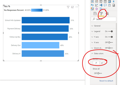
@ianallen13 For the bar chart, to get the gradient option you go to "Data colors" and pick the little "Fx" button. This allows you to pass it a measure and choose how to color it.
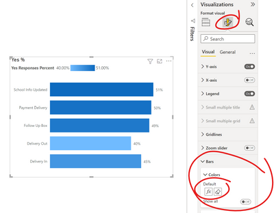
and in the preview of the new visualization pane, it's here:
I chose gradient, but you can also impliment rules too, so you can highlight when it drops below or above a certain percent also. You can also base it on a different measure than the one used in the bar. Lots of options! 🙂
Respectfully,
Zoe Douglas (DataZoe)
Follow me on LinkedIn at https://www.linkedin.com/in/zoedouglas-data
See my reports and blog at https://www.datazoepowerbi.com/
- Mark as New
- Bookmark
- Subscribe
- Mute
- Subscribe to RSS Feed
- Permalink
- Report Inappropriate Content
Thank you for this and for the example file, but I do have an issue...
The calculations showing are indicating the percentage of YES's for each attribute, but I don't want the N/A's to count in the overall calculations.
e.g.
If I have "School Info Updated" with 166 responses:
N/A: 141
NO: 6
YES: 19
I don't want it to be 19/166, but I want it to be 19/25 = 76%. Do I have to do a new measure for each attribute then?
- Mark as New
- Bookmark
- Subscribe
- Mute
- Subscribe to RSS Feed
- Permalink
- Report Inappropriate Content
Disregard this - I answered my own question.
- Mark as New
- Bookmark
- Subscribe
- Mute
- Subscribe to RSS Feed
- Permalink
- Report Inappropriate Content
@ianallen13 what was your solution so others can also find it helpful?
The way I usually do this is either change the measure or simply remove the N/A's entirely, either in Power Query or in the all pages filter in the filter pane. To change the measure I use this approach:
Yes Responses Percent = DIVIDE(CALCULATE([Responses],'Table'[Value]="YES"),CALCULATE([Responses],'Table'[Value] in {"YES","NO"}))
Respectfully,
Zoe Douglas (DataZoe)
Follow me on LinkedIn at https://www.linkedin.com/in/zoedouglas-data
See my reports and blog at https://www.datazoepowerbi.com/
- Mark as New
- Bookmark
- Subscribe
- Mute
- Subscribe to RSS Feed
- Permalink
- Report Inappropriate Content
@ianallen13 I would probably unpivot the data and then create the %'s in a measure.
1. In "Transform data"/Power Query, if there is no ID column, I'd create one using "Add column" > "Index Column"
2. Then I would select all the columns except for the Index
3. Then go to "Transform" > "Unpivot Columns"
4. Now I have "Attribute" which is my headers before, and "Value" which is the data inside.
5. Close and Apply to get back to the visual layer
6. I created a measure to count the number of responses using the Index column,
7. Now I can create a 100% stacked bar chart,

or more measures to determine the Yes % and create charts:
I've attached the PBIX so you can take a look.
Respectfully,
Zoe Douglas (DataZoe)
Follow me on LinkedIn at https://www.linkedin.com/in/zoedouglas-data
See my reports and blog at https://www.datazoepowerbi.com/
Helpful resources

Microsoft Fabric Learn Together
Covering the world! 9:00-10:30 AM Sydney, 4:00-5:30 PM CET (Paris/Berlin), 7:00-8:30 PM Mexico City

Power BI Monthly Update - April 2024
Check out the April 2024 Power BI update to learn about new features.

| User | Count |
|---|---|
| 114 | |
| 100 | |
| 78 | |
| 75 | |
| 50 |
| User | Count |
|---|---|
| 144 | |
| 109 | |
| 108 | |
| 87 | |
| 61 |

