- Power BI forums
- Updates
- News & Announcements
- Get Help with Power BI
- Desktop
- Service
- Report Server
- Power Query
- Mobile Apps
- Developer
- DAX Commands and Tips
- Custom Visuals Development Discussion
- Health and Life Sciences
- Power BI Spanish forums
- Translated Spanish Desktop
- Power Platform Integration - Better Together!
- Power Platform Integrations (Read-only)
- Power Platform and Dynamics 365 Integrations (Read-only)
- Training and Consulting
- Instructor Led Training
- Dashboard in a Day for Women, by Women
- Galleries
- Community Connections & How-To Videos
- COVID-19 Data Stories Gallery
- Themes Gallery
- Data Stories Gallery
- R Script Showcase
- Webinars and Video Gallery
- Quick Measures Gallery
- 2021 MSBizAppsSummit Gallery
- 2020 MSBizAppsSummit Gallery
- 2019 MSBizAppsSummit Gallery
- Events
- Ideas
- Custom Visuals Ideas
- Issues
- Issues
- Events
- Upcoming Events
- Community Blog
- Power BI Community Blog
- Custom Visuals Community Blog
- Community Support
- Community Accounts & Registration
- Using the Community
- Community Feedback
Register now to learn Fabric in free live sessions led by the best Microsoft experts. From Apr 16 to May 9, in English and Spanish.
- Power BI forums
- Forums
- Get Help with Power BI
- Desktop
- Re: Data Modelling for multiple reports on a singl...
- Subscribe to RSS Feed
- Mark Topic as New
- Mark Topic as Read
- Float this Topic for Current User
- Bookmark
- Subscribe
- Printer Friendly Page
- Mark as New
- Bookmark
- Subscribe
- Mute
- Subscribe to RSS Feed
- Permalink
- Report Inappropriate Content
Data Modelling for multiple reports on a single page.
Hello Community,
I am creating a Project Status - Weekly Dashboard for executives to get a high level overview of the project status as the first screenshot.
There is an Excel Spreadsheet that I have put up on SharePoint Online Site for the Zonal Managers to update the spreadsheet on a weekly basis and have timed the Power BI Report Dataset to refresh automatically at a certain time every Monday at 6:00AM.
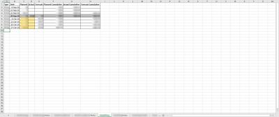
The spreadsheet with data looks like the second screenshot.
This is fairly a simple spreadsheet with 12 tabs for each report with additional 12 tabs for notes that go right below the respective reports.
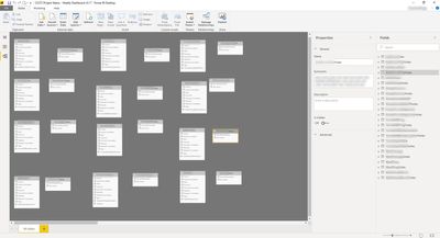
The data model is looking like the third screenshot.
However, I am pretty sure there must be a better way of modelling this.
Can anyone please suggest a better data model so I can enhance my data model to suit the above requirements? I could not imagine of a Star Schema since this is more of a budgeting model, or am I not right?
I feel like something is missing.
Your help is greatly appreciated.
Kind regards,
Bhoga


Solved! Go to Solution.
- Mark as New
- Bookmark
- Subscribe
- Mute
- Subscribe to RSS Feed
- Permalink
- Report Inappropriate Content
You can achieve the same result with a dashboard.
Create a report with ONE visual and the filter.
Then
1. Filter by area 1
2. the visual will be updated
3. Pin the visual to a dashboard
4. Repeat steps 1-3 for all 12 areas
Now you will have one dashboard with all of your visuals. As dashboard keeps the filters, all those visuals will be prefiltered with your values. Now rename them (as they will be named the same) and place them in your preferred order.
You can actually name them correctly using Conditional Formatting in visual name and avoid the last step.
- Mark as New
- Bookmark
- Subscribe
- Mute
- Subscribe to RSS Feed
- Permalink
- Report Inappropriate Content
All fact tables looks like the same. Aren't them 12 EXACTLY identical tables (in terms of structure)? Then UNION them and add a key column that divide them by zone.
- Mark as New
- Bookmark
- Subscribe
- Mute
- Subscribe to RSS Feed
- Permalink
- Report Inappropriate Content
@AnonymousHi, you are absolutely right. Thanks for the advice. I'll do that today and let you know how I go. On the other note, is there anything I could do w.r.t the 12 + 12 (so many) tabs in the spreadsheet! I was wondering if I could make my end users's life easier by amalgamating so many tabs with same columns but different data coming in from various zones.
Thanks in advance.
@Anonymous wrote:All fact tables looks like the same. Aren't them 12 EXACTLY identical tables (in terms of structure)? Then UNION them and add a key column that divide them by zone.
Kind regards,
Bhoga
- Mark as New
- Bookmark
- Subscribe
- Mute
- Subscribe to RSS Feed
- Permalink
- Report Inappropriate Content
- Mark as New
- Bookmark
- Subscribe
- Mute
- Subscribe to RSS Feed
- Permalink
- Report Inappropriate Content
Thanks for your reply and nice to hear from you again @Anonymous.
Absolutely, the CEO and Board of Directors actually need to see ALL of those 12 graphs all the time, together on a single A3 Page. They can't have 1 graph and a filter to show the zone because they don't have time for that and need complete visibility in a single snapshot!
The requirement was so abrupt that the CEO just wants his PA to print an A3 copy for him to take into his meetings.
Thanks for your great ideas, will keep them handy for future use.
Kind regards,
Bhoga
- Mark as New
- Bookmark
- Subscribe
- Mute
- Subscribe to RSS Feed
- Permalink
- Report Inappropriate Content
You can achieve the same result with a dashboard.
Create a report with ONE visual and the filter.
Then
1. Filter by area 1
2. the visual will be updated
3. Pin the visual to a dashboard
4. Repeat steps 1-3 for all 12 areas
Now you will have one dashboard with all of your visuals. As dashboard keeps the filters, all those visuals will be prefiltered with your values. Now rename them (as they will be named the same) and place them in your preferred order.
You can actually name them correctly using Conditional Formatting in visual name and avoid the last step.
- Mark as New
- Bookmark
- Subscribe
- Mute
- Subscribe to RSS Feed
- Permalink
- Report Inappropriate Content
Thank you so much for your time @Anonymous.
Kind regards,
Bhoga
Helpful resources

Microsoft Fabric Learn Together
Covering the world! 9:00-10:30 AM Sydney, 4:00-5:30 PM CET (Paris/Berlin), 7:00-8:30 PM Mexico City

Power BI Monthly Update - April 2024
Check out the April 2024 Power BI update to learn about new features.

| User | Count |
|---|---|
| 115 | |
| 100 | |
| 88 | |
| 68 | |
| 61 |
| User | Count |
|---|---|
| 152 | |
| 120 | |
| 102 | |
| 87 | |
| 68 |
