- Power BI forums
- Updates
- News & Announcements
- Get Help with Power BI
- Desktop
- Service
- Report Server
- Power Query
- Mobile Apps
- Developer
- DAX Commands and Tips
- Custom Visuals Development Discussion
- Health and Life Sciences
- Power BI Spanish forums
- Translated Spanish Desktop
- Power Platform Integration - Better Together!
- Power Platform Integrations (Read-only)
- Power Platform and Dynamics 365 Integrations (Read-only)
- Training and Consulting
- Instructor Led Training
- Dashboard in a Day for Women, by Women
- Galleries
- Community Connections & How-To Videos
- COVID-19 Data Stories Gallery
- Themes Gallery
- Data Stories Gallery
- R Script Showcase
- Webinars and Video Gallery
- Quick Measures Gallery
- 2021 MSBizAppsSummit Gallery
- 2020 MSBizAppsSummit Gallery
- 2019 MSBizAppsSummit Gallery
- Events
- Ideas
- Custom Visuals Ideas
- Issues
- Issues
- Events
- Upcoming Events
- Community Blog
- Power BI Community Blog
- Custom Visuals Community Blog
- Community Support
- Community Accounts & Registration
- Using the Community
- Community Feedback
Register now to learn Fabric in free live sessions led by the best Microsoft experts. From Apr 16 to May 9, in English and Spanish.
- Power BI forums
- Forums
- Get Help with Power BI
- Desktop
- Re: Data Label colors based on their Position (Ins...
- Subscribe to RSS Feed
- Mark Topic as New
- Mark Topic as Read
- Float this Topic for Current User
- Bookmark
- Subscribe
- Printer Friendly Page
- Mark as New
- Bookmark
- Subscribe
- Mute
- Subscribe to RSS Feed
- Permalink
- Report Inappropriate Content
Data Label colors based on their Position (Inside/Outside/Base/Center/End)
Hi,
I'm facing the following siutation: When I create a new PBI file from scratch with the default color theme (provided by MS) the color of the data labels are automatically chaning based on their position. In case of a bar chart that means if the data label is outside the bar it has a certain color (in my case Grey). But if the data label is inside a bar the color is white. Thus, that's quite.
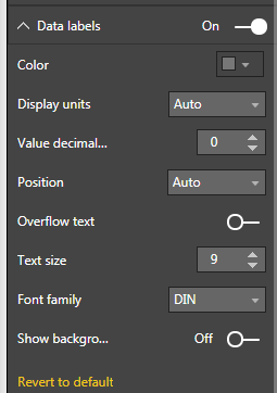
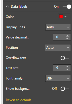
But if I change the color of the data lables for once (e.g. to Red), all labels will turn to this color no matter which position they have. In some chase that makes the data labels hard to read if there are inside the bar. The same happens if I want to use a cutoms color theme. So, here is my question: Is it possible to configure a primary and a alternative color based on the position of the data label?
BTW there is no intentention to show the data labels always outside the bar. The Auto option is quite handy.
Thanks a lot.
Cheers,
Dom
- Mark as New
- Bookmark
- Subscribe
- Mute
- Subscribe to RSS Feed
- Permalink
- Report Inappropriate Content
The way you can work around with this is to change advanced color in current theme and keep the color of data labels as default.
- Mark as New
- Bookmark
- Subscribe
- Mute
- Subscribe to RSS Feed
- Permalink
- Report Inappropriate Content
In order to get white color in the bar. go to format->click on Format ->select Datalabel ON(By default off) -> if it is ON, go to bottom of the same session click on Revert to default.
Now Data label should be automatically turned off. Just Turn ON. Now data label which is inside the bar should be in white color automatically.
- Mark as New
- Bookmark
- Subscribe
- Mute
- Subscribe to RSS Feed
- Permalink
- Report Inappropriate Content
That's a stunning workaround, thank you!
- Mark as New
- Bookmark
- Subscribe
- Mute
- Subscribe to RSS Feed
- Permalink
- Report Inappropriate Content
Hi @Anonymous,
You cannot define a secondary colour, one option would be to set the background of the data label to withe (or the background colour of the chart) and when you have it inside the bar it will evidence the number when outside it will be just the number, because the background will blend.
Regards,
MFelix
Regards
Miguel Félix
Did I answer your question? Mark my post as a solution!
Proud to be a Super User!
Check out my blog: Power BI em Português- Mark as New
- Bookmark
- Subscribe
- Mute
- Subscribe to RSS Feed
- Permalink
- Report Inappropriate Content
First things first... Happy new year!
Thanks @MFelix for your reponse. You're right about that it seems that you cannot define a scondary color but your suggested workaround is not what I'm looking for actually. As demostrated in the screenshot before Power BI is somehow "magically" able to handle two colors out of the box. In this case I havent (pre-)configured anything but the grey color of the bars.
I reckon that there is no way of defining two colors via GUI at the moment. Thus, maybe there is a way to do it via JSON theme? That would be a question adressed to the Power BI team of Microsoft.
- Mark as New
- Bookmark
- Subscribe
- Mute
- Subscribe to RSS Feed
- Permalink
- Report Inappropriate Content
Hello ... could you solve this problem? I mean, understand why sometimes the lable is white inside the bar sometimes not?
Helpful resources

Microsoft Fabric Learn Together
Covering the world! 9:00-10:30 AM Sydney, 4:00-5:30 PM CET (Paris/Berlin), 7:00-8:30 PM Mexico City

Power BI Monthly Update - April 2024
Check out the April 2024 Power BI update to learn about new features.

| User | Count |
|---|---|
| 109 | |
| 99 | |
| 77 | |
| 66 | |
| 54 |
| User | Count |
|---|---|
| 144 | |
| 104 | |
| 102 | |
| 87 | |
| 64 |


