- Power BI forums
- Updates
- News & Announcements
- Get Help with Power BI
- Desktop
- Service
- Report Server
- Power Query
- Mobile Apps
- Developer
- DAX Commands and Tips
- Custom Visuals Development Discussion
- Health and Life Sciences
- Power BI Spanish forums
- Translated Spanish Desktop
- Power Platform Integration - Better Together!
- Power Platform Integrations (Read-only)
- Power Platform and Dynamics 365 Integrations (Read-only)
- Training and Consulting
- Instructor Led Training
- Dashboard in a Day for Women, by Women
- Galleries
- Community Connections & How-To Videos
- COVID-19 Data Stories Gallery
- Themes Gallery
- Data Stories Gallery
- R Script Showcase
- Webinars and Video Gallery
- Quick Measures Gallery
- 2021 MSBizAppsSummit Gallery
- 2020 MSBizAppsSummit Gallery
- 2019 MSBizAppsSummit Gallery
- Events
- Ideas
- Custom Visuals Ideas
- Issues
- Issues
- Events
- Upcoming Events
- Community Blog
- Power BI Community Blog
- Custom Visuals Community Blog
- Community Support
- Community Accounts & Registration
- Using the Community
- Community Feedback
Register now to learn Fabric in free live sessions led by the best Microsoft experts. From Apr 16 to May 9, in English and Spanish.
- Power BI forums
- Forums
- Get Help with Power BI
- Desktop
- Data Format - Line Graph
- Subscribe to RSS Feed
- Mark Topic as New
- Mark Topic as Read
- Float this Topic for Current User
- Bookmark
- Subscribe
- Printer Friendly Page
- Mark as New
- Bookmark
- Subscribe
- Mute
- Subscribe to RSS Feed
- Permalink
- Report Inappropriate Content
Data Format - Line Graph
Evening all,
I'm trying to import some data around our weekly CSAT perforamance
I need to group the 'Excellent' and 'Good' responses then calculate their percetage against total no of responses.
I then need to create a line graph which shows progress from week to week (maximum of 5 weeks showing).
Any help is very much appreciated.
- Mark as New
- Bookmark
- Subscribe
- Mute
- Subscribe to RSS Feed
- Permalink
- Report Inappropriate Content
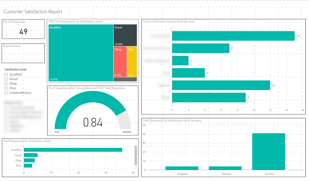
Actually it's probably a good idea to show you what I have so far and explain some of the troubles I'm having as a newbie.
Problem 1
The gauge is showing as 0.84 instead of 84%.
Problem 2
Bottom left chart I want to be the line graph discussed above.
Problem 3
Under the total number of responses card I want a kpi indicator arrow (red, green) to show the trend from last week.
Problem 4
Bottom right graph I want to be show as stacked bar chart.
I want this to show the service that our customers where feeding back against (broken down by negative, positive). The problem is this service is in a seperate data source so I need to match the reference column in datasource1 to the reference in datasource2 and pull ou the service.
Problem 5
I need to drop in new data each week without having to manually go through and amend these reports.
I'm learning this stuff slowly but I'm in such a rush for these reports I may have to pay to have them developed.
- Mark as New
- Bookmark
- Subscribe
- Mute
- Subscribe to RSS Feed
- Permalink
- Report Inappropriate Content
Hi @johnbradbury,
The screenshot you post on the original thread is your resource data? I really understand you are urgent for these reports. While I am unable to reproduce your scenario without sample data table. You'd better post your sample data.
In addition, the second screenshot is what you want or you have done what like that? It's confusing.
Thanks,
Angelia
- Mark as New
- Bookmark
- Subscribe
- Mute
- Subscribe to RSS Feed
- Permalink
- Report Inappropriate Content
Helpful resources

Microsoft Fabric Learn Together
Covering the world! 9:00-10:30 AM Sydney, 4:00-5:30 PM CET (Paris/Berlin), 7:00-8:30 PM Mexico City

Power BI Monthly Update - April 2024
Check out the April 2024 Power BI update to learn about new features.

| User | Count |
|---|---|
| 107 | |
| 97 | |
| 75 | |
| 63 | |
| 53 |
| User | Count |
|---|---|
| 139 | |
| 100 | |
| 95 | |
| 85 | |
| 63 |


