- Power BI forums
- Updates
- News & Announcements
- Get Help with Power BI
- Desktop
- Service
- Report Server
- Power Query
- Mobile Apps
- Developer
- DAX Commands and Tips
- Custom Visuals Development Discussion
- Health and Life Sciences
- Power BI Spanish forums
- Translated Spanish Desktop
- Power Platform Integration - Better Together!
- Power Platform Integrations (Read-only)
- Power Platform and Dynamics 365 Integrations (Read-only)
- Training and Consulting
- Instructor Led Training
- Dashboard in a Day for Women, by Women
- Galleries
- Community Connections & How-To Videos
- COVID-19 Data Stories Gallery
- Themes Gallery
- Data Stories Gallery
- R Script Showcase
- Webinars and Video Gallery
- Quick Measures Gallery
- 2021 MSBizAppsSummit Gallery
- 2020 MSBizAppsSummit Gallery
- 2019 MSBizAppsSummit Gallery
- Events
- Ideas
- Custom Visuals Ideas
- Issues
- Issues
- Events
- Upcoming Events
- Community Blog
- Power BI Community Blog
- Custom Visuals Community Blog
- Community Support
- Community Accounts & Registration
- Using the Community
- Community Feedback
Register now to learn Fabric in free live sessions led by the best Microsoft experts. From Apr 16 to May 9, in English and Spanish.
- Power BI forums
- Forums
- Get Help with Power BI
- Desktop
- Data Colors in Scatter Chart
- Subscribe to RSS Feed
- Mark Topic as New
- Mark Topic as Read
- Float this Topic for Current User
- Bookmark
- Subscribe
- Printer Friendly Page
- Mark as New
- Bookmark
- Subscribe
- Mute
- Subscribe to RSS Feed
- Permalink
- Report Inappropriate Content
Data Colors in Scatter Chart
Hi all,
I was wondering what the minimum, Center and Maximim refer to in the color saturation options on the scatter chart.
Basically I want any values below 40 to be red between 40 - 69 to be amber and 70 and upwards to be green.
How do I achieve this it won't seem to let you put < or > signs.
Solved! Go to Solution.
- Mark as New
- Bookmark
- Subscribe
- Mute
- Subscribe to RSS Feed
- Permalink
- Report Inappropriate Content
Hi @Jay2077,
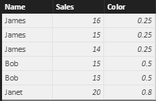
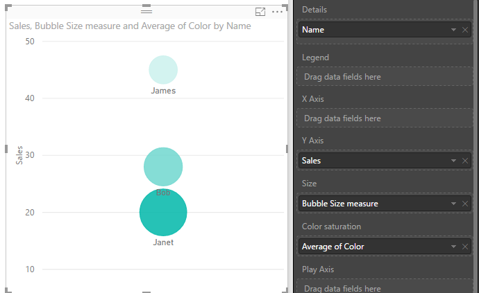
The bubble will be filled with gradual color based on the field added to color saturation option. Take below sample data as an example. We can see that the max value of field [Color] is 0.8, so, it corresponding category "Janet" is shown with highest saturation. Please note as the field added to color saturation section, it will be sum up automatically, in order to keep its original value, here, we select "Average".
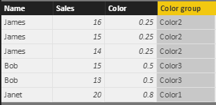
To workaround your requirement that set bubble color based on its value, we could create a new category group. As you can see, in my test, the sales value was sum up based on category.
So, I added a calculated column as below: (please modify the CALCULATION section according to your scenario)
Color group =
IF (
    CALCULATE (
        SUM ( 'Sales of team'[Sales] ),
        ALLEXCEPT ( 'Sales of team', 'Sales of team'[Name] )
    )
        <= 20,
    "Color1",
    IF (
        CALCULATE (
            SUM ( 'Sales of team'[Sales] ),
            ALLEXCEPT ( 'Sales of team', 'Sales of team'[Name] )
        )
            > 40,
        "Color2",
        "Color3"
    )
)
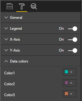
In Scatter Chart, add this new group [Color group] to legend. Under "Format" pane, you can customize the data color based on new category.
Best regards,
Yuliana Gu
If this post helps, then please consider Accept it as the solution to help the other members find it more quickly.
- Mark as New
- Bookmark
- Subscribe
- Mute
- Subscribe to RSS Feed
- Permalink
- Report Inappropriate Content
Hi @Jay2077,
In my test, the data poins show the same color in service as that in desktop. In your scenario, please log in service using a different browser to see whether is works. Besides, please test whether issue persists if setting data points to different colors.
Regards,
Yuliana Gu
If this post helps, then please consider Accept it as the solution to help the other members find it more quickly.
- Mark as New
- Bookmark
- Subscribe
- Mute
- Subscribe to RSS Feed
- Permalink
- Report Inappropriate Content
Hi @Jay2077,
The bubble will be filled with gradual color based on the field added to color saturation option. Take below sample data as an example. We can see that the max value of field [Color] is 0.8, so, it corresponding category "Janet" is shown with highest saturation. Please note as the field added to color saturation section, it will be sum up automatically, in order to keep its original value, here, we select "Average".
To workaround your requirement that set bubble color based on its value, we could create a new category group. As you can see, in my test, the sales value was sum up based on category.
So, I added a calculated column as below: (please modify the CALCULATION section according to your scenario)
Color group =
IF (
    CALCULATE (
        SUM ( 'Sales of team'[Sales] ),
        ALLEXCEPT ( 'Sales of team', 'Sales of team'[Name] )
    )
        <= 20,
    "Color1",
    IF (
        CALCULATE (
            SUM ( 'Sales of team'[Sales] ),
            ALLEXCEPT ( 'Sales of team', 'Sales of team'[Name] )
        )
            > 40,
        "Color2",
        "Color3"
    )
)
In Scatter Chart, add this new group [Color group] to legend. Under "Format" pane, you can customize the data color based on new category.
Best regards,
Yuliana Gu
If this post helps, then please consider Accept it as the solution to help the other members find it more quickly.
- Mark as New
- Bookmark
- Subscribe
- Mute
- Subscribe to RSS Feed
- Permalink
- Report Inappropriate Content
Hi v-yulgu-msft
I followed your instructions and they work great on my desktop version, however when I publish my report/dashboard the data points are various colours and not the red, orange and green that I specified with the categories (through the if statements) and as they appear on the desktop.
Why is this ? How do I resolve this please?
Any help greatly appreciated.
Thanks
- Mark as New
- Bookmark
- Subscribe
- Mute
- Subscribe to RSS Feed
- Permalink
- Report Inappropriate Content
Hi @Jay2077,
In my test, the data poins show the same color in service as that in desktop. In your scenario, please log in service using a different browser to see whether is works. Besides, please test whether issue persists if setting data points to different colors.
Regards,
Yuliana Gu
If this post helps, then please consider Accept it as the solution to help the other members find it more quickly.
- Mark as New
- Bookmark
- Subscribe
- Mute
- Subscribe to RSS Feed
- Permalink
- Report Inappropriate Content
Many thanks for your help however, there is no legend option in my format pane.
- Mark as New
- Bookmark
- Subscribe
- Mute
- Subscribe to RSS Feed
- Permalink
- Report Inappropriate Content
Ignore my last comment I found the legend option, however now when I publish my report I cannot see the colours in the scatter (red, amber green) as I specified, instead the data points show all multi coloured.
Do you know why this is ?
Helpful resources

Microsoft Fabric Learn Together
Covering the world! 9:00-10:30 AM Sydney, 4:00-5:30 PM CET (Paris/Berlin), 7:00-8:30 PM Mexico City

Power BI Monthly Update - April 2024
Check out the April 2024 Power BI update to learn about new features.

| User | Count |
|---|---|
| 110 | |
| 94 | |
| 82 | |
| 66 | |
| 58 |
| User | Count |
|---|---|
| 151 | |
| 121 | |
| 104 | |
| 87 | |
| 67 |


