Register now to learn Fabric in free live sessions led by the best Microsoft experts. From Apr 16 to May 9, in English and Spanish.
Hi Everyone,
I'm new to Power BI and I'm having a hard time trying to accomplish something.
I have a Line Chart with the S-curve of a construction and a filter that allows me to select substeps of the project. Each substep has a starting date and an ending date. My visual already adapts itself to show only the necessary period according to the substeps selected in the filter. What I need to do now is create a measure that filters out useless repetitions of the maximum value of the S-curve of the expected values by date. More specifically, what I need is to compare two subsequent values in a measurement I created on this visual, and if they are both equal to the maximum value (MAX = 1), I want to show only the first one and ignore the rest.
For you to have a visual idea of what I need:
Imagine that today we are in November of 2019 and the construction has just been finished, in which case the black curve would have reached the maximum value (one) on the graph. In that scenario we don't need any values of neither the curves after that. Note that, firstly, the repeated maximum values before November of 2019 are still needed to be shown, and secondly, that next month, the visual will show the same data as today.
It is important to state that the values used as input in the visual come from 2 other measures ("% Avanço Planejado" and "% Avanço Real").
I couldn't manage to select values from those measures respective to specific dates.
Can you guys help me with this one?
HI @Ordulruk ,
I still not so clear for your data structure, share some sample data with expect result to help us clarify your requirement.
How to Get Your Question Answered Quickly
Regards,
Xiaoxin Sheng
Hey Xiaoxin Sheng,
Thank you for the reply.
So... to clarify the expected result, please check the following sketches:
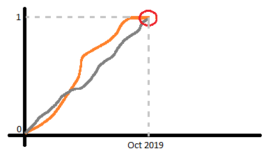
Here you can see that when the two curves meet, I don't want to show values of neither the curves after that.
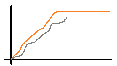
Here you can see that before they meet, I want to show the entire orange curve (Fixed data) and all the data gathered so far for the gray curve.
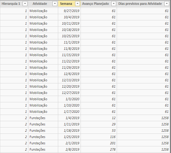
This table shows some sample data for the orange curve. "Avanço Planejado" is the rare data, in which we make a measurement to build the orange curve.
"Atividade" represents the substeps of the construction.
"Dias previstos para Atividade" represents the amount of days we expect the substep to take.
"Semana" represents which week of the construction the respective data is about. (We collect data once a week every Friday)
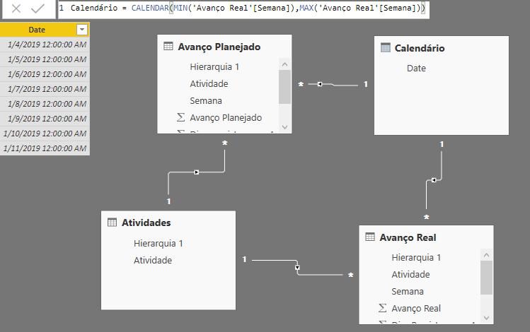
There's also a a calendar structure related to "Semana", which you can see a sample below, along with the relationships:
As we want a percentage in the graph, as shown in the pictures, we make a measurement for each of the datum as shown below:
Covering the world! 9:00-10:30 AM Sydney, 4:00-5:30 PM CET (Paris/Berlin), 7:00-8:30 PM Mexico City
Check out the April 2024 Power BI update to learn about new features.
User | Count |
---|---|
106 | |
93 | |
75 | |
62 | |
50 |
User | Count |
---|---|
147 | |
107 | |
105 | |
87 | |
61 |