- Power BI forums
- Updates
- News & Announcements
- Get Help with Power BI
- Desktop
- Service
- Report Server
- Power Query
- Mobile Apps
- Developer
- DAX Commands and Tips
- Custom Visuals Development Discussion
- Health and Life Sciences
- Power BI Spanish forums
- Translated Spanish Desktop
- Power Platform Integration - Better Together!
- Power Platform Integrations (Read-only)
- Power Platform and Dynamics 365 Integrations (Read-only)
- Training and Consulting
- Instructor Led Training
- Dashboard in a Day for Women, by Women
- Galleries
- Community Connections & How-To Videos
- COVID-19 Data Stories Gallery
- Themes Gallery
- Data Stories Gallery
- R Script Showcase
- Webinars and Video Gallery
- Quick Measures Gallery
- 2021 MSBizAppsSummit Gallery
- 2020 MSBizAppsSummit Gallery
- 2019 MSBizAppsSummit Gallery
- Events
- Ideas
- Custom Visuals Ideas
- Issues
- Issues
- Events
- Upcoming Events
- Community Blog
- Power BI Community Blog
- Custom Visuals Community Blog
- Community Support
- Community Accounts & Registration
- Using the Community
- Community Feedback
Register now to learn Fabric in free live sessions led by the best Microsoft experts. From Apr 16 to May 9, in English and Spanish.
- Power BI forums
- Forums
- Get Help with Power BI
- Desktop
- Customer Revenue - Splitting into 10 Quartile
- Subscribe to RSS Feed
- Mark Topic as New
- Mark Topic as Read
- Float this Topic for Current User
- Bookmark
- Subscribe
- Printer Friendly Page
- Mark as New
- Bookmark
- Subscribe
- Mute
- Subscribe to RSS Feed
- Permalink
- Report Inappropriate Content
Customer Revenue - Splitting into 10 Quartile
Hello,
I have a mock dataset here:
| Company | Type of Goods | Qty | Profit ($) | Avg Selling Price ($) |
| A | 1 | 10 | 120 | 12 |
| B | 1 | 20 | 200 | 10 |
| E | 3 | 10 | 90 | 9 |
| C | 1 | 40 | 280 | 7 |
| A | 2 | 40 | 320 | 8 |
| E | 3 | 20 | 120 | 6 |
| A | 1 | 30 | 180 | 6 |
| C | 1 | 10 | 110 | 11 |
| C | 3 | 20 | 220 | 11 |
There are a total of more than 2000 entries with over 100+ different companies.
I would like to create a visualization that is able to capture the % proportion of the total profit in 10 quartiles of an equal number of distinct customers. I am not sure if I should create a table or measure that adds up the sum of all profits for each company.
I'm thinking of doing a bar chart with each bar representing a certain % and all will add up to give me 100%.
I really appreciate it if there is a better way to visualize this. Thank you for your help.
Solved! Go to Solution.
- Mark as New
- Bookmark
- Subscribe
- Mute
- Subscribe to RSS Feed
- Permalink
- Report Inappropriate Content
Hi, @lwklwk98
According to your description and sample data, I can roughly understand your requirement, I think you can try this measure to achieve this:
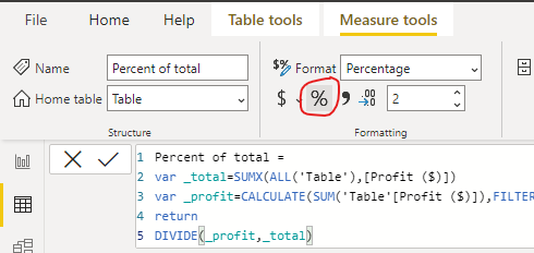
Percent of total =

var _total=SUMX(ALL('Table'),[Profit ($)])

var _profit=CALCULATE(SUM('Table'[Profit ($)]),FILTER(ALL('Table'),[Company]=MAX('Table'[Company])))

return

DIVIDE(_profit,_total)
Then you can change the measure format like this:
Then you can create a clustered column chart to place the fields like this:
And you can get what you want.
You can download my test pbix file below
Thank you very much!
Best Regards,
Community Support Team _Robert Qin
If this post helps, then please consider Accept it as the solution to help the other members find it more quickly.
Helpful resources

Microsoft Fabric Learn Together
Covering the world! 9:00-10:30 AM Sydney, 4:00-5:30 PM CET (Paris/Berlin), 7:00-8:30 PM Mexico City

Power BI Monthly Update - April 2024
Check out the April 2024 Power BI update to learn about new features.

| User | Count |
|---|---|
| 117 | |
| 107 | |
| 69 | |
| 68 | |
| 43 |
| User | Count |
|---|---|
| 148 | |
| 103 | |
| 103 | |
| 88 | |
| 66 |


