- Power BI forums
- Updates
- News & Announcements
- Get Help with Power BI
- Desktop
- Service
- Report Server
- Power Query
- Mobile Apps
- Developer
- DAX Commands and Tips
- Custom Visuals Development Discussion
- Health and Life Sciences
- Power BI Spanish forums
- Translated Spanish Desktop
- Power Platform Integration - Better Together!
- Power Platform Integrations (Read-only)
- Power Platform and Dynamics 365 Integrations (Read-only)
- Training and Consulting
- Instructor Led Training
- Dashboard in a Day for Women, by Women
- Galleries
- Community Connections & How-To Videos
- COVID-19 Data Stories Gallery
- Themes Gallery
- Data Stories Gallery
- R Script Showcase
- Webinars and Video Gallery
- Quick Measures Gallery
- 2021 MSBizAppsSummit Gallery
- 2020 MSBizAppsSummit Gallery
- 2019 MSBizAppsSummit Gallery
- Events
- Ideas
- Custom Visuals Ideas
- Issues
- Issues
- Events
- Upcoming Events
- Community Blog
- Power BI Community Blog
- Custom Visuals Community Blog
- Community Support
- Community Accounts & Registration
- Using the Community
- Community Feedback
Register now to learn Fabric in free live sessions led by the best Microsoft experts. From Apr 16 to May 9, in English and Spanish.
- Power BI forums
- Forums
- Get Help with Power BI
- Desktop
- Re: Custom name legend
- Subscribe to RSS Feed
- Mark Topic as New
- Mark Topic as Read
- Float this Topic for Current User
- Bookmark
- Subscribe
- Printer Friendly Page
- Mark as New
- Bookmark
- Subscribe
- Mute
- Subscribe to RSS Feed
- Permalink
- Report Inappropriate Content
Custom name legend
I have data with following columns:
Product1.FaultA, Product1.FaultB, Product2.FaultA, Product2.FaultB etc.
I want to draw two pie charts (one for product 1 and one for 2) that tell how many faults of each type occures.
What I need help with is naming the legends for these charts. By default they say Product1.FaultA and so on. But this is long and confusing because there are only data from single product in this chart. I would like to rename legends without renaiming columns in data.
Solved! Go to Solution.
- Mark as New
- Bookmark
- Subscribe
- Mute
- Subscribe to RSS Feed
- Permalink
- Report Inappropriate Content
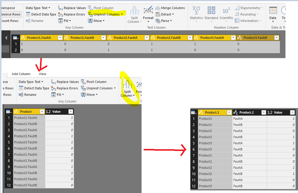
Your scenario is still confusing me. Maybe you're looking for something as below?
- Unpivot the table.
- Split the Product column by dot.
- Rename the column properly.
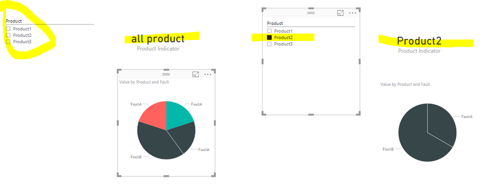
In report window, to avoid confusion, instead of individual pie charts, use one chart with slicer. Create a measure Product Indicator and show it in a Card visual.
Product Indicator = IF(ISFILTERED('Table'[Product]),LASTNONBLANK('Table'[Product],""),"all product")
Check more details in a
- Mark as New
- Bookmark
- Subscribe
- Mute
- Subscribe to RSS Feed
- Permalink
- Report Inappropriate Content
Hi
I have a demand to show the last 3 years gross profit distribution per product.
for this i chose clustred column visualization.
for this i created 3 measures:
Gross Profit 2 years ago
Gross Profit Last Year
Gross Profit
All are based on a ParallelPeriod calculation.
I get the desired results, but the data legend takes the name of the measure automatically.
The year where the data presentation begines is deterimned by a slicer as shown here:

Since these measures show the gross profit dynamically at the selected year,as well as 1 and 2 years prior to that year the legend shown for these measures is the name of the meaure (i.e. Gross Profit)
Now as each of these meaures represesnts data from a single year only, i would like the legend to take dynamic naming according to the year i calculates.
so if i am inspecing 2016, then i want to see at teh legend:
Gross Profit 2 years ago -->2014
Gross Profit Last Year --> 2015
Gross Profit --> 2016
can this be achieved?
Thank you,
Tal
- Mark as New
- Bookmark
- Subscribe
- Mute
- Subscribe to RSS Feed
- Permalink
- Report Inappropriate Content
Hi, is there a solution to this?
I have a demand which is very similar,to show the last 3 years gross profit distribution per product.
for this i chose clustred column visualization.
for this i created 3 measures:
Gross Profit 2 years ago
Gross Profit Last Year
Gross Profit
All are based on a ParallelPeriod calculation.
I get the desired results, but the data legend takes the name of the measure automatically.
The year where the data presentation begines is deterimned by a slicer as shown here:

Since these measures show the gross profit dynamically at the selected year,as well as 1 and 2 years prior to that year the legend shown for these measures is the name of the meaure (i.e. Gross Profit)
Now as each of these meaures represesnts data from a single year only, i would like the legend to take dynamic naming according to the year i calculates.
so if i am inspecing 2016, then i want to see at teh legend:
Gross Profit 2 years ago -->2014
Gross Profit Last Year --> 2015
Gross Profit --> 2016
can this be achieved?
Thank you,
Tal
- Mark as New
- Bookmark
- Subscribe
- Mute
- Subscribe to RSS Feed
- Permalink
- Report Inappropriate Content
Hi, Did you find the solution for this problem ? As I am also stuck with the same.
Also the solution posted for this problem is incorrect and so this problem's status should be changed to "Not Solved"
- Mark as New
- Bookmark
- Subscribe
- Mute
- Subscribe to RSS Feed
- Permalink
- Report Inappropriate Content
I used combination of unique queries with filters and visual level filters to archieve my goal.
- Mark as New
- Bookmark
- Subscribe
- Mute
- Subscribe to RSS Feed
- Permalink
- Report Inappropriate Content
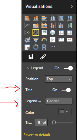
@Z7-852 For pie chart visual under paintbrush icon, you do have option to rename Legend or even turn it off. You can also rename column in your data set.
- Mark as New
- Bookmark
- Subscribe
- Mute
- Subscribe to RSS Feed
- Permalink
- Report Inappropriate Content
Solution given by @ankitpatira is not what I'am looking for.
From format you can give a title for legends. This is not what I need.
I need to rename variables without changing their names in the data set. If I chance names in data set I would have to columns both names "Fault A" and I wouldn't know which is for product 1 and which is for product 2.
- Mark as New
- Bookmark
- Subscribe
- Mute
- Subscribe to RSS Feed
- Permalink
- Report Inappropriate Content
So do you mean changing values of actual rows ? In that case you will have to do replace values via query editor to replace values of actual rows in column which will become legend in pie chart.
- Mark as New
- Bookmark
- Subscribe
- Mute
- Subscribe to RSS Feed
- Permalink
- Report Inappropriate Content
@ankitpatiraNo I don't want to chance any values.
I have data with columns named "Product1.FaultA", "Product1.FaultB", "Product2.FaultA", "Product2.FaultB" and so on. These variables are binary data (0 = no fault, 1 = fault)
I draw 2 pie charts. In the first I use variables Product1.FaultA and Product1.FaultB. These columns are summed giving me answer how many FaultA and FaultB are in all of the Products1. Same is done for product2.
Now I set legends on. Legends say "Product1.FaultA", "Product1.FaultB" in the first chart and "Product2.FaultA", "Product2.FaultB" because these are the variable names. For reader this is confusing because first chart only contains Product1 faults. So legends shouldn't say Product1.FaultA but only FaultA. If I rename columns I would end up with two FaultA columns (one for product1 and one for product2).
I'am not even sure if this is possible, but for estetic point of view it would be nice.
- Mark as New
- Bookmark
- Subscribe
- Mute
- Subscribe to RSS Feed
- Permalink
- Report Inappropriate Content
Your scenario is still confusing me. Maybe you're looking for something as below?
- Unpivot the table.
- Split the Product column by dot.
- Rename the column properly.
In report window, to avoid confusion, instead of individual pie charts, use one chart with slicer. Create a measure Product Indicator and show it in a Card visual.
Product Indicator = IF(ISFILTERED('Table'[Product]),LASTNONBLANK('Table'[Product],""),"all product")
Check more details in a
- Mark as New
- Bookmark
- Subscribe
- Mute
- Subscribe to RSS Feed
- Permalink
- Report Inappropriate Content
One thing you could try is creating a calcuated table with three columns-
1. "Product" - The name of the product.
2. "FaultA" - The sum of that product's FaultA column.
3. "FaultB" - The sum of that product's FaultB column.
Polulating them with the products you want to show in the pie charts, and then creating several pie-charts, each with "FaultA" and "FaultB" as their values sources, and a visual level filter applied on each one, in order to make them show only the values of a specific product.
You can achieve this by performing the following steps:
1. In the "Modeling" ribbon's "calculations" section, click on the "New Table" button.
2. Enter a DAX expression representing the table you want to create. For example, you can create a UNION of ROWs. For Example-
DisplayableProductsTable = UNION(
    ROW("Product", "Product1", "FaultA", SUM(srcTable[Product1.FaultA]), "FaultB", SUM(srcTable[Product1.FaultB])),
    ROW("Product", "Product2", "FaultA", SUM(srcTable[Product2.FaultA]), "FaultB", SUM(srcTable[Product2.FaultB])),
    ROW("Product", "Product3", "FaultA", SUM(srcTable[Product3.FaultA]), "FaultB", SUM(srcTable[Product3.FaultB]))
)
3. Add a pie-chart to your page and put the FaultA and FaultB in its "values" field well.
4. Add the Products column to the pie-chart's visual level filters field well and select a product to have only its values shown.
5. Repeat steps 3 - 4(Or copy and paste the first pie-chart).
Helpful resources

Microsoft Fabric Learn Together
Covering the world! 9:00-10:30 AM Sydney, 4:00-5:30 PM CET (Paris/Berlin), 7:00-8:30 PM Mexico City

Power BI Monthly Update - April 2024
Check out the April 2024 Power BI update to learn about new features.

| User | Count |
|---|---|
| 109 | |
| 96 | |
| 77 | |
| 66 | |
| 53 |
| User | Count |
|---|---|
| 144 | |
| 105 | |
| 102 | |
| 89 | |
| 63 |


