- Power BI forums
- Updates
- News & Announcements
- Get Help with Power BI
- Desktop
- Service
- Report Server
- Power Query
- Mobile Apps
- Developer
- DAX Commands and Tips
- Custom Visuals Development Discussion
- Health and Life Sciences
- Power BI Spanish forums
- Translated Spanish Desktop
- Power Platform Integration - Better Together!
- Power Platform Integrations (Read-only)
- Power Platform and Dynamics 365 Integrations (Read-only)
- Training and Consulting
- Instructor Led Training
- Dashboard in a Day for Women, by Women
- Galleries
- Community Connections & How-To Videos
- COVID-19 Data Stories Gallery
- Themes Gallery
- Data Stories Gallery
- R Script Showcase
- Webinars and Video Gallery
- Quick Measures Gallery
- 2021 MSBizAppsSummit Gallery
- 2020 MSBizAppsSummit Gallery
- 2019 MSBizAppsSummit Gallery
- Events
- Ideas
- Custom Visuals Ideas
- Issues
- Issues
- Events
- Upcoming Events
- Community Blog
- Power BI Community Blog
- Custom Visuals Community Blog
- Community Support
- Community Accounts & Registration
- Using the Community
- Community Feedback
Register now to learn Fabric in free live sessions led by the best Microsoft experts. From Apr 16 to May 9, in English and Spanish.
- Power BI forums
- Forums
- Get Help with Power BI
- Desktop
- Re: Custom markers in combination column/line char...
- Subscribe to RSS Feed
- Mark Topic as New
- Mark Topic as Read
- Float this Topic for Current User
- Bookmark
- Subscribe
- Printer Friendly Page
- Mark as New
- Bookmark
- Subscribe
- Mute
- Subscribe to RSS Feed
- Permalink
- Report Inappropriate Content
Custom markers in combination column/line chart?
Hi,
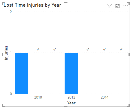
I have a combination stacked column/line chart. The line is formatted to show only the markers. Is there a way to get a tick mark instead of the cross as a marker? So, either
- upload an image to use as a marker
- use a Wingdings or similar font for the marker
- or, use a third party visual that can build a combo chart with custom line markers
- any other option to make the green cross show as a green tick mark
The idea here is that zero injuries means a KPI is met and needs to be visualised as a positive. I have formatted the secondary axis to a different scale, hence the x sits a bit above the zero line.
Any ideas welcome.
Solved! Go to Solution.
- Mark as New
- Bookmark
- Subscribe
- Mute
- Subscribe to RSS Feed
- Permalink
- Report Inappropriate Content
Hi @teylyn
Download this sample PBIX file
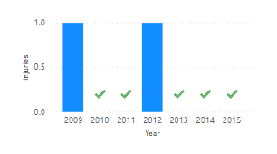
I've created a new column called Injuries_Line to plot as line values.
Turn on Data Labels, turn on Customize series and only show labels for the line series.
Use a Custom Format string for the line series ✔;;; so it only displays positive values and these values will only be 1 (or whatever value you choose to plot)
Regards
Phil
Did I answer your question? Then please mark my post as the solution.
If I helped you, click on the Thumbs Up to give Kudos.
Blog :: YouTube Channel :: Connect on Linkedin
Proud to be a Super User!
- Mark as New
- Bookmark
- Subscribe
- Mute
- Subscribe to RSS Feed
- Permalink
- Report Inappropriate Content
Hi @PhilipTreacy ,
that's genius.
I never realised that you can just type into the format dropdown. Nor that the Excel formatting syntax applies. Brilliant.
That will work.
I just wish that the label font size could be set to something other than small and very small. I cannot get it to show anything bigger than 8 or 9 pt.
Say hello to M.!!
- Ingeborg
- Mark as New
- Bookmark
- Subscribe
- Mute
- Subscribe to RSS Feed
- Permalink
- Report Inappropriate Content
Hi Ingeborg,
Yeah the Custom Strings are pretty cool. It doesn't allow you do everything exactly the same as Excel. You can't apply colour for example [Red]
You can set the Text Size under Format->Data Labels
I'll say hi to Myn for you.
Phil
Did I answer your question? Then please mark my post as the solution.
If I helped you, click on the Thumbs Up to give Kudos.
Blog :: YouTube Channel :: Connect on Linkedin
Proud to be a Super User!
- Mark as New
- Bookmark
- Subscribe
- Mute
- Subscribe to RSS Feed
- Permalink
- Report Inappropriate Content
Hi @teylyn
Download this sample PBIX file
I've created a new column called Injuries_Line to plot as line values.
Turn on Data Labels, turn on Customize series and only show labels for the line series.
Use a Custom Format string for the line series ✔;;; so it only displays positive values and these values will only be 1 (or whatever value you choose to plot)
Regards
Phil
Did I answer your question? Then please mark my post as the solution.
If I helped you, click on the Thumbs Up to give Kudos.
Blog :: YouTube Channel :: Connect on Linkedin
Proud to be a Super User!
- Mark as New
- Bookmark
- Subscribe
- Mute
- Subscribe to RSS Feed
- Permalink
- Report Inappropriate Content
@PhilipTreacy That is so cool!
Respectfully,
Zoe Douglas (DataZoe)
Follow me on LinkedIn at https://www.linkedin.com/in/zoedouglas-data
See my reports and blog at https://www.datazoepowerbi.com/
- Mark as New
- Bookmark
- Subscribe
- Mute
- Subscribe to RSS Feed
- Permalink
- Report Inappropriate Content
@teylyn You could try to carefully stack a chart and table. I'd be careful to adjust the chart to the auto setting on the table so it will still work as you get more data.
Respectfully,
Zoe Douglas (DataZoe)
Follow me on LinkedIn at https://www.linkedin.com/in/zoedouglas-data
See my reports and blog at https://www.datazoepowerbi.com/
- Mark as New
- Bookmark
- Subscribe
- Mute
- Subscribe to RSS Feed
- Permalink
- Report Inappropriate Content
Hi, thanks for the suggestion. How will this behave on different devices and when the visual is pinned to a dashboard?
Helpful resources

Microsoft Fabric Learn Together
Covering the world! 9:00-10:30 AM Sydney, 4:00-5:30 PM CET (Paris/Berlin), 7:00-8:30 PM Mexico City

Power BI Monthly Update - April 2024
Check out the April 2024 Power BI update to learn about new features.

| User | Count |
|---|---|
| 109 | |
| 99 | |
| 77 | |
| 66 | |
| 54 |
| User | Count |
|---|---|
| 144 | |
| 104 | |
| 102 | |
| 87 | |
| 64 |


