- Power BI forums
- Updates
- News & Announcements
- Get Help with Power BI
- Desktop
- Service
- Report Server
- Power Query
- Mobile Apps
- Developer
- DAX Commands and Tips
- Custom Visuals Development Discussion
- Health and Life Sciences
- Power BI Spanish forums
- Translated Spanish Desktop
- Power Platform Integration - Better Together!
- Power Platform Integrations (Read-only)
- Power Platform and Dynamics 365 Integrations (Read-only)
- Training and Consulting
- Instructor Led Training
- Dashboard in a Day for Women, by Women
- Galleries
- Community Connections & How-To Videos
- COVID-19 Data Stories Gallery
- Themes Gallery
- Data Stories Gallery
- R Script Showcase
- Webinars and Video Gallery
- Quick Measures Gallery
- 2021 MSBizAppsSummit Gallery
- 2020 MSBizAppsSummit Gallery
- 2019 MSBizAppsSummit Gallery
- Events
- Ideas
- Custom Visuals Ideas
- Issues
- Issues
- Events
- Upcoming Events
- Community Blog
- Power BI Community Blog
- Custom Visuals Community Blog
- Community Support
- Community Accounts & Registration
- Using the Community
- Community Feedback
Register now to learn Fabric in free live sessions led by the best Microsoft experts. From Apr 16 to May 9, in English and Spanish.
- Power BI forums
- Forums
- Get Help with Power BI
- Desktop
- Custom columns based on IF statement
- Subscribe to RSS Feed
- Mark Topic as New
- Mark Topic as Read
- Float this Topic for Current User
- Bookmark
- Subscribe
- Printer Friendly Page
- Mark as New
- Bookmark
- Subscribe
- Mute
- Subscribe to RSS Feed
- Permalink
- Report Inappropriate Content
Custom columns based on IF statement
Hi,
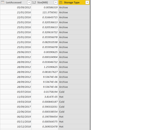
I am trying to build a dashboard of which shows the amount of files i have in a storage tier. I have exported over 1 million files into a CSV with the last accessed date and also the size of the files as a property. My goal is to create a column which will specify 'Hot' if the file is less than 1 year old, 'Cold' if the file is 1-3 years old, and 'Archive' if the file is older than 3 years. I have done this with a conditional column in Query Editor.
However, when i apply the changes to the dashboard, i would like to have 3 'Card' visualizations that show how much space is being used for each storage tier (Hot,Cold,Archive). For example, if i have 1000 hot files of which result to 17gb in total size, this would be reflected in the card visualisation as 'Hot = 17GB'.
At the moment i have 1 column which has Hot, Cold next to the relevant files. Although when i add the card visualization it just shows all of the values in the column, where as i'd like to filter it for each visualization.
Could someone let me know the best way to do a total of the storage for each hot, cold, archive and how to show it in the visualization?
Thanks in advance.
Matt
Solved! Go to Solution.
- Mark as New
- Bookmark
- Subscribe
- Mute
- Subscribe to RSS Feed
- Permalink
- Report Inappropriate Content
You can download the pbix file and have a look at the implemented solutions. I have shared the URL along with my solution.
- Mark as New
- Bookmark
- Subscribe
- Mute
- Subscribe to RSS Feed
- Permalink
- Report Inappropriate Content
- Mark as New
- Bookmark
- Subscribe
- Mute
- Subscribe to RSS Feed
- Permalink
- Report Inappropriate Content
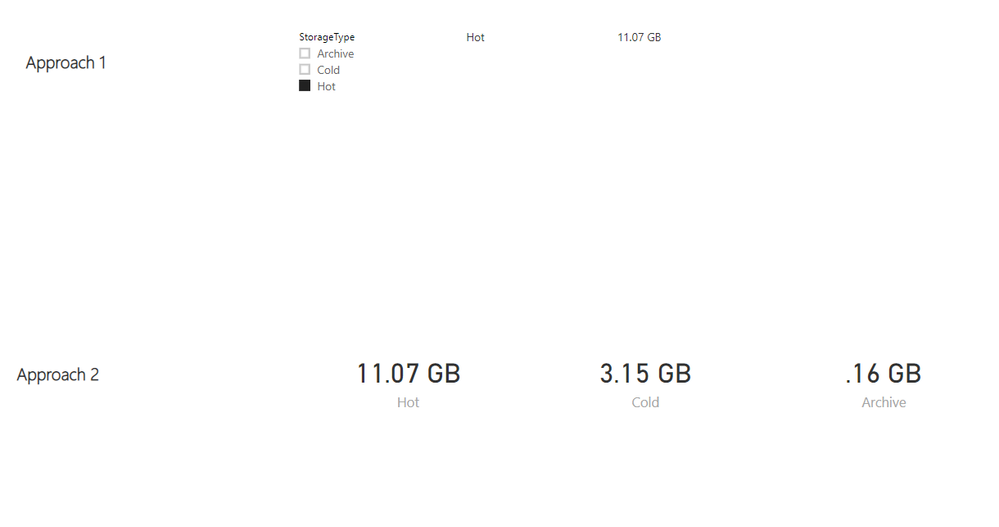
You can have 2 approaches to this.
1. Have 3 card visualizations and show individual storage type & storage for Hot, Cold and Archive
2. Have 1 card visual and show storage type & storage based on the selection from the filter.
Please find the link below if you want to have a look at the sample code.
https://drive.google.com/open?id=1u313aJC60YukV8Xt8-nwxKqDWUb2wJto
Hope this helps !!
Please mark the answer as accepted if you find the solution appropriate.
Thanks
- Mark as New
- Bookmark
- Subscribe
- Mute
- Subscribe to RSS Feed
- Permalink
- Report Inappropriate Content
Hi @JIGAR , very helpful thank you.
How did you do the solution number 2?
If i choose the card visual, and then choose size column and the column i created, it shows all archive cold and hot. How do you filter it so the visual card only shows 1 chunk of it?
Thank you,
Matt
- Mark as New
- Bookmark
- Subscribe
- Mute
- Subscribe to RSS Feed
- Permalink
- Report Inappropriate Content
Sorry i mean how did you do the 3x cards solution?
- Mark as New
- Bookmark
- Subscribe
- Mute
- Subscribe to RSS Feed
- Permalink
- Report Inappropriate Content
You can download the pbix file and have a look at the implemented solutions. I have shared the URL along with my solution.
- Mark as New
- Bookmark
- Subscribe
- Mute
- Subscribe to RSS Feed
- Permalink
- Report Inappropriate Content
Thank you Jigar, i have got this working.
Accepted as solution.
Helpful resources

Microsoft Fabric Learn Together
Covering the world! 9:00-10:30 AM Sydney, 4:00-5:30 PM CET (Paris/Berlin), 7:00-8:30 PM Mexico City

Power BI Monthly Update - April 2024
Check out the April 2024 Power BI update to learn about new features.

| User | Count |
|---|---|
| 111 | |
| 100 | |
| 80 | |
| 64 | |
| 58 |
| User | Count |
|---|---|
| 148 | |
| 111 | |
| 93 | |
| 84 | |
| 66 |


