- Power BI forums
- Updates
- News & Announcements
- Get Help with Power BI
- Desktop
- Service
- Report Server
- Power Query
- Mobile Apps
- Developer
- DAX Commands and Tips
- Custom Visuals Development Discussion
- Health and Life Sciences
- Power BI Spanish forums
- Translated Spanish Desktop
- Power Platform Integration - Better Together!
- Power Platform Integrations (Read-only)
- Power Platform and Dynamics 365 Integrations (Read-only)
- Training and Consulting
- Instructor Led Training
- Dashboard in a Day for Women, by Women
- Galleries
- Community Connections & How-To Videos
- COVID-19 Data Stories Gallery
- Themes Gallery
- Data Stories Gallery
- R Script Showcase
- Webinars and Video Gallery
- Quick Measures Gallery
- 2021 MSBizAppsSummit Gallery
- 2020 MSBizAppsSummit Gallery
- 2019 MSBizAppsSummit Gallery
- Events
- Ideas
- Custom Visuals Ideas
- Issues
- Issues
- Events
- Upcoming Events
- Community Blog
- Power BI Community Blog
- Custom Visuals Community Blog
- Community Support
- Community Accounts & Registration
- Using the Community
- Community Feedback
Register now to learn Fabric in free live sessions led by the best Microsoft experts. From Apr 16 to May 9, in English and Spanish.
- Power BI forums
- Forums
- Get Help with Power BI
- Desktop
- Custom Start and End Points for Time Data on X-Axi...
- Subscribe to RSS Feed
- Mark Topic as New
- Mark Topic as Read
- Float this Topic for Current User
- Bookmark
- Subscribe
- Printer Friendly Page
- Mark as New
- Bookmark
- Subscribe
- Mute
- Subscribe to RSS Feed
- Permalink
- Report Inappropriate Content
Custom Start and End Points for Time Data on X-Axis
I have column chart data scaled on a time-valued x-axis where values are summed per 15 minute (Time data type) segment throughout our work shift. My problem lies in the fact that I have an operations environment where we work across the midnight time break. Ideally I want to be able to show the 15 minute time-segments beginning at 12:00 PM segment and ending with the 11:45 AM segment.
I have attempted to format the x-axis, but I still only get the date picker despite it being a Time data type value, formatted as HH:mm. Any ideas how to accomplish this without doing a calculated time shift to trick the visual into doing what I need?
Solved! Go to Solution.
- Mark as New
- Bookmark
- Subscribe
- Mute
- Subscribe to RSS Feed
- Permalink
- Report Inappropriate Content
Hi @nicholastrausch,
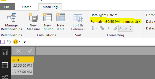
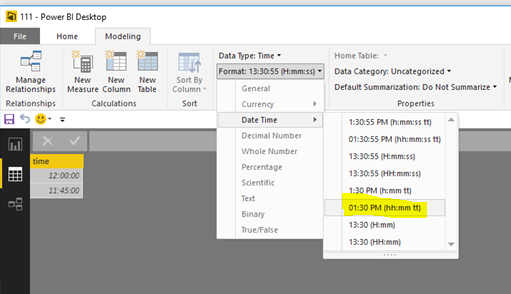
Got it, I change the type, the date display normal as follows.
If this is not waht you want, could you post your sample data or PBI file for further analysis?
Best Regards,
Angelia
- Mark as New
- Bookmark
- Subscribe
- Mute
- Subscribe to RSS Feed
- Permalink
- Report Inappropriate Content
Hi @nicholastrausch,
What's the hierarchy od the x-axis value in the chart, day, hour, or minutes? "where values are summed per 15 minute (Time data type) segment throughout our work shift" means the difference in two adjacent date value are 15 minites?
>>My problem lies in the fact that I have an operations environment where we work across the midnight time break. I have attempted to format the x-axis, but I still only get the date picker despite it being a Time data type value, formatted as HH:mm.
What do you mean? Could you please share more details, sample data or snaoshot for further analysis?
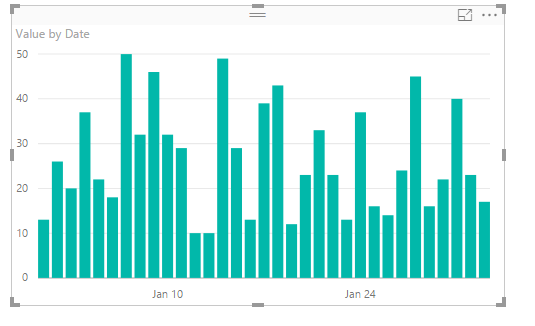
From what I know, the x-axis will display all the values in the filed. For instance, if the date column are each day, it return as the following screenshot when I select date column as x-axis level. Ane the y-asix display the corresponding result.
Best Regards,
Angelia
- Mark as New
- Bookmark
- Subscribe
- Mute
- Subscribe to RSS Feed
- Permalink
- Report Inappropriate Content
There is no hierarchy to date before time in a datetime sense. I have only time values, imagine everything 01/01/1900 hh:mm for times 00:00 through 23:45. I am creating this rounded time value for each record through a SQL function during the query. This representation works the best for me and I can slice to specific DOW and workareas through slicers or interactions.
What I need is my x-axis to start at 12:00 and end at 11:45 instead of the traditional 00:00 - 23:45. Any ideas on how to accomplish that?
- Mark as New
- Bookmark
- Subscribe
- Mute
- Subscribe to RSS Feed
- Permalink
- Report Inappropriate Content
Hi @nicholastrausch,
The 12:00 display the noonday, and the 11:45 means 11:45 PM, transferring the date type doesn't accomplish it?
Best Regards,
Angelia
- Mark as New
- Bookmark
- Subscribe
- Mute
- Subscribe to RSS Feed
- Permalink
- Report Inappropriate Content
sorry... I wasn't clear regarding my times. All times are scaled in 24-hour clock. I need the x-axis to run from 12:00 (pm) to 11:45 (am).
- Mark as New
- Bookmark
- Subscribe
- Mute
- Subscribe to RSS Feed
- Permalink
- Report Inappropriate Content
Hi @nicholastrausch,
Got it, I change the type, the date display normal as follows.
If this is not waht you want, could you post your sample data or PBI file for further analysis?
Best Regards,
Angelia
- Mark as New
- Bookmark
- Subscribe
- Mute
- Subscribe to RSS Feed
- Permalink
- Report Inappropriate Content
Hi
I am having a similar issue, all my reports need to start at 6am as we operate up till 5am but everything starts from midnight.
so currently x axis runs
00:00-01:00-02:00 up to 23:00
i need it to start at 06:00-07:00 up to finishing at 05:00
the data type is set to time in the right format but the Xaxis options only let me set a start date
- Mark as New
- Bookmark
- Subscribe
- Mute
- Subscribe to RSS Feed
- Permalink
- Report Inappropriate Content
Hello!
I've the same issue as you.
Did you solved that? If yes, how you did it??
thanks
- Mark as New
- Bookmark
- Subscribe
- Mute
- Subscribe to RSS Feed
- Permalink
- Report Inappropriate Content
I actually was able to solve this. Was a bit of an indirect path, but works very efficient and gives a lot of control as to how I want to display.
Solution was to create a reference/lookup table in our SQL DB. The table has the rounded 15 min time (everything we measure is in 15 min increments), the a generic datetime rounded to 15 to ensure proper sorting across the midnight break and a integer column with sort order. I actually have two seperate "scales" in the same table as we had seperate operational windows to measures.
This lets me either join against this in my SQL to have the Sort Order along with the rounded time value, or I can bring it in the Query Editor and merge queries to associate the sort order with rounded time value. In the report view, you can set the custom sort order on the rounded time value using the interger value. This was actually a pretty simple solution. if you don't have ability to create a native SQL table, this could live in an xlsx or csv, or a manually created table in PBI to the same effect.
Helpful resources

Microsoft Fabric Learn Together
Covering the world! 9:00-10:30 AM Sydney, 4:00-5:30 PM CET (Paris/Berlin), 7:00-8:30 PM Mexico City

Power BI Monthly Update - April 2024
Check out the April 2024 Power BI update to learn about new features.

| User | Count |
|---|---|
| 109 | |
| 99 | |
| 77 | |
| 66 | |
| 54 |
| User | Count |
|---|---|
| 144 | |
| 104 | |
| 102 | |
| 87 | |
| 64 |


