- Power BI forums
- Updates
- News & Announcements
- Get Help with Power BI
- Desktop
- Service
- Report Server
- Power Query
- Mobile Apps
- Developer
- DAX Commands and Tips
- Custom Visuals Development Discussion
- Health and Life Sciences
- Power BI Spanish forums
- Translated Spanish Desktop
- Power Platform Integration - Better Together!
- Power Platform Integrations (Read-only)
- Power Platform and Dynamics 365 Integrations (Read-only)
- Training and Consulting
- Instructor Led Training
- Dashboard in a Day for Women, by Women
- Galleries
- Community Connections & How-To Videos
- COVID-19 Data Stories Gallery
- Themes Gallery
- Data Stories Gallery
- R Script Showcase
- Webinars and Video Gallery
- Quick Measures Gallery
- 2021 MSBizAppsSummit Gallery
- 2020 MSBizAppsSummit Gallery
- 2019 MSBizAppsSummit Gallery
- Events
- Ideas
- Custom Visuals Ideas
- Issues
- Issues
- Events
- Upcoming Events
- Community Blog
- Power BI Community Blog
- Custom Visuals Community Blog
- Community Support
- Community Accounts & Registration
- Using the Community
- Community Feedback
Register now to learn Fabric in free live sessions led by the best Microsoft experts. From Apr 16 to May 9, in English and Spanish.
- Power BI forums
- Forums
- Get Help with Power BI
- Desktop
- Custom Data bars
- Subscribe to RSS Feed
- Mark Topic as New
- Mark Topic as Read
- Float this Topic for Current User
- Bookmark
- Subscribe
- Printer Friendly Page
- Mark as New
- Bookmark
- Subscribe
- Mute
- Subscribe to RSS Feed
- Permalink
- Report Inappropriate Content
Custom Data bars
Hello everyone,
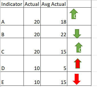
how can i active below data icons in power bi.
For Indicator (A) Actual is greater than Avg Actual i need to have up arrow with green colour
For Indicator (B) Actual is less than Avg Actual i need to have down arrow with green colour
For Indicator (C) Actual is greater than Avg Actual i need to have up arrow with green
For indicator (D) Actual is greater than Avg Actual i need to have up arrow with red
For indicator (E) Actual is less than Avg Actual i need to have down arrow with red
Solved! Go to Solution.
- Mark as New
- Bookmark
- Subscribe
- Mute
- Subscribe to RSS Feed
- Permalink
- Report Inappropriate Content
Hi @_Abhilash ,
You can try to create a measure with your scenarios and give it a value. For example,
CondiIcons =

VAR _Actual = YOUR_ACTUAL_SUM_MEASURE
VAR _Avg = YOUR_AVG_MEASURE
VAR _Indicator = MAX(YOUR_TABLE[Indicator])

RETURN

SWITCH( TRUE(),
_Indicator = "A" && _Actual > _Avg, 1,      // Green Up
_Indicator = "B" && _Actual < _Avg, 2,      // Green Down
_Indicator = "C" && _Actual > _Avg, 1,      // Green Up
_Indicator = "D" && _Actual > _Avg, 3,      // Red Up
_Indicator = "E" && _Actual < _Avg, 4       // Red Down
)
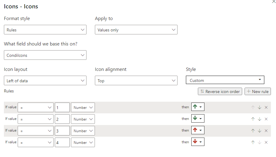
Then in the conditional format settings, turn on Icons and have the setting to this:
Let me know if this is what you're looking for.
Did I answer your question?
Please help by clicking the thumbs up button and mark my post as a solution!
- Mark as New
- Bookmark
- Subscribe
- Mute
- Subscribe to RSS Feed
- Permalink
- Report Inappropriate Content
Hi @_Abhilash
You can try this, create the 2 measures below,
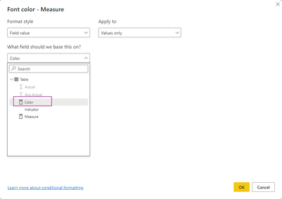
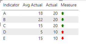
Measure = IF(MIN('Table'[Actual])>MIN('Table'[Avg Actual]), UNICHAR(129093),UNICHAR(129095))Color = IF(MIN('Table'[Indicator]) in {"A","B","C"}, "green","red")
result
Best Regards,
Community Support Team _Tang
If this post helps, please consider Accept it as the solution to help the other members find it more quickly.
- Mark as New
- Bookmark
- Subscribe
- Mute
- Subscribe to RSS Feed
- Permalink
- Report Inappropriate Content
Hi @_Abhilash ,
You can try to create a measure with your scenarios and give it a value. For example,
CondiIcons =

VAR _Actual = YOUR_ACTUAL_SUM_MEASURE
VAR _Avg = YOUR_AVG_MEASURE
VAR _Indicator = MAX(YOUR_TABLE[Indicator])

RETURN

SWITCH( TRUE(),
_Indicator = "A" && _Actual > _Avg, 1,      // Green Up
_Indicator = "B" && _Actual < _Avg, 2,      // Green Down
_Indicator = "C" && _Actual > _Avg, 1,      // Green Up
_Indicator = "D" && _Actual > _Avg, 3,      // Red Up
_Indicator = "E" && _Actual < _Avg, 4       // Red Down
)
Then in the conditional format settings, turn on Icons and have the setting to this:
Let me know if this is what you're looking for.
Did I answer your question?
Please help by clicking the thumbs up button and mark my post as a solution!
- Mark as New
- Bookmark
- Subscribe
- Mute
- Subscribe to RSS Feed
- Permalink
- Report Inappropriate Content
@hnguy71 thanks for the solution.
i have i have 26 inidcators from A to Z, Any other option aprart from using switch because if i use switch i need to enter 26 inidcators manually.
Thanks & Regards
Abhilash.P
- Mark as New
- Bookmark
- Subscribe
- Mute
- Subscribe to RSS Feed
- Permalink
- Report Inappropriate Content
Hi @_Abhilash ,
Sure it's possible to use a configuration dimension with a relationship to your indicators to get the right colors and icons, or if you can understand your patterns a bit more we can remove your indicators totally. Currently it's unclear how you're coming up with the logic for your arrows.
1. Why is D an up red arrow against A which follows the same pattern?
2. Why is E a down red arrow when A also follows the same pattern?
Did I answer your question?
Please help by clicking the thumbs up button and mark my post as a solution!
Helpful resources

Microsoft Fabric Learn Together
Covering the world! 9:00-10:30 AM Sydney, 4:00-5:30 PM CET (Paris/Berlin), 7:00-8:30 PM Mexico City

Power BI Monthly Update - April 2024
Check out the April 2024 Power BI update to learn about new features.

| User | Count |
|---|---|
| 111 | |
| 95 | |
| 80 | |
| 68 | |
| 59 |
| User | Count |
|---|---|
| 150 | |
| 119 | |
| 104 | |
| 87 | |
| 67 |


