- Power BI forums
- Updates
- News & Announcements
- Get Help with Power BI
- Desktop
- Service
- Report Server
- Power Query
- Mobile Apps
- Developer
- DAX Commands and Tips
- Custom Visuals Development Discussion
- Health and Life Sciences
- Power BI Spanish forums
- Translated Spanish Desktop
- Power Platform Integration - Better Together!
- Power Platform Integrations (Read-only)
- Power Platform and Dynamics 365 Integrations (Read-only)
- Training and Consulting
- Instructor Led Training
- Dashboard in a Day for Women, by Women
- Galleries
- Community Connections & How-To Videos
- COVID-19 Data Stories Gallery
- Themes Gallery
- Data Stories Gallery
- R Script Showcase
- Webinars and Video Gallery
- Quick Measures Gallery
- 2021 MSBizAppsSummit Gallery
- 2020 MSBizAppsSummit Gallery
- 2019 MSBizAppsSummit Gallery
- Events
- Ideas
- Custom Visuals Ideas
- Issues
- Issues
- Events
- Upcoming Events
- Community Blog
- Power BI Community Blog
- Custom Visuals Community Blog
- Community Support
- Community Accounts & Registration
- Using the Community
- Community Feedback
Register now to learn Fabric in free live sessions led by the best Microsoft experts. From Apr 16 to May 9, in English and Spanish.
- Power BI forums
- Forums
- Get Help with Power BI
- Desktop
- Custom Colors in a Stacked Column Chart not displa...
- Subscribe to RSS Feed
- Mark Topic as New
- Mark Topic as Read
- Float this Topic for Current User
- Bookmark
- Subscribe
- Printer Friendly Page
- Mark as New
- Bookmark
- Subscribe
- Mute
- Subscribe to RSS Feed
- Permalink
- Report Inappropriate Content
Custom Colors in a Stacked Column Chart not displaying correctly
Hi all, this is my first post here. I've tried finding the answer to my question in the forums but have come up short so far.
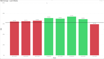
My question is pretty basic. I've got a pbix that contains a couple of Stacked Column Charts. The column values are displayed as percentages and I'm attempting to get the colors of the columns to show green or red based of the value of the column.
Columns with values >= 60% and <= 100% should show green.
Columns with values >= 0% and < 60% should show red.
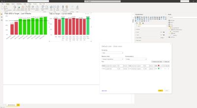
One of the charts (Plant OEE to Target - Last 8 Weeks) displays the columns correctly.
The other chart (OEE to Target - Current Week), using the same formula, does not show the columns in the desired colors.
Here's a shot of the dashboard and the forumla in question.
I'm a little baffled and any tips/suggestions would be much appreciated.
Solved! Go to Solution.
- Mark as New
- Bookmark
- Subscribe
- Mute
- Subscribe to RSS Feed
- Permalink
- Report Inappropriate Content
Additional information:
After changing the changing the Color Rule to use a number rather than a percentage, the column colors display properly.
I'm not sure if this is a bug or if I'm not understanding the Rule properly.
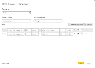
Applying this rule (using Number), the graph displays as expected:
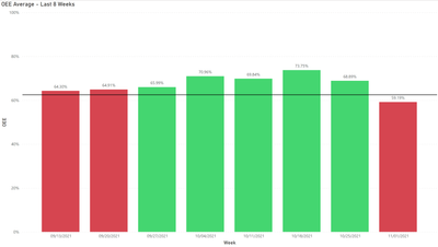
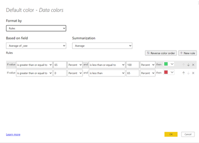
Applying this rule (using Percentage), the graph does not display as expected (colums with values > 65% show red:
I also came across a little tidbit, hidden away in the documentation:
Conditional table formatting in Power BI Desktop - Power BI | Microsoft Docs
The key takeaway from this document lies in this statement:
Color by rules for percentages
If the field the formatting is based on contains percentages, write the numbers in the rules as decimals, which are the actual values; for example, ".25" instead of "25". Also, select Number instead of Percent for the number format. For example, "If value is greater than or equal to 0 Number and is less than .25 Number" returns values less than 25%.
And finally, I found another response from MS on this:
The way the "Percent" conditional formatting works is different than one might think, it doesn't have anything to do with percent of total. It take the lowest and highest displayed amounts and uses those to determine the formatting bands based on the Percent you entered so your table is looking at these numbers to apply the formatting.
So, the answer appears to be that in order to have the colors displayed as a % of the displayed values, one needs to use the Rule for Number rather than Percentage. All in all, somewhat confusing in the designer as to what the two options represent.
- Mark as New
- Bookmark
- Subscribe
- Mute
- Subscribe to RSS Feed
- Permalink
- Report Inappropriate Content
Hi, @jbryant
I hope this will help you understand the problem.
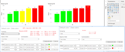
I have made an example to help understanding, see the following snapshot.
When formatting based on percentage, the reference percentage is the percentage of the difference between the minimum and maximum values.
Note that even though the data is showed as a percentage on the chart, the data is actually a decimal.
For example, in the example, if 100 is the minimum value and 200 is the maximum value, then the percentage reference is the difference between the maximum value and the minimum value, which is 100.
Note: The percentage based value is actually the percentage of the difference.
Check again the example in the documentation:
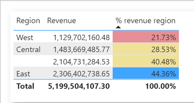
Note: If you use Percent instead of Number for fields containing percentages, you may get unexpected results. In the above example, in a range of percent values from 21.73% to 44.36%, 50% of that range is 33%. So use Number instead.
Min = 21.73% (0.2173),
Max = 44.36% (0.4436),
Diff = max-min = 0.2263 (22.63%)
50% of Diff = 0.11315 >> min + 50% of Diff =33%
In your case, since your data is displayed in percentage format and is actually a decimal, So you need to apply the conditional formatting on a number rather than a percentage approach.
Best Regards,
Community Support Team _ Zeon Zheng
If this post helps, then please consider Accept it as the solution to help the other members find it more quickly.
- Mark as New
- Bookmark
- Subscribe
- Mute
- Subscribe to RSS Feed
- Permalink
- Report Inappropriate Content
Hi, @jbryant
Could you please consider sharing a simple sample file and I will test if I can reproduce your issue on my machine in order to find the cause of the issue?
Best Regards,
Community Support Team _ Zeon Zheng
- Mark as New
- Bookmark
- Subscribe
- Mute
- Subscribe to RSS Feed
- Permalink
- Report Inappropriate Content
Additional information:
After changing the changing the Color Rule to use a number rather than a percentage, the column colors display properly.
I'm not sure if this is a bug or if I'm not understanding the Rule properly.
Applying this rule (using Number), the graph displays as expected:
Applying this rule (using Percentage), the graph does not display as expected (colums with values > 65% show red:
I also came across a little tidbit, hidden away in the documentation:
Conditional table formatting in Power BI Desktop - Power BI | Microsoft Docs
The key takeaway from this document lies in this statement:
Color by rules for percentages
If the field the formatting is based on contains percentages, write the numbers in the rules as decimals, which are the actual values; for example, ".25" instead of "25". Also, select Number instead of Percent for the number format. For example, "If value is greater than or equal to 0 Number and is less than .25 Number" returns values less than 25%.
And finally, I found another response from MS on this:
The way the "Percent" conditional formatting works is different than one might think, it doesn't have anything to do with percent of total. It take the lowest and highest displayed amounts and uses those to determine the formatting bands based on the Percent you entered so your table is looking at these numbers to apply the formatting.
So, the answer appears to be that in order to have the colors displayed as a % of the displayed values, one needs to use the Rule for Number rather than Percentage. All in all, somewhat confusing in the designer as to what the two options represent.
- Mark as New
- Bookmark
- Subscribe
- Mute
- Subscribe to RSS Feed
- Permalink
- Report Inappropriate Content
I've put together a sample and am happy to share it, but I don't see an option to upload a pbix or zip to this site.
I can share it with you if you'd like, just PM me with an email address, or point me in the right direction as to how to best share it.
- Mark as New
- Bookmark
- Subscribe
- Mute
- Subscribe to RSS Feed
- Permalink
- Report Inappropriate Content
People typically share files here by linking to a copy stored in the cloud using DropBox, Google Docs, OneDrive, or similar.
- Mark as New
- Bookmark
- Subscribe
- Mute
- Subscribe to RSS Feed
- Permalink
- Report Inappropriate Content
Your screenshot shows 62%. Is that part of the problem?
- Mark as New
- Bookmark
- Subscribe
- Mute
- Subscribe to RSS Feed
- Permalink
- Report Inappropriate Content
You're right, however I changed the percentage to 60 and I'm still not seeing the desired colors being reflected. (I updated the screenshot here with the updated % as well).
Helpful resources

Microsoft Fabric Learn Together
Covering the world! 9:00-10:30 AM Sydney, 4:00-5:30 PM CET (Paris/Berlin), 7:00-8:30 PM Mexico City

Power BI Monthly Update - April 2024
Check out the April 2024 Power BI update to learn about new features.

| User | Count |
|---|---|
| 111 | |
| 94 | |
| 80 | |
| 68 | |
| 59 |
| User | Count |
|---|---|
| 150 | |
| 119 | |
| 104 | |
| 87 | |
| 67 |
