- Power BI forums
- Updates
- News & Announcements
- Get Help with Power BI
- Desktop
- Service
- Report Server
- Power Query
- Mobile Apps
- Developer
- DAX Commands and Tips
- Custom Visuals Development Discussion
- Health and Life Sciences
- Power BI Spanish forums
- Translated Spanish Desktop
- Power Platform Integration - Better Together!
- Power Platform Integrations (Read-only)
- Power Platform and Dynamics 365 Integrations (Read-only)
- Training and Consulting
- Instructor Led Training
- Dashboard in a Day for Women, by Women
- Galleries
- Community Connections & How-To Videos
- COVID-19 Data Stories Gallery
- Themes Gallery
- Data Stories Gallery
- R Script Showcase
- Webinars and Video Gallery
- Quick Measures Gallery
- 2021 MSBizAppsSummit Gallery
- 2020 MSBizAppsSummit Gallery
- 2019 MSBizAppsSummit Gallery
- Events
- Ideas
- Custom Visuals Ideas
- Issues
- Issues
- Events
- Upcoming Events
- Community Blog
- Power BI Community Blog
- Custom Visuals Community Blog
- Community Support
- Community Accounts & Registration
- Using the Community
- Community Feedback
Register now to learn Fabric in free live sessions led by the best Microsoft experts. From Apr 16 to May 9, in English and Spanish.
- Power BI forums
- Forums
- Get Help with Power BI
- Desktop
- Cumulative percentage of another percentage measur...
- Subscribe to RSS Feed
- Mark Topic as New
- Mark Topic as Read
- Float this Topic for Current User
- Bookmark
- Subscribe
- Printer Friendly Page
- Mark as New
- Bookmark
- Subscribe
- Mute
- Subscribe to RSS Feed
- Permalink
- Report Inappropriate Content
Cumulative percentage of another percentage measure
Hello!
I need to make a Pareto Chart and I found a lot of tutorials in the Internet of how to make it in Power Bi, however I need to use a measure that is a percentage.
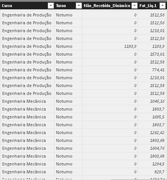
Here's a part of my table:
I made a measure that is a percentage of "Não_Recebido_Dinâmico" by "Fat_Liq1". The measure is:
% Inadimplência_Dinâmico = DIVIDE(SUM('Mapa_de_Faturamento (2)'[Não_Recebido_Dinâmico]);SUM('Mapa_de_Faturamento (2)'[Fat_Liq.1]))+0
So I need to make a Pareto Chart with the top 10 "Cursos" by this measure. When I apply the ways of the Pareto Chart in the Internet it doesn't work because they use the total of the measure to make the accumulated percentage.
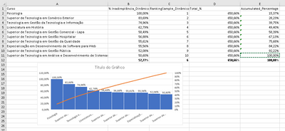
For example, these are the top 10 "Cursos" by the measure "% Inadimplência_Dinâmico". I think that, to make the Pareto Chart works properly, the total and the accumulated should be the sum of the measure, but that's not what happens in Power Bi because it keeps considering it as a percentage.
Summing up, I need to make a cumulative percentage of a percentage measure. I don't want to just sum up the percentage measure I have, I need to take the percentage measure of every row and divide it by the grand total.
That's what I want made in Excel (the "Total_%" is not necessary, I just put it to illustrate the point):
Thank you!
- Mark as New
- Bookmark
- Subscribe
- Mute
- Subscribe to RSS Feed
- Permalink
- Report Inappropriate Content
Hi @marcosmota5,
Please have a look at below similar examples to see if they are helpful to your scenario.
Regards,
Yuliana Gu
If this post helps, then please consider Accept it as the solution to help the other members find it more quickly.
- Mark as New
- Bookmark
- Subscribe
- Mute
- Subscribe to RSS Feed
- Permalink
- Report Inappropriate Content
Hello @v-yulgu-msft,
I've already read those topics and a bunch of other topics but no one could help me because my situation is a little bit different.
In all the topics I read of Pareto Chartting, the people used measures/columns of values and not of percentage. But, as you can see in my post, I need to make a Pareto Chart with a measure that is a percentage of two columns. The problem sticks on the accumulated sum of the measure. When I try to sum the percentage measure, it not works properly because Power Bi considers it as a percentage and keeps doing the division and not summing each percentage like it's needed. That's the only thing that is keeping me away of archieving what I need.
Thank you for the response!
- Mark as New
- Bookmark
- Subscribe
- Mute
- Subscribe to RSS Feed
- Permalink
- Report Inappropriate Content
Hello everyone!
I'm having an issue with a dashboard that I'm creating.
I need to make a Pareto Chart and I found a lot of tutorials in the Internet of how to make it in Power Bi, however I need to use a measure that is a percentage and this is where I'm stuck.
Here's a part of my table:
I made a measure that is a percentage of "Não_Recebido_Dinâmico" by "Fat_Liq1". The measure is:
% Inadimplência_Dinâmico = DIVIDE(SUM('Mapa_de_Faturamento (2)'[Não_Recebido_Dinâmico]);SUM('Mapa_de_Faturamento (2)'[Fat_Liq.1]))+0
So I need to make a Pareto Chart with the top 10 "Cursos" by this measure. When I apply the ways of the Pareto Chart in the Internet it doesn't work because they use the total of the measure to make the accumulated percentage.
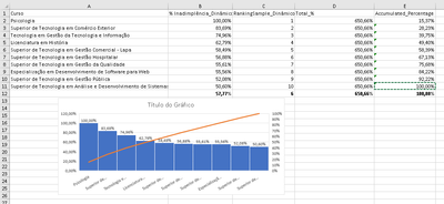
For example, these are the top 10 "Cursos" by the measure "% Inadimplência_Dinâmico". I think that, to make the Pareto Chart works properly, the total and the accumulated should be the sum of the measure, but that's not what happens in the Power Bi because it keeps considering it as a percentage.
I've tried to make the same measure as a calculated column but it doesn't work either, because in this case it sums the percentage of all rows.
I'm not familiar with the DAX functions of Power Bi, so I need some help 🙂
That's what I want in Power Bi, but made in Excel:
Thank you all!
Helpful resources

Microsoft Fabric Learn Together
Covering the world! 9:00-10:30 AM Sydney, 4:00-5:30 PM CET (Paris/Berlin), 7:00-8:30 PM Mexico City

Power BI Monthly Update - April 2024
Check out the April 2024 Power BI update to learn about new features.

| User | Count |
|---|---|
| 114 | |
| 99 | |
| 82 | |
| 70 | |
| 60 |
| User | Count |
|---|---|
| 149 | |
| 114 | |
| 107 | |
| 89 | |
| 67 |


