- Power BI forums
- Updates
- News & Announcements
- Get Help with Power BI
- Desktop
- Service
- Report Server
- Power Query
- Mobile Apps
- Developer
- DAX Commands and Tips
- Custom Visuals Development Discussion
- Health and Life Sciences
- Power BI Spanish forums
- Translated Spanish Desktop
- Power Platform Integration - Better Together!
- Power Platform Integrations (Read-only)
- Power Platform and Dynamics 365 Integrations (Read-only)
- Training and Consulting
- Instructor Led Training
- Dashboard in a Day for Women, by Women
- Galleries
- Community Connections & How-To Videos
- COVID-19 Data Stories Gallery
- Themes Gallery
- Data Stories Gallery
- R Script Showcase
- Webinars and Video Gallery
- Quick Measures Gallery
- 2021 MSBizAppsSummit Gallery
- 2020 MSBizAppsSummit Gallery
- 2019 MSBizAppsSummit Gallery
- Events
- Ideas
- Custom Visuals Ideas
- Issues
- Issues
- Events
- Upcoming Events
- Community Blog
- Power BI Community Blog
- Custom Visuals Community Blog
- Community Support
- Community Accounts & Registration
- Using the Community
- Community Feedback
Register now to learn Fabric in free live sessions led by the best Microsoft experts. From Apr 16 to May 9, in English and Spanish.
- Power BI forums
- Forums
- Get Help with Power BI
- Desktop
- Re: Cumulative bar chart for categorical varibale
- Subscribe to RSS Feed
- Mark Topic as New
- Mark Topic as Read
- Float this Topic for Current User
- Bookmark
- Subscribe
- Printer Friendly Page
- Mark as New
- Bookmark
- Subscribe
- Mute
- Subscribe to RSS Feed
- Permalink
- Report Inappropriate Content
Cumulative bar chart for categorical varibale
Hi there.
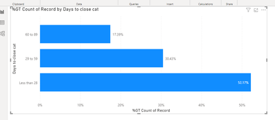
I'm trying to generate a cumulative bar chart on a categorical time based variable. So as can be seen below I have produced the percentages for each timeframe category, but would like to have <28 days as 87%, <60 days as 87+10 = 97%, and <90 as 100%.
Is there a simple way to do this with the chart options or do I need to create a new variable. If the latter, could someone steer me in the right direction for the dax code? (I am a dax newbie)
Thanks in adavance
Solved! Go to Solution.
- Mark as New
- Bookmark
- Subscribe
- Mute
- Subscribe to RSS Feed
- Permalink
- Report Inappropriate Content
@LaurieK ,
Please find the solution file attached after the signature. Leave my last update.
I have created one measure where you can you the option you shown in the last update
Microsoft Power BI Learning Resources, 2023 !!
Learn Power BI - Full Course with Dec-2022, with Window, Index, Offset, 100+ Topics !!
Did I answer your question? Mark my post as a solution! Appreciate your Kudos !! Proud to be a Super User! !!
- Mark as New
- Bookmark
- Subscribe
- Mute
- Subscribe to RSS Feed
- Permalink
- Report Inappropriate Content
@LaurieK , Not enough information.
You have to try like
Cumm = CALCULATE([Measure],filter(allselected(Table),table[bucket] <=table(Sales[bucket])))
Can you share sample data and sample output in table format? Or a sample pbix after removing sensitive data.
Microsoft Power BI Learning Resources, 2023 !!
Learn Power BI - Full Course with Dec-2022, with Window, Index, Offset, 100+ Topics !!
Did I answer your question? Mark my post as a solution! Appreciate your Kudos !! Proud to be a Super User! !!
- Mark as New
- Bookmark
- Subscribe
- Mute
- Subscribe to RSS Feed
- Permalink
- Report Inappropriate Content
Hi again @amitchandak
Sorry, I am unsure how to add a file here. I tried a drag and drop of .pbix file and it didn't work.
I've had to resort to pasting screengrabs of some dummy data, and the subsequent Power BI visual. Hope that makes sense.
So I need the above figures to read cumulative, ie 52.17%, 82.6%, 100%
Thanks
- Mark as New
- Bookmark
- Subscribe
- Mute
- Subscribe to RSS Feed
- Permalink
- Report Inappropriate Content
@LaurieK , If days to close is a column , try
Cumm = CALCULATE([Measure],filter(allselected(Table),table[days to close] <=max(Table[days to close])))
The measure is your % column
Microsoft Power BI Learning Resources, 2023 !!
Learn Power BI - Full Course with Dec-2022, with Window, Index, Offset, 100+ Topics !!
Did I answer your question? Mark my post as a solution! Appreciate your Kudos !! Proud to be a Super User! !!
- Mark as New
- Bookmark
- Subscribe
- Mute
- Subscribe to RSS Feed
- Permalink
- Report Inappropriate Content
@LaurieK ,
Please find the solution file attached after the signature. Leave my last update.
I have created one measure where you can you the option you shown in the last update
Microsoft Power BI Learning Resources, 2023 !!
Learn Power BI - Full Course with Dec-2022, with Window, Index, Offset, 100+ Topics !!
Did I answer your question? Mark my post as a solution! Appreciate your Kudos !! Proud to be a Super User! !!
- Mark as New
- Bookmark
- Subscribe
- Mute
- Subscribe to RSS Feed
- Permalink
- Report Inappropriate Content
- Mark as New
- Bookmark
- Subscribe
- Mute
- Subscribe to RSS Feed
- Permalink
- Report Inappropriate Content
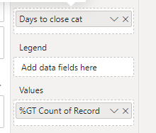
@amitchandak Thanks for that.. I didn't actually create a percentage measure, rather just used the visual to calculate that
I'll try to add as a measure and see how that goes.
- Mark as New
- Bookmark
- Subscribe
- Mute
- Subscribe to RSS Feed
- Permalink
- Report Inappropriate Content
@LaurieK , You upload to onedrive and dropbox and share.
or copy paste table from Power BI
Microsoft Power BI Learning Resources, 2023 !!
Learn Power BI - Full Course with Dec-2022, with Window, Index, Offset, 100+ Topics !!
Did I answer your question? Mark my post as a solution! Appreciate your Kudos !! Proud to be a Super User! !!
- Mark as New
- Bookmark
- Subscribe
- Mute
- Subscribe to RSS Feed
- Permalink
- Report Inappropriate Content
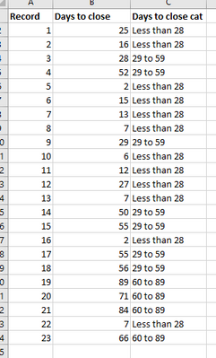
@amitchandak , here you go.. Learning as I go 🙂
RecordDays to closeDays to close cat
| 1 | 25 | Less than 28 |
| 2 | 16 | Less than 28 |
| 3 | 28 | 29 to 59 |
| 4 | 52 | 29 to 59 |
| 5 | 2 | Less than 28 |
| 6 | 15 | Less than 28 |
| 7 | 13 | Less than 28 |
| 8 | 7 | Less than 28 |
| 9 | 29 | 29 to 59 |
| 10 | 6 | Less than 28 |
| 11 | 12 | Less than 28 |
| 12 | 27 | Less than 28 |
| 13 | 7 | Less than 28 |
| 14 | 50 | 29 to 59 |
| 15 | 55 | 29 to 59 |
| 16 | 2 | Less than 28 |
| 17 | 55 | 29 to 59 |
| 18 | 56 | 29 to 59 |
| 19 | 89 | 60 to 89 |
| 20 | 71 | 60 to 89 |
| 21 | 84 | 60 to 89 |
| 22 | 7 | Less than 28 |
| 23 | 66 | 60 to 89 |
Helpful resources

Microsoft Fabric Learn Together
Covering the world! 9:00-10:30 AM Sydney, 4:00-5:30 PM CET (Paris/Berlin), 7:00-8:30 PM Mexico City

Power BI Monthly Update - April 2024
Check out the April 2024 Power BI update to learn about new features.

| User | Count |
|---|---|
| 117 | |
| 107 | |
| 69 | |
| 68 | |
| 43 |
| User | Count |
|---|---|
| 148 | |
| 103 | |
| 103 | |
| 88 | |
| 66 |


