- Power BI forums
- Updates
- News & Announcements
- Get Help with Power BI
- Desktop
- Service
- Report Server
- Power Query
- Mobile Apps
- Developer
- DAX Commands and Tips
- Custom Visuals Development Discussion
- Health and Life Sciences
- Power BI Spanish forums
- Translated Spanish Desktop
- Power Platform Integration - Better Together!
- Power Platform Integrations (Read-only)
- Power Platform and Dynamics 365 Integrations (Read-only)
- Training and Consulting
- Instructor Led Training
- Dashboard in a Day for Women, by Women
- Galleries
- Community Connections & How-To Videos
- COVID-19 Data Stories Gallery
- Themes Gallery
- Data Stories Gallery
- R Script Showcase
- Webinars and Video Gallery
- Quick Measures Gallery
- 2021 MSBizAppsSummit Gallery
- 2020 MSBizAppsSummit Gallery
- 2019 MSBizAppsSummit Gallery
- Events
- Ideas
- Custom Visuals Ideas
- Issues
- Issues
- Events
- Upcoming Events
- Community Blog
- Power BI Community Blog
- Custom Visuals Community Blog
- Community Support
- Community Accounts & Registration
- Using the Community
- Community Feedback
Register now to learn Fabric in free live sessions led by the best Microsoft experts. From Apr 16 to May 9, in English and Spanish.
- Power BI forums
- Forums
- Get Help with Power BI
- Desktop
- Cumulative backlog to date
- Subscribe to RSS Feed
- Mark Topic as New
- Mark Topic as Read
- Float this Topic for Current User
- Bookmark
- Subscribe
- Printer Friendly Page
- Mark as New
- Bookmark
- Subscribe
- Mute
- Subscribe to RSS Feed
- Permalink
- Report Inappropriate Content
Cumulative backlog to date
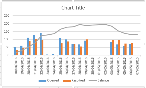
I am trying to create a line graph in Power BI to show the difference between a number of opened tickets vs resolved tickets on a daily basis. I then want to show a line graph of the cumulative data.
I am new to Power BI and whilst I can easily achieve this in Excel, I cannot get what I need. The data is shown below from Excel. The Balance is the difference between Opened and Resolved and then each day it either increases or decreased based on this difference.
| Date | Opened | Resolved | Balance |
| 18/04/2016 | 52 | 35 | 17 |
| 19/04/2016 | 62 | 47 | 32 |
| 20/04/2016 | 111 | 91 | 52 |
| 21/04/2016 | 130 | 103 | 79 |
| 22/04/2016 | 141 | 96 | 124 |
| 23/04/2016 | 6 | 0 | 130 |
| 24/04/2016 | 8 | 1 | 137 |
| 25/04/2016 | 108 | 80 | 165 |
| 26/04/2016 | 101 | 88 | 178 |
| 27/04/2016 | 73 | 71 | 180 |
| 28/04/2016 | 69 | 55 | 194 |
| 29/04/2016 | 93 | 100 | 187 |
| 30/04/2016 | 4 | 0 | 191 |
| 01/05/2016 | 2 | 0 | 193 |
| 02/05/2016 | 3 | 1 | 195 |
| 03/05/2016 | 85 | 97 | 183 |
| 04/05/2016 | 68 | 98 | 153 |
| 05/05/2016 | 60 | 75 | 138 |
| 06/05/2016 | 73 | 80 | 131 |
| 07/05/2016 | 3 | 0 | 134 |
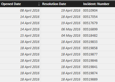
The raw data I have is as below, where the Incident Number is a unique reference
Solved! Go to Solution.
- Mark as New
- Bookmark
- Subscribe
- Mute
- Subscribe to RSS Feed
- Permalink
- Report Inappropriate Content
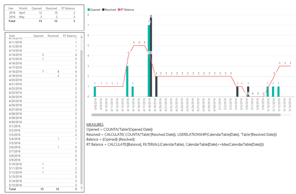
@andrew_hardwick Couple small changes since there are blank dates... But you should be set now! Let me know.
Helpful resources

Microsoft Fabric Learn Together
Covering the world! 9:00-10:30 AM Sydney, 4:00-5:30 PM CET (Paris/Berlin), 7:00-8:30 PM Mexico City

Power BI Monthly Update - April 2024
Check out the April 2024 Power BI update to learn about new features.

| User | Count |
|---|---|
| 113 | |
| 97 | |
| 85 | |
| 70 | |
| 61 |
| User | Count |
|---|---|
| 151 | |
| 121 | |
| 104 | |
| 87 | |
| 67 |


