- Power BI forums
- Updates
- News & Announcements
- Get Help with Power BI
- Desktop
- Service
- Report Server
- Power Query
- Mobile Apps
- Developer
- DAX Commands and Tips
- Custom Visuals Development Discussion
- Health and Life Sciences
- Power BI Spanish forums
- Translated Spanish Desktop
- Power Platform Integration - Better Together!
- Power Platform Integrations (Read-only)
- Power Platform and Dynamics 365 Integrations (Read-only)
- Training and Consulting
- Instructor Led Training
- Dashboard in a Day for Women, by Women
- Galleries
- Community Connections & How-To Videos
- COVID-19 Data Stories Gallery
- Themes Gallery
- Data Stories Gallery
- R Script Showcase
- Webinars and Video Gallery
- Quick Measures Gallery
- 2021 MSBizAppsSummit Gallery
- 2020 MSBizAppsSummit Gallery
- 2019 MSBizAppsSummit Gallery
- Events
- Ideas
- Custom Visuals Ideas
- Issues
- Issues
- Events
- Upcoming Events
- Community Blog
- Power BI Community Blog
- Custom Visuals Community Blog
- Community Support
- Community Accounts & Registration
- Using the Community
- Community Feedback
Register now to learn Fabric in free live sessions led by the best Microsoft experts. From Apr 16 to May 9, in English and Spanish.
- Power BI forums
- Forums
- Get Help with Power BI
- Desktop
- Cumulative Sum Graph with Labels
- Subscribe to RSS Feed
- Mark Topic as New
- Mark Topic as Read
- Float this Topic for Current User
- Bookmark
- Subscribe
- Printer Friendly Page
- Mark as New
- Bookmark
- Subscribe
- Mute
- Subscribe to RSS Feed
- Permalink
- Report Inappropriate Content
Cumulative Sum Graph with Labels
Dear All,
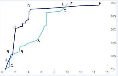
I have a requirement to dispaly a cumilative sum chart for Offline / Online brands . I also need to display the brand labels on the chart but i dont find a way to show brand labels on the chart (I can only show the values). could somebody help me if you face this kind of requirement .
I would like to achieve the below graph. Please provide your help
Thanks & Regards,
Rajeev
- Mark as New
- Bookmark
- Subscribe
- Mute
- Subscribe to RSS Feed
- Permalink
- Report Inappropriate Content
The graph and your data are very hard to understand Rajeev. Are you sure that a line chart is the correct chart here? Usually a line chart is only used when one of the dimensions is time based...
- Mark as New
- Bookmark
- Subscribe
- Mute
- Subscribe to RSS Feed
- Permalink
- Report Inappropriate Content
Hi Jaap,
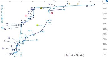
I'm using numbers and not time on X -axis. I need to show the brand labels on the line chart like below. Is it possible to achieve the below graph. I have used scatter plot to show the lables (Category labels) unfortunately we dont have connecting line to join the bubbles (Like in Excel Scatter plot with line).
- Mark as New
- Bookmark
- Subscribe
- Mute
- Subscribe to RSS Feed
- Permalink
- Report Inappropriate Content
Yeah I still don't think that a line chart is appropriate here. LO and PO are now connected to each other for no reason, they have no more relation than NU and PO. A scatter chart is the correct chart here, the lines should not connect to each other. This is probably also why PowerBI doesnt allow you to put labels there, because it doenst make sense in a line chart....
If you have a line chart per day, and you have the following values:
1-1-2017 50
2-1-2017 100
You can put a line between those two values, because you're showing a rise in the value over time. In your example, there is no rise from LO to PO, they are unrelated, so there shouldn't be a line.
My recommendation would be to create a group for all the online and offline values, and use that group ID to determine the colour of the dots in the scatter plot (you can put this group value in the "legend" box. Then you will see which products are online and offline, and you have the brand names once you put the brand names in the "details" box.
Helpful resources

Microsoft Fabric Learn Together
Covering the world! 9:00-10:30 AM Sydney, 4:00-5:30 PM CET (Paris/Berlin), 7:00-8:30 PM Mexico City

Power BI Monthly Update - April 2024
Check out the April 2024 Power BI update to learn about new features.

| User | Count |
|---|---|
| 114 | |
| 99 | |
| 81 | |
| 70 | |
| 61 |
| User | Count |
|---|---|
| 148 | |
| 116 | |
| 104 | |
| 89 | |
| 65 |


