- Power BI forums
- Updates
- News & Announcements
- Get Help with Power BI
- Desktop
- Service
- Report Server
- Power Query
- Mobile Apps
- Developer
- DAX Commands and Tips
- Custom Visuals Development Discussion
- Health and Life Sciences
- Power BI Spanish forums
- Translated Spanish Desktop
- Power Platform Integration - Better Together!
- Power Platform Integrations (Read-only)
- Power Platform and Dynamics 365 Integrations (Read-only)
- Training and Consulting
- Instructor Led Training
- Dashboard in a Day for Women, by Women
- Galleries
- Community Connections & How-To Videos
- COVID-19 Data Stories Gallery
- Themes Gallery
- Data Stories Gallery
- R Script Showcase
- Webinars and Video Gallery
- Quick Measures Gallery
- 2021 MSBizAppsSummit Gallery
- 2020 MSBizAppsSummit Gallery
- 2019 MSBizAppsSummit Gallery
- Events
- Ideas
- Custom Visuals Ideas
- Issues
- Issues
- Events
- Upcoming Events
- Community Blog
- Power BI Community Blog
- Custom Visuals Community Blog
- Community Support
- Community Accounts & Registration
- Using the Community
- Community Feedback
Register now to learn Fabric in free live sessions led by the best Microsoft experts. From Apr 16 to May 9, in English and Spanish.
- Power BI forums
- Forums
- Get Help with Power BI
- Desktop
- Cumulative Running Totals for Prior Year (flat lin...
- Subscribe to RSS Feed
- Mark Topic as New
- Mark Topic as Read
- Float this Topic for Current User
- Bookmark
- Subscribe
- Printer Friendly Page
- Mark as New
- Bookmark
- Subscribe
- Mute
- Subscribe to RSS Feed
- Permalink
- Report Inappropriate Content
Cumulative Running Totals for Prior Year (flat line only, want cumulative curve) in Chart
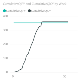
I have a flat line instead of a cummulative curve for a prior year measure calculation (black line in graph below). I'd like to see a cummulative curve, just like the current year (green line in graph below). I'm trying to graph cumulative running count on a line graph comparing prior year to current year count.
How to I display the black line as a running total curve?
The x-axis is week number.
Chart:
Measures:
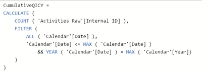
CumulativeQICY:
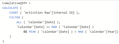
CumulativeQIPY:
I've tried incorporating sameperiodlastyear, dateadd and have failed.
Thanks in advance for all your help. I'm really looking forward to the responses. Thank you.
Solved! Go to Solution.
- Mark as New
- Bookmark
- Subscribe
- Mute
- Subscribe to RSS Feed
- Permalink
- Report Inappropriate Content
Hi @h0ttamale
The beauty of time intelligence functions is that you can calculate an existing measure in an altered date context without having to rewrite the logic of the underlying measure.
I would write CumulativeQIPY like this:
CumulativeQIPY =
CALCULATE ( [CumulativeQICY], SAMEPERIODLASTYEAR ( 'Calendar'[Date] ) )
Since CumulativeQIPY is already working correctly, wrapping it in CALCULATE with SAMEPERIODLASTYEAR performs exactly the same calculation but in a date context one year earlier.
You could also use DATEADD ( 'Calendar'[Date], -1, YEAR ) in place of SAMEPERIODLASTYEAR ( 'Calendar'[Date] ).
Regards,
Owen
- Mark as New
- Bookmark
- Subscribe
- Mute
- Subscribe to RSS Feed
- Permalink
- Report Inappropriate Content
Hi @h0ttamale
Yes you're right.
In your original measure, having the condition YEAR ( 'Calendar'[Date] ) < MAX ( 'Calendar'[Year] ) meant you were effectively showing a cumulative total for all previous years, which wouldn't change within a given year (it also meant 'Calendar'[Date] <= MAX ( 'Calendar'[Date] ) was redundant.
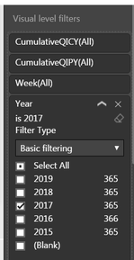
In your visual, only 2017 was selected so your measure returned a cumulative total up to the end of 2016 for all dates.
If you had plotted multiple years, you would see the line step up to a new constant each year.
Owen 🙂
- Mark as New
- Bookmark
- Subscribe
- Mute
- Subscribe to RSS Feed
- Permalink
- Report Inappropriate Content
Hi @h0ttamale
The beauty of time intelligence functions is that you can calculate an existing measure in an altered date context without having to rewrite the logic of the underlying measure.
I would write CumulativeQIPY like this:
CumulativeQIPY =
CALCULATE ( [CumulativeQICY], SAMEPERIODLASTYEAR ( 'Calendar'[Date] ) )
Since CumulativeQIPY is already working correctly, wrapping it in CALCULATE with SAMEPERIODLASTYEAR performs exactly the same calculation but in a date context one year earlier.
You could also use DATEADD ( 'Calendar'[Date], -1, YEAR ) in place of SAMEPERIODLASTYEAR ( 'Calendar'[Date] ).
Regards,
Owen
- Mark as New
- Bookmark
- Subscribe
- Mute
- Subscribe to RSS Feed
- Permalink
- Report Inappropriate Content
That's awesome. Thanks!
Do you know why my original code wasn't working as expected? My thought was that it was because the x-axis started at Week 1 2017 and during Week 1 2017, the 2016 activities alredy took place and thus for every week after week 1 2017, the 2016 activities didn't change...
- Mark as New
- Bookmark
- Subscribe
- Mute
- Subscribe to RSS Feed
- Permalink
- Report Inappropriate Content
Hi @h0ttamale
Yes you're right.
In your original measure, having the condition YEAR ( 'Calendar'[Date] ) < MAX ( 'Calendar'[Year] ) meant you were effectively showing a cumulative total for all previous years, which wouldn't change within a given year (it also meant 'Calendar'[Date] <= MAX ( 'Calendar'[Date] ) was redundant.
In your visual, only 2017 was selected so your measure returned a cumulative total up to the end of 2016 for all dates.
If you had plotted multiple years, you would see the line step up to a new constant each year.
Owen 🙂
Helpful resources

Microsoft Fabric Learn Together
Covering the world! 9:00-10:30 AM Sydney, 4:00-5:30 PM CET (Paris/Berlin), 7:00-8:30 PM Mexico City

Power BI Monthly Update - April 2024
Check out the April 2024 Power BI update to learn about new features.

| User | Count |
|---|---|
| 113 | |
| 100 | |
| 77 | |
| 76 | |
| 52 |
| User | Count |
|---|---|
| 144 | |
| 109 | |
| 108 | |
| 88 | |
| 61 |


