- Power BI forums
- Updates
- News & Announcements
- Get Help with Power BI
- Desktop
- Service
- Report Server
- Power Query
- Mobile Apps
- Developer
- DAX Commands and Tips
- Custom Visuals Development Discussion
- Health and Life Sciences
- Power BI Spanish forums
- Translated Spanish Desktop
- Power Platform Integration - Better Together!
- Power Platform Integrations (Read-only)
- Power Platform and Dynamics 365 Integrations (Read-only)
- Training and Consulting
- Instructor Led Training
- Dashboard in a Day for Women, by Women
- Galleries
- Community Connections & How-To Videos
- COVID-19 Data Stories Gallery
- Themes Gallery
- Data Stories Gallery
- R Script Showcase
- Webinars and Video Gallery
- Quick Measures Gallery
- 2021 MSBizAppsSummit Gallery
- 2020 MSBizAppsSummit Gallery
- 2019 MSBizAppsSummit Gallery
- Events
- Ideas
- Custom Visuals Ideas
- Issues
- Issues
- Events
- Upcoming Events
- Community Blog
- Power BI Community Blog
- Custom Visuals Community Blog
- Community Support
- Community Accounts & Registration
- Using the Community
- Community Feedback
Register now to learn Fabric in free live sessions led by the best Microsoft experts. From Apr 16 to May 9, in English and Spanish.
- Power BI forums
- Forums
- Get Help with Power BI
- Desktop
- Cumulative Difference with Categorical Variables
- Subscribe to RSS Feed
- Mark Topic as New
- Mark Topic as Read
- Float this Topic for Current User
- Bookmark
- Subscribe
- Printer Friendly Page
- Mark as New
- Bookmark
- Subscribe
- Mute
- Subscribe to RSS Feed
- Permalink
- Report Inappropriate Content
Cumulative Difference with Categorical Variables
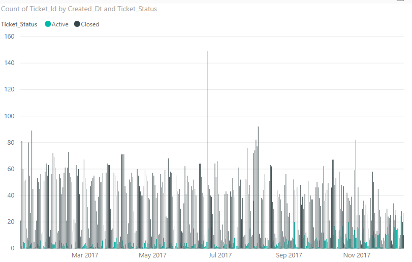
I am trying to create a clustered bar chart showing count of closed and open tickets each month. That's the easy part. I want to add a line to the chart showing the cumulative difference between the amount of closed and open tickets. I've looked through the multiple posts on here concerning cumulative differences, but they all deal with values like sales and revenue whereas my data is categorical.
To be more clear with the cumulative part, I want to add up the amount of open tickets since the beginning of time in the data set. Then as time moves forward with each day that tickets are opened and closed, they are added to the cumulative total (open) or subtracted from the cumulative total (closed). It's complicated because it depends on that condition. Any help would be much appreciated.
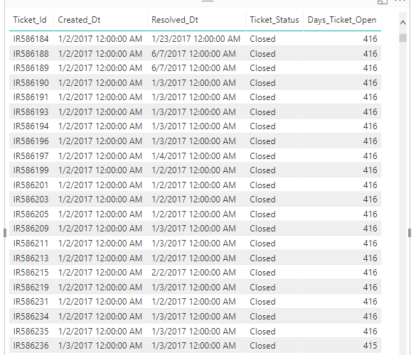
Here's a screen of my data. In the Ticket_Status column, it either has Closed or Open.
Solved! Go to Solution.
- Mark as New
- Bookmark
- Subscribe
- Mute
- Subscribe to RSS Feed
- Permalink
- Report Inappropriate Content
Hi @Folio,
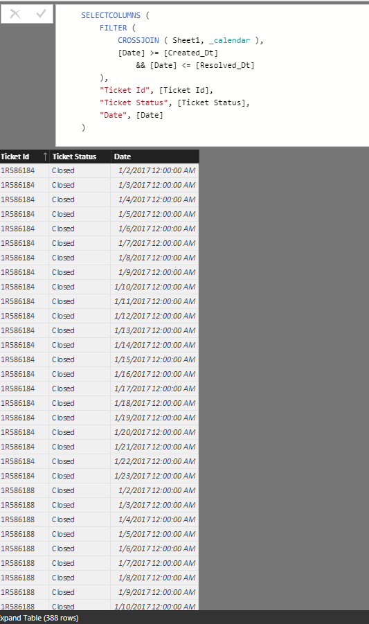
I'd like to suggest you use below formula to expand your original table, then you can direct use detail date range table to create visuals.
Expand Table =
VAR _calendar =
    CALENDAR ( MINX ( Sheet1, [Created_Dt] ), MAXX ( Sheet1, [Resolved_Dt] ) )
RETURN
    SELECTCOLUMNS (
        FILTER (
            CROSSJOIN ( Sheet1, _calendar ),
            [Date] >= [Created_Dt]
                && [Date] <= [Resolved_Dt]
        ),
        "Ticket Id", [Ticket Id],
        "Ticket Status", [Ticket Status],
        "Date", [Date]
    )
Regards,
Xiaoxin Sheng
If this post helps, please consider accept as solution to help other members find it more quickly.
- Mark as New
- Bookmark
- Subscribe
- Mute
- Subscribe to RSS Feed
- Permalink
- Report Inappropriate Content
Hi @Foliodoes something like this this solve your problem:
Measure =
CALCULATE(
countrows(table);
FILTER(
ALLSELECTED('table'[Created_dt]);
ISONORAFTER('table'[Created_dt]; 'table'[Created_dt]; DESC)
); 'table'Ticket_status" ="open"))
- Mark as New
- Bookmark
- Subscribe
- Mute
- Subscribe to RSS Feed
- Permalink
- Report Inappropriate Content
Hi,
In a simple Excel file, please show the result you are expecting.
Regards,
Ashish Mathur
http://www.ashishmathur.com
https://www.linkedin.com/in/excelenthusiasts/
Helpful resources

Microsoft Fabric Learn Together
Covering the world! 9:00-10:30 AM Sydney, 4:00-5:30 PM CET (Paris/Berlin), 7:00-8:30 PM Mexico City

Power BI Monthly Update - April 2024
Check out the April 2024 Power BI update to learn about new features.

| User | Count |
|---|---|
| 112 | |
| 99 | |
| 73 | |
| 72 | |
| 49 |
| User | Count |
|---|---|
| 145 | |
| 109 | |
| 109 | |
| 90 | |
| 64 |


