- Power BI forums
- Updates
- News & Announcements
- Get Help with Power BI
- Desktop
- Service
- Report Server
- Power Query
- Mobile Apps
- Developer
- DAX Commands and Tips
- Custom Visuals Development Discussion
- Health and Life Sciences
- Power BI Spanish forums
- Translated Spanish Desktop
- Power Platform Integration - Better Together!
- Power Platform Integrations (Read-only)
- Power Platform and Dynamics 365 Integrations (Read-only)
- Training and Consulting
- Instructor Led Training
- Dashboard in a Day for Women, by Women
- Galleries
- Community Connections & How-To Videos
- COVID-19 Data Stories Gallery
- Themes Gallery
- Data Stories Gallery
- R Script Showcase
- Webinars and Video Gallery
- Quick Measures Gallery
- 2021 MSBizAppsSummit Gallery
- 2020 MSBizAppsSummit Gallery
- 2019 MSBizAppsSummit Gallery
- Events
- Ideas
- Custom Visuals Ideas
- Issues
- Issues
- Events
- Upcoming Events
- Community Blog
- Power BI Community Blog
- Custom Visuals Community Blog
- Community Support
- Community Accounts & Registration
- Using the Community
- Community Feedback
Register now to learn Fabric in free live sessions led by the best Microsoft experts. From Apr 16 to May 9, in English and Spanish.
- Power BI forums
- Forums
- Get Help with Power BI
- Desktop
- Cumulate values on a column and display data by re...
- Subscribe to RSS Feed
- Mark Topic as New
- Mark Topic as Read
- Float this Topic for Current User
- Bookmark
- Subscribe
- Printer Friendly Page
- Mark as New
- Bookmark
- Subscribe
- Mute
- Subscribe to RSS Feed
- Permalink
- Report Inappropriate Content
Cumulate values on a column and display data by record or date range
Hi,
I am pretty new in Power BI, so I think my question is not that difficult but I can't achieve it...
I have records and have a benefit value for each record.
I want to calculate and cumulate the benefit for this column (from the 1st record until the last one).
I want to get the last column in red 'cumulative benefit', but after reading some posts, I couldn't achieve that.
| createdon | crceb_benefit | cumulative benefit |
| 09/11/2020 14:24 | 110 | 110 |
| 09/11/2020 16:10 | -5 | 105 |
| 09/11/2020 16:16 | -10 | 95 |
Once I will get this data, I would like to display the data with a graph like the following one:
- by records (from the first one to the last one)
- or by date range: november 2020, december 2020, january 2021... then by year...
Can you help me to calculate the last column?
Do you think I can display data as I wanted with the only date field createdon that I get in my table?
Thanks
Solved! Go to Solution.
- Mark as New
- Bookmark
- Subscribe
- Mute
- Subscribe to RSS Feed
- Permalink
- Report Inappropriate Content
Hi, @LaM
Try like this:
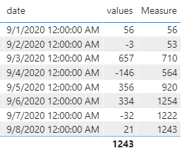
column= SUMX(FILTER(ALL('Table'),[date]<=earlier('Table'[date])),[values])Best Regards
Janey Guo
If this post helps, then please consider Accept it as the solution to help the other members find it more quickly.
- Mark as New
- Bookmark
- Subscribe
- Mute
- Subscribe to RSS Feed
- Permalink
- Report Inappropriate Content
Hi, @LaM
It’s my pleasure to answer for you.
According to your description,I think you can create a measure to calculate the desired result.
Like this:
Measure = SUMX(FILTER(ALL('Table'),[date]<=SELECTEDVALUE('Table'[date])),[values])If it doesn’t solve your problem, please feel free to ask me.
Best Regards
Janey Guo
If this post helps, then please consider Accept it as the solution to help the other members find it more quickly.
- Mark as New
- Bookmark
- Subscribe
- Mute
- Subscribe to RSS Feed
- Permalink
- Report Inappropriate Content
Hi @v-janeyg-msft ,
I tried your solution but I must do something wrong because it does'nt work 😓
I tried two things:
- First I created a measure, but when I put it on the the report tab, and add it on a visualization of type 'Line chart', the graph is empty (I also added the createdon on axis).
I can't see the measure in the data tab as a column (like your printscreen), to check the data calculated, is it normal?
2.I created a column (to see it in the data tab), and I put the same formula, but it also remains empty.
Can't we move the columns to put this new one near the benefit column? To see the data more easily?
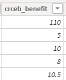
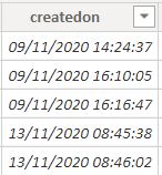
My data columns, so my formula seems like yours:
- Mark as New
- Bookmark
- Subscribe
- Mute
- Subscribe to RSS Feed
- Permalink
- Report Inappropriate Content
Hi, @LaM
Try like this:
column= SUMX(FILTER(ALL('Table'),[date]<=earlier('Table'[date])),[values])Best Regards
Janey Guo
If this post helps, then please consider Accept it as the solution to help the other members find it more quickly.
Helpful resources

Microsoft Fabric Learn Together
Covering the world! 9:00-10:30 AM Sydney, 4:00-5:30 PM CET (Paris/Berlin), 7:00-8:30 PM Mexico City

Power BI Monthly Update - April 2024
Check out the April 2024 Power BI update to learn about new features.

| User | Count |
|---|---|
| 114 | |
| 100 | |
| 75 | |
| 73 | |
| 49 |
| User | Count |
|---|---|
| 145 | |
| 109 | |
| 109 | |
| 90 | |
| 64 |


