- Power BI forums
- Updates
- News & Announcements
- Get Help with Power BI
- Desktop
- Service
- Report Server
- Power Query
- Mobile Apps
- Developer
- DAX Commands and Tips
- Custom Visuals Development Discussion
- Health and Life Sciences
- Power BI Spanish forums
- Translated Spanish Desktop
- Power Platform Integration - Better Together!
- Power Platform Integrations (Read-only)
- Power Platform and Dynamics 365 Integrations (Read-only)
- Training and Consulting
- Instructor Led Training
- Dashboard in a Day for Women, by Women
- Galleries
- Community Connections & How-To Videos
- COVID-19 Data Stories Gallery
- Themes Gallery
- Data Stories Gallery
- R Script Showcase
- Webinars and Video Gallery
- Quick Measures Gallery
- 2021 MSBizAppsSummit Gallery
- 2020 MSBizAppsSummit Gallery
- 2019 MSBizAppsSummit Gallery
- Events
- Ideas
- Custom Visuals Ideas
- Issues
- Issues
- Events
- Upcoming Events
- Community Blog
- Power BI Community Blog
- Custom Visuals Community Blog
- Community Support
- Community Accounts & Registration
- Using the Community
- Community Feedback
Register now to learn Fabric in free live sessions led by the best Microsoft experts. From Apr 16 to May 9, in English and Spanish.
- Power BI forums
- Forums
- Get Help with Power BI
- Desktop
- Creating column from Measures
- Subscribe to RSS Feed
- Mark Topic as New
- Mark Topic as Read
- Float this Topic for Current User
- Bookmark
- Subscribe
- Printer Friendly Page
- Mark as New
- Bookmark
- Subscribe
- Mute
- Subscribe to RSS Feed
- Permalink
- Report Inappropriate Content
Creating column from Measures
Hello, I am new power BI. I need your help in solving a issue I am facing.
I have data as below. I want to display Category Vs Value. The Category (X-axis) will have titles of values like Value_1, Value_2, Value_3. And Value (Y-axis) will have average values of value_1, Value_2, Value_3 respectively.
ID Value_1 Value_2 Value_3
1 200 250 300
2 300 225 400
3 275 250 150
I am able to place them under 'Column values' but in the graph, they are coming together. So I think creating Category would make it look much better than placing them side by side.
Please advice.
- Mark as New
- Bookmark
- Subscribe
- Mute
- Subscribe to RSS Feed
- Permalink
- Report Inappropriate Content
@d_gosbell @v-alq-msft Guys thank you for your reply.
The concern with this method would be, Increasing the number of rows and ID which is supposed to be unique identifier is getting repeated. If I have multiple data sets at ID level as Key, then it might create duplication.
Please let me know your thoughts.
- Mark as New
- Bookmark
- Subscribe
- Mute
- Subscribe to RSS Feed
- Permalink
- Report Inappropriate Content
Hi, @Sunnyatwork
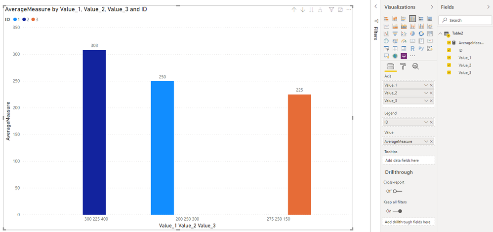
You may create a measure as follows.
AverageMeasure =
AVERAGEX(
      Table2,
      DIVIDE(Table2[Value_1]+Table2[Value_2]+Table2[Value_3],3)
)
Then you may configure fields of the visual as below.
If I misunderstand your thoughts, please show me your expected result. Thanks
Best Regards
Allan
If this post helps, then please consider Accept it as the solution to help the other members find it more quickly.
- Mark as New
- Bookmark
- Subscribe
- Mute
- Subscribe to RSS Feed
- Permalink
- Report Inappropriate Content
Hi, @Sunnyatwork
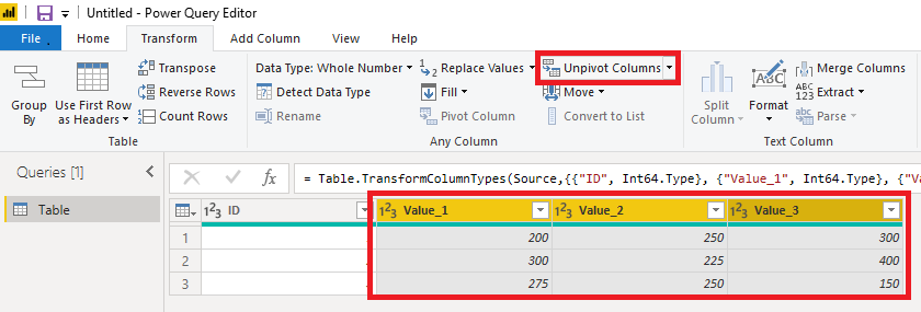
Just as what @d_gosbell said, you may click 'Edit Query', go to Query Editor, click 'Transform' ribbon, make corresponding cloumns selected, click 'Unpivot Column' and then 'Close and Apply'.
Then you may create a visual, right-click the 'Value' column and choose 'Average'. Here is the result.
Best Regards
Allan
If this post helps, then please consider Accept it as the solution to help the other members find it more quickly.
- Mark as New
- Bookmark
- Subscribe
- Mute
- Subscribe to RSS Feed
- Permalink
- Report Inappropriate Content
If Value_1, Value_2 and Value_3 are categories then you should probably change your query that brings in the data to do an Unpivot transformation to change your data into the following shape:
ID Category Amount
1 Value_1 200
1 Value_2 250
1 Value_3 300
2 Value_1 300
2 Value_2 225
2 Value_3 400
3 Value_1 275
3 Value_2 250
3 Value_3 150
That should make it much easier to create reports splitting the data out by the different categories.
Helpful resources

Microsoft Fabric Learn Together
Covering the world! 9:00-10:30 AM Sydney, 4:00-5:30 PM CET (Paris/Berlin), 7:00-8:30 PM Mexico City

Power BI Monthly Update - April 2024
Check out the April 2024 Power BI update to learn about new features.

| User | Count |
|---|---|
| 110 | |
| 94 | |
| 81 | |
| 66 | |
| 58 |
| User | Count |
|---|---|
| 150 | |
| 119 | |
| 104 | |
| 87 | |
| 67 |


