- Power BI forums
- Updates
- News & Announcements
- Get Help with Power BI
- Desktop
- Service
- Report Server
- Power Query
- Mobile Apps
- Developer
- DAX Commands and Tips
- Custom Visuals Development Discussion
- Health and Life Sciences
- Power BI Spanish forums
- Translated Spanish Desktop
- Power Platform Integration - Better Together!
- Power Platform Integrations (Read-only)
- Power Platform and Dynamics 365 Integrations (Read-only)
- Training and Consulting
- Instructor Led Training
- Dashboard in a Day for Women, by Women
- Galleries
- Community Connections & How-To Videos
- COVID-19 Data Stories Gallery
- Themes Gallery
- Data Stories Gallery
- R Script Showcase
- Webinars and Video Gallery
- Quick Measures Gallery
- 2021 MSBizAppsSummit Gallery
- 2020 MSBizAppsSummit Gallery
- 2019 MSBizAppsSummit Gallery
- Events
- Ideas
- Custom Visuals Ideas
- Issues
- Issues
- Events
- Upcoming Events
- Community Blog
- Power BI Community Blog
- Custom Visuals Community Blog
- Community Support
- Community Accounts & Registration
- Using the Community
- Community Feedback
Register now to learn Fabric in free live sessions led by the best Microsoft experts. From Apr 16 to May 9, in English and Spanish.
- Power BI forums
- Forums
- Get Help with Power BI
- Desktop
- Creating a waterfall chart with calculations using...
- Subscribe to RSS Feed
- Mark Topic as New
- Mark Topic as Read
- Float this Topic for Current User
- Bookmark
- Subscribe
- Printer Friendly Page
- Mark as New
- Bookmark
- Subscribe
- Mute
- Subscribe to RSS Feed
- Permalink
- Report Inappropriate Content
Creating a waterfall chart with calculations using table totals and be able to filter.
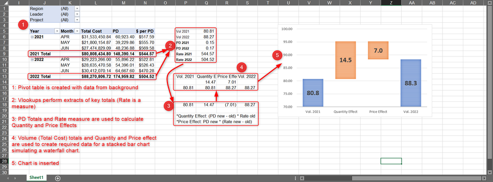
I have this report in excel, which im trying to migrate to a PowerBi report, but im having issues recreating the waterfall chart.
I need all filters to work and update the chart and table at the same time, currently the chart is not filtering in PBI.
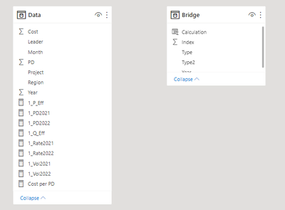
For this i tried creating the values in step 3 and 2 from the image as measures in the same table as the original data. Then a new table which contains the values in the step 4 (which are the values required for building the chart) in a calculated column that uses the previously created measures depending on a row index i inserted, thinking the totals would filter with the slicers.
I think it would be hard to make the calculations individually in each row in the original data table since the formulas work with total values, and also that i need the 2 breakdowns to appear, and only 1 field can be inserted in the chart thus having to duplicate the content in the table, i did try but had no luck. And there is no posibility to creating a relationship to enable filtering since no field has unique values.
From what i understand there are only these 2 options here. 1) Having a connection between both tables, 2) having the calculations on the main table itself. or maybe 3) having a different visual that can adapt better to the data required.
Maybe there are more options with using DAX, and this requires more advanced skills which i currently dont have as a powerBI beginner, i tried what i could and made some research but i think this is a very specific topic and was hard to find helpful stuff.
In the end what i need is to have the exact same funcionality as the excel in a PowerBI.
(in the excel the chart hides the background calculations, and only the filters, pivot table, and chart are visible, so would be the case in the PBI)
Here is a link to a small sample file i have created for this issue, since the original file is really big and has work data.
https://1drv.ms/u/s!AnUxFEs727OlxwRJ2jcdHqPBLG_o?e=6dpnWU
If i need to elaborate better feel free to ask, maybe specific questions would work better than my overall understanding and description of the problem, since this is a more advanced and confusing thing i may have not explained myself correctly.
I really appreciate any help provided.
- Mark as New
- Bookmark
- Subscribe
- Mute
- Subscribe to RSS Feed
- Permalink
- Report Inappropriate Content
Your data model is missing the linkage between the Data and Bridge tables hence the interaction isn't working.
"In the end what i need is to have the exact same funcionality as the excel in a PowerBI."
I would challenge that. Don't fight the change, embrace it.
Helpful resources

Microsoft Fabric Learn Together
Covering the world! 9:00-10:30 AM Sydney, 4:00-5:30 PM CET (Paris/Berlin), 7:00-8:30 PM Mexico City

Power BI Monthly Update - April 2024
Check out the April 2024 Power BI update to learn about new features.

| User | Count |
|---|---|
| 109 | |
| 99 | |
| 77 | |
| 66 | |
| 54 |
| User | Count |
|---|---|
| 144 | |
| 104 | |
| 101 | |
| 86 | |
| 64 |


