- Power BI forums
- Updates
- News & Announcements
- Get Help with Power BI
- Desktop
- Service
- Report Server
- Power Query
- Mobile Apps
- Developer
- DAX Commands and Tips
- Custom Visuals Development Discussion
- Health and Life Sciences
- Power BI Spanish forums
- Translated Spanish Desktop
- Power Platform Integration - Better Together!
- Power Platform Integrations (Read-only)
- Power Platform and Dynamics 365 Integrations (Read-only)
- Training and Consulting
- Instructor Led Training
- Dashboard in a Day for Women, by Women
- Galleries
- Community Connections & How-To Videos
- COVID-19 Data Stories Gallery
- Themes Gallery
- Data Stories Gallery
- R Script Showcase
- Webinars and Video Gallery
- Quick Measures Gallery
- 2021 MSBizAppsSummit Gallery
- 2020 MSBizAppsSummit Gallery
- 2019 MSBizAppsSummit Gallery
- Events
- Ideas
- Custom Visuals Ideas
- Issues
- Issues
- Events
- Upcoming Events
- Community Blog
- Power BI Community Blog
- Custom Visuals Community Blog
- Community Support
- Community Accounts & Registration
- Using the Community
- Community Feedback
Register now to learn Fabric in free live sessions led by the best Microsoft experts. From Apr 16 to May 9, in English and Spanish.
- Power BI forums
- Forums
- Get Help with Power BI
- Desktop
- Re: Creating a time driven bullet chart
- Subscribe to RSS Feed
- Mark Topic as New
- Mark Topic as Read
- Float this Topic for Current User
- Bookmark
- Subscribe
- Printer Friendly Page
- Mark as New
- Bookmark
- Subscribe
- Mute
- Subscribe to RSS Feed
- Permalink
- Report Inappropriate Content
Creating a time driven bullet chart
All,
I am new to Power BI and I am trying to develop a time driven bullet chart. The gist is to use the bullet chart to show the application availability times i.e. when did the batch start to make the application available and when was the application available for use by the user. I had downloaded the sample and did some investigation myself but was not able to achieve what I want.
Steps done so far -
1. Created a table with following columns :
AppliactionName| ETA| Target| Minimum| Satisfactory| Good| Very Good| Maximum| Needs improvement
The values for all of the columns (apart from Application Name) is HH:MM:SS.
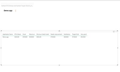
2. Dragged the values to the corresponding fields for bullet chart custom visual but unfortunately the attached is where I get.
I'd greatly appreciate if someone is able to help me out and point the mistake I am making. I am attaching some screenshots as well.
- Mark as New
- Bookmark
- Subscribe
- Mute
- Subscribe to RSS Feed
- Permalink
- Report Inappropriate Content
Hi @AnandTrivedi,
I can not create a time driven bullet chart without your resource table. Based on the fields you discribed, it looks like you can create a right one. Have you set the colors for different field like highlighted in bule circle in the following screenshot? Please check and try it.
If this still does not resolve your issue, please share your sample table for further analysis.
Best Regards,
Angelia
- Mark as New
- Bookmark
- Subscribe
- Mute
- Subscribe to RSS Feed
- Permalink
- Report Inappropriate Content
Hi @v-huizhn-msft,
Thanks for taking a look at it.
I am attaching the excel (table) here. The idea is to create a bullet chart from worksheet named as "applicationCurrentEstimate". The bullet chart needs to be based on the time completion of the batch.
The "batchStartTime" denotes the time at which the overnight batch starts. If the batch is running smooth and the ETA for completion is below the SLA (the target value) then the chart should be green, if it is over the SLA then it should be red. If it needs improvement then it should be amber.
- Mark as New
- Bookmark
- Subscribe
- Mute
- Subscribe to RSS Feed
- Permalink
- Report Inappropriate Content
Hi @AnandTrivedi,
As for as I tested, it also return the blank result when we add your data. I am not sure if the time type data is not available to this custom visual, you can post the comments on below the webside.
Best Regards,
Angelia
Helpful resources

Microsoft Fabric Learn Together
Covering the world! 9:00-10:30 AM Sydney, 4:00-5:30 PM CET (Paris/Berlin), 7:00-8:30 PM Mexico City

Power BI Monthly Update - April 2024
Check out the April 2024 Power BI update to learn about new features.

| User | Count |
|---|---|
| 109 | |
| 99 | |
| 77 | |
| 66 | |
| 54 |
| User | Count |
|---|---|
| 144 | |
| 104 | |
| 102 | |
| 87 | |
| 64 |


