cancel
Showing results for 
Search instead for 
Did you mean: 

Register now to learn Fabric in free live sessions led by the best Microsoft experts. From Apr 16 to May 9, in English and Spanish.

Reply
PowerNewbieT
Regular Visitor

Creating a report based on contingent value

Hi folks, I was wondering if you would be so kind to help me with a tricky report. 

Based on the expected date of resource engagement and expected resource use per month, I need to create a view showing how many projected resources would be engaged per project over time. 

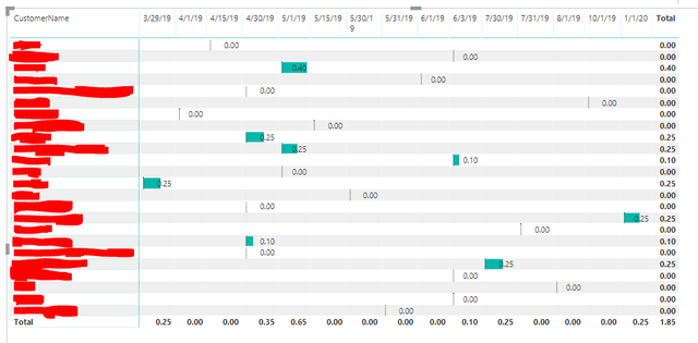
I've gotten to the view below, but I can't figure out how to show the value correctly.


For example, 0.40 (40%) of a resource would be needed starting on 5/1/19 for a period of 3 months. This means I need to show 0.40 for three months following the start date of 5/1/19. Another resource is needed to start on 4/30/19 in the amount of 0.25 (25%) for 5 months, which means that in the first three months resource need would be totaled at 0.4+0.25=0.65 (65%).


This was way easier in Excel, when you can create a table with monthly dates across the top and formulas in values showing data bar: "For as long as the 'current date' is less than 'expected engagent date+duration of engagement' and more or equal 'expected engagement date', then resource allocation is at a constant given value "


Resource-funnel-report
Any ideas would be greatly appreciated!

Thank you,


T

1 ACCEPTED SOLUTION
v-shex-msft
Community Support
Community Support

HI @PowerNewbieT ,

Maybe you can try to use gantt chart or timeline charts, they can analysis date duration based on two date fields. (you can find them in marketplace of power bi visuals)

Visual Awesomeness Unlocked – Gantt chart

as Timeline

Regards,

Xiaoxin Sheng

Community Support Team _ Xiaoxin
If this post helps, please consider accept as solution to help other members find it more quickly.

View solution in original post

1 REPLY 1
v-shex-msft
Community Support
Community Support

HI @PowerNewbieT ,

Maybe you can try to use gantt chart or timeline charts, they can analysis date duration based on two date fields. (you can find them in marketplace of power bi visuals)

Visual Awesomeness Unlocked – Gantt chart

as Timeline

Regards,

Xiaoxin Sheng

Community Support Team _ Xiaoxin
If this post helps, please consider accept as solution to help other members find it more quickly.

Helpful resources

Announcements
Microsoft Fabric Learn Together

Microsoft Fabric Learn Together

Covering the world! 9:00-10:30 AM Sydney, 4:00-5:30 PM CET (Paris/Berlin), 7:00-8:30 PM Mexico City

PBI_APRIL_CAROUSEL1

Power BI Monthly Update - April 2024

Check out the April 2024 Power BI update to learn about new features.

April Fabric Community Update

Fabric Community Update - April 2024

Find out what's new and trending in the Fabric Community.