- Power BI forums
- Updates
- News & Announcements
- Get Help with Power BI
- Desktop
- Service
- Report Server
- Power Query
- Mobile Apps
- Developer
- DAX Commands and Tips
- Custom Visuals Development Discussion
- Health and Life Sciences
- Power BI Spanish forums
- Translated Spanish Desktop
- Power Platform Integration - Better Together!
- Power Platform Integrations (Read-only)
- Power Platform and Dynamics 365 Integrations (Read-only)
- Training and Consulting
- Instructor Led Training
- Dashboard in a Day for Women, by Women
- Galleries
- Community Connections & How-To Videos
- COVID-19 Data Stories Gallery
- Themes Gallery
- Data Stories Gallery
- R Script Showcase
- Webinars and Video Gallery
- Quick Measures Gallery
- 2021 MSBizAppsSummit Gallery
- 2020 MSBizAppsSummit Gallery
- 2019 MSBizAppsSummit Gallery
- Events
- Ideas
- Custom Visuals Ideas
- Issues
- Issues
- Events
- Upcoming Events
- Community Blog
- Power BI Community Blog
- Custom Visuals Community Blog
- Community Support
- Community Accounts & Registration
- Using the Community
- Community Feedback
Register now to learn Fabric in free live sessions led by the best Microsoft experts. From Apr 16 to May 9, in English and Spanish.
- Power BI forums
- Forums
- Get Help with Power BI
- Desktop
- Creating a percentage graph
- Subscribe to RSS Feed
- Mark Topic as New
- Mark Topic as Read
- Float this Topic for Current User
- Bookmark
- Subscribe
- Printer Friendly Page
- Mark as New
- Bookmark
- Subscribe
- Mute
- Subscribe to RSS Feed
- Permalink
- Report Inappropriate Content
Creating a percentage graph
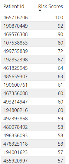
I am attempting to show a distribution of patient risk across a 1 - 100 scale. I can produce the following graph that shows deitentified patient ids and their total risk score.
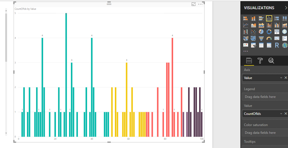
What I would ultimately like to do with this data is create the following chart showing the total percentage on the x axis and the count of patients in each bucket.
I just cannot seem to figure out how to use accomplish this. It appears that a good use case for this is binning, but my final output is a calculated field and the option for a new group is not available. Any suggestions?
- Mark as New
- Bookmark
- Subscribe
- Mute
- Subscribe to RSS Feed
- Permalink
- Report Inappropriate Content
Hmmm... I am not getting much feedback on this.
Can anyone tell me if it is possible to take a result set (from a view) (calculated from several calculated measures) like the following:
and turn it into a new table? I am sure that I could then use binning to achieve the visual that I need.
- Mark as New
- Bookmark
- Subscribe
- Mute
- Subscribe to RSS Feed
- Permalink
- Report Inappropriate Content
Hi, If your BINs are 0 to 100 and Risk Score is a WholeNumber between 0 to 100. You can try with this:
1. Create a Table with Bins:
Modeling--New Table
Bins = GENERATESERIES(0;100;1 )
2. Create a CountofPatientID
CountOfIds =
CALCULATE (
    COUNT ( Table2[PatientID] );
    FILTER ( Table2; [AVG Risk Score] = SELECTEDVALUE ( Bins[Value] ) )
)
AVG Risk Score is your measure
3. Insert a Visual:
To select the colors you can work with Data Colors (But you need to assign to each bin the color )
Let me know if works on your side
Regards
Victor
Lima . Peru
Lima - Peru
- Mark as New
- Bookmark
- Subscribe
- Mute
- Subscribe to RSS Feed
- Permalink
- Report Inappropriate Content
Hi @powerdev,
Aggree with the solution you mentioned that to use "Bin" to generate new group. But what do you mean "my final output is a calculated field and the option for a new group is not available"? After creating a bin based on a specific field, it will dynamically add a calculated column in table view, you just need to add this new field into X-axis of column chart.
Regards,
Yuliana Gu
If this post helps, then please consider Accept it as the solution to help the other members find it more quickly.
- Mark as New
- Bookmark
- Subscribe
- Mute
- Subscribe to RSS Feed
- Permalink
- Report Inappropriate Content
Thanks @v-yulgu-msft for the reply.
What I mean is that the "Risk Score" column above is itself a calculated measure. When I select it and try to select "New Group" from the menu it is greyed out. I am thinking that creating a group from a calculated measure isn't possible. Is this correct?
Helpful resources

Microsoft Fabric Learn Together
Covering the world! 9:00-10:30 AM Sydney, 4:00-5:30 PM CET (Paris/Berlin), 7:00-8:30 PM Mexico City

Power BI Monthly Update - April 2024
Check out the April 2024 Power BI update to learn about new features.

| User | Count |
|---|---|
| 118 | |
| 107 | |
| 70 | |
| 70 | |
| 43 |
| User | Count |
|---|---|
| 148 | |
| 105 | |
| 104 | |
| 89 | |
| 65 |


