- Power BI forums
- Updates
- News & Announcements
- Get Help with Power BI
- Desktop
- Service
- Report Server
- Power Query
- Mobile Apps
- Developer
- DAX Commands and Tips
- Custom Visuals Development Discussion
- Health and Life Sciences
- Power BI Spanish forums
- Translated Spanish Desktop
- Power Platform Integration - Better Together!
- Power Platform Integrations (Read-only)
- Power Platform and Dynamics 365 Integrations (Read-only)
- Training and Consulting
- Instructor Led Training
- Dashboard in a Day for Women, by Women
- Galleries
- Community Connections & How-To Videos
- COVID-19 Data Stories Gallery
- Themes Gallery
- Data Stories Gallery
- R Script Showcase
- Webinars and Video Gallery
- Quick Measures Gallery
- 2021 MSBizAppsSummit Gallery
- 2020 MSBizAppsSummit Gallery
- 2019 MSBizAppsSummit Gallery
- Events
- Ideas
- Custom Visuals Ideas
- Issues
- Issues
- Events
- Upcoming Events
- Community Blog
- Power BI Community Blog
- Custom Visuals Community Blog
- Community Support
- Community Accounts & Registration
- Using the Community
- Community Feedback
Register now to learn Fabric in free live sessions led by the best Microsoft experts. From Apr 16 to May 9, in English and Spanish.
- Power BI forums
- Forums
- Get Help with Power BI
- Desktop
- Re: Creating a Running Total by Date, Stacked Area...
- Subscribe to RSS Feed
- Mark Topic as New
- Mark Topic as Read
- Float this Topic for Current User
- Bookmark
- Subscribe
- Printer Friendly Page
- Mark as New
- Bookmark
- Subscribe
- Mute
- Subscribe to RSS Feed
- Permalink
- Report Inappropriate Content
Creating a Running Total by Date, Stacked Area Chart by Category
Hello - I'm trying to do something in Power BI that I can do fairly easily in excel and I was wondering if I am missing something.
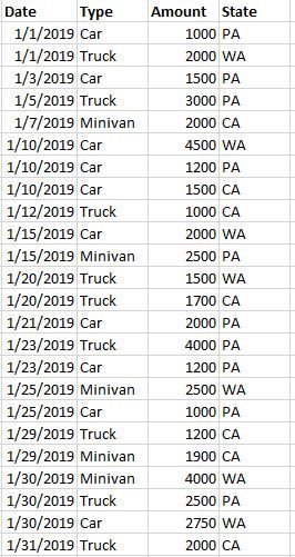
I'm starting from a data table like this:
In Excel, i would then pivot the data as follows (with running totals):
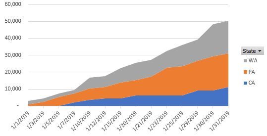
And then create a pivot chart as follows:
I can't figure out how to do any of this in Power BI.
Any help would be MASSIVELY appreciated - thanks so much.
Adam
Solved! Go to Solution.
- Mark as New
- Bookmark
- Subscribe
- Mute
- Subscribe to RSS Feed
- Permalink
- Report Inappropriate Content
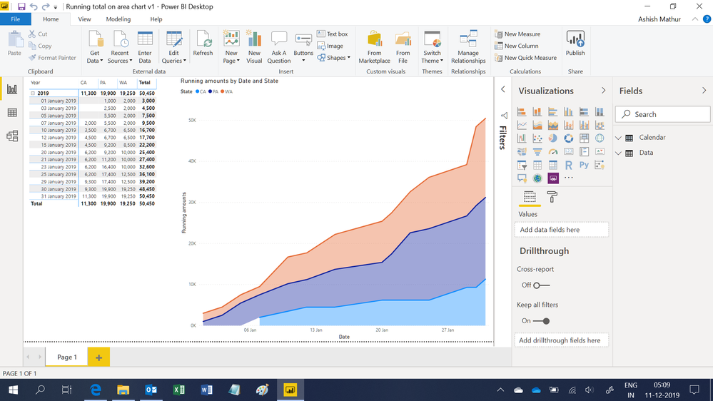
Hi,
You may download my revised PBI file from here.
Hope this helps.
Regards,
Ashish Mathur
http://www.ashishmathur.com
https://www.linkedin.com/in/excelenthusiasts/
- Mark as New
- Bookmark
- Subscribe
- Mute
- Subscribe to RSS Feed
- Permalink
- Report Inappropriate Content
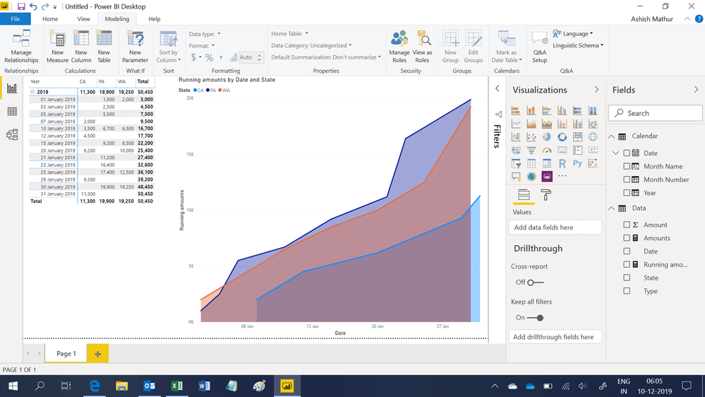
Hi,
You may download my PBI file from here.
Hope this helps.
Regards,
Ashish Mathur
http://www.ashishmathur.com
https://www.linkedin.com/in/excelenthusiasts/
- Mark as New
- Bookmark
- Subscribe
- Mute
- Subscribe to RSS Feed
- Permalink
- Report Inappropriate Content
Thank you for the reply; however, the graph that is produced here is does not appear to be the same as the graph that I produced with the Pivot Chart. The amounts do not appear to be stacked (i.e. the top amount on the y axis is not $50,450. Is there any way to configure it the same way that I have it?
- Mark as New
- Bookmark
- Subscribe
- Mute
- Subscribe to RSS Feed
- Permalink
- Report Inappropriate Content
Hi,
You may download my revised PBI file from here.
Hope this helps.
Regards,
Ashish Mathur
http://www.ashishmathur.com
https://www.linkedin.com/in/excelenthusiasts/
- Mark as New
- Bookmark
- Subscribe
- Mute
- Subscribe to RSS Feed
- Permalink
- Report Inappropriate Content
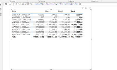
Hi Ashish, I found your solution and it is exactly what I'm needing. Although the measure to calucate the amount for all states is not working properly for me. For some reason it is adding a column with a blank header that sums the entire data table. I believe this is what is causing the mis calculation in my RT. Do you have any insight as to why this would be happening? Please see screenshot below
- Mark as New
- Bookmark
- Subscribe
- Mute
- Subscribe to RSS Feed
- Permalink
- Report Inappropriate Content
Ashish -
Thank you so very much!!!
You are awesome. We've been trying to figure this out for a long time.
Best regards,
Adam
- Mark as New
- Bookmark
- Subscribe
- Mute
- Subscribe to RSS Feed
- Permalink
- Report Inappropriate Content
You are most welcome. Thank you for your kind words.
Regards,
Ashish Mathur
http://www.ashishmathur.com
https://www.linkedin.com/in/excelenthusiasts/
- Mark as New
- Bookmark
- Subscribe
- Mute
- Subscribe to RSS Feed
- Permalink
- Report Inappropriate Content
@Anonymous
Adam, Could you paste the sample data instead of a picture of sample data?
- Mark as New
- Bookmark
- Subscribe
- Mute
- Subscribe to RSS Feed
- Permalink
- Report Inappropriate Content
See below - thanks!
| Date | Type | Amount | State |
| 1/1/2019 | Car | 1000 | PA |
| 1/1/2019 | Truck | 2000 | WA |
| 1/3/2019 | Car | 1500 | PA |
| 1/5/2019 | Truck | 3000 | PA |
| 1/7/2019 | Minivan | 2000 | CA |
| 1/10/2019 | Car | 4500 | WA |
| 1/10/2019 | Car | 1200 | PA |
| 1/10/2019 | Car | 1500 | CA |
| 1/12/2019 | Truck | 1000 | CA |
| 1/15/2019 | Car | 2000 | WA |
| 1/15/2019 | Minivan | 2500 | PA |
| 1/20/2019 | Truck | 1500 | WA |
| 1/20/2019 | Truck | 1700 | CA |
| 1/21/2019 | Car | 2000 | PA |
| 1/23/2019 | Truck | 4000 | PA |
| 1/23/2019 | Car | 1200 | PA |
| 1/25/2019 | Minivan | 2500 | WA |
| 1/25/2019 | Car | 1000 | PA |
| 1/29/2019 | Truck | 1200 | CA |
| 1/29/2019 | Minivan | 1900 | CA |
| 1/30/2019 | Minivan | 4000 | WA |
| 1/30/2019 | Truck | 2500 | PA |
| 1/30/2019 | Car | 2750 | WA |
| 1/31/2019 | Truck | 2000 | CA |
- Mark as New
- Bookmark
- Subscribe
- Mute
- Subscribe to RSS Feed
- Permalink
- Report Inappropriate Content
@Anonymous
UPDATE:
I completely missed the running total. Use the DAX below to create the running total and use it in the graph instead of "Amount"
Replace the table and column names. Table - Data; Column - Date,Amount
| Running Total = VAR DATE1 = MAX ( Data[Date] ) RETURN CALCULATE ( SUM ( Data[Amount] ), FILTER ( ALL ( Data[Date] ), Data[Date] <= DATE1 ) ) |
Its easy in Power BI too.
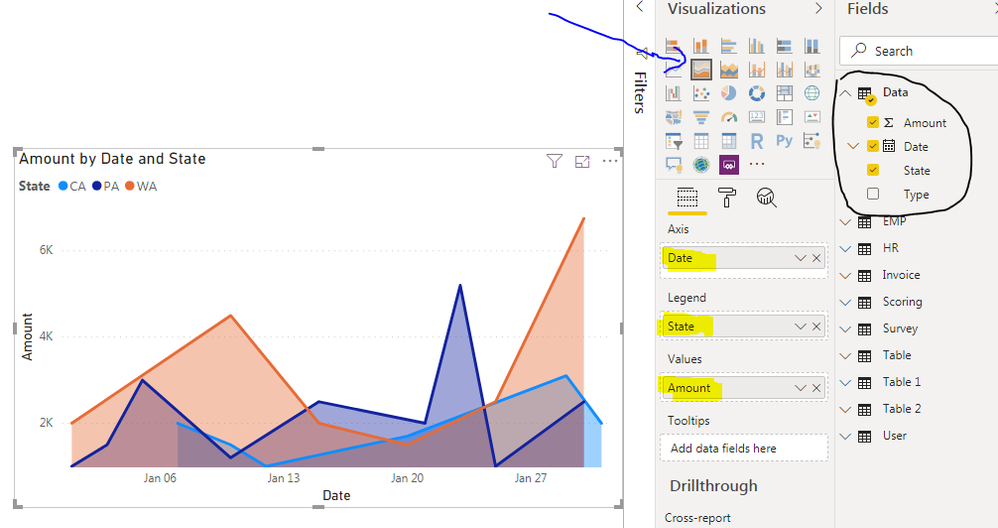
I used your sample data and created this graph.
Just connect to your data with excel as data source and select the sheet you want to load. Choose edit,Query editor window opens, click on the column header( Left side of each column - where you see ABC,123) to select the correct datatypes in Query Editor.Close & Apply.
In the report window choose the graph i pointed out, drag and drop the attributes or measures in the highlighted area.
To change the column format, open data window, choose the column and you could the format in the top ribbon.
If this helps, mark it as a solution,
Kudos are nice too.
Helpful resources

Microsoft Fabric Learn Together
Covering the world! 9:00-10:30 AM Sydney, 4:00-5:30 PM CET (Paris/Berlin), 7:00-8:30 PM Mexico City

Power BI Monthly Update - April 2024
Check out the April 2024 Power BI update to learn about new features.

| User | Count |
|---|---|
| 114 | |
| 97 | |
| 86 | |
| 70 | |
| 62 |
| User | Count |
|---|---|
| 151 | |
| 120 | |
| 103 | |
| 87 | |
| 68 |
