- Power BI forums
- Updates
- News & Announcements
- Get Help with Power BI
- Desktop
- Service
- Report Server
- Power Query
- Mobile Apps
- Developer
- DAX Commands and Tips
- Custom Visuals Development Discussion
- Health and Life Sciences
- Power BI Spanish forums
- Translated Spanish Desktop
- Power Platform Integration - Better Together!
- Power Platform Integrations (Read-only)
- Power Platform and Dynamics 365 Integrations (Read-only)
- Training and Consulting
- Instructor Led Training
- Dashboard in a Day for Women, by Women
- Galleries
- Community Connections & How-To Videos
- COVID-19 Data Stories Gallery
- Themes Gallery
- Data Stories Gallery
- R Script Showcase
- Webinars and Video Gallery
- Quick Measures Gallery
- 2021 MSBizAppsSummit Gallery
- 2020 MSBizAppsSummit Gallery
- 2019 MSBizAppsSummit Gallery
- Events
- Ideas
- Custom Visuals Ideas
- Issues
- Issues
- Events
- Upcoming Events
- Community Blog
- Power BI Community Blog
- Custom Visuals Community Blog
- Community Support
- Community Accounts & Registration
- Using the Community
- Community Feedback
Register now to learn Fabric in free live sessions led by the best Microsoft experts. From Apr 16 to May 9, in English and Spanish.
- Power BI forums
- Forums
- Get Help with Power BI
- Desktop
- Re: Creating a Pie Chart comparing amount spent vs...
- Subscribe to RSS Feed
- Mark Topic as New
- Mark Topic as Read
- Float this Topic for Current User
- Bookmark
- Subscribe
- Printer Friendly Page
- Mark as New
- Bookmark
- Subscribe
- Mute
- Subscribe to RSS Feed
- Permalink
- Report Inappropriate Content
Creating a Pie Chart comparing amount spent vs Amount left
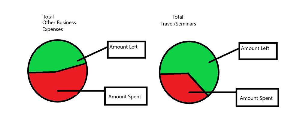
Hey guys I am completely blanking out on how to set up this simple pie chart. Basically I have 2 accounts, and I want 2 separate Pie charts for each account that shows the total amount spent vs the amount left in the budget. Where the whole graph represents the full budget. I have all these measures I created for other visuals that give me that information, but I am not sure how to make it work with the pie chart. Here are some pictures to help visualize what I am trying to do.
Solved! Go to Solution.
- Mark as New
- Bookmark
- Subscribe
- Mute
- Subscribe to RSS Feed
- Permalink
- Report Inappropriate Content
Hello again!
Thx for the reply. Its easy to see data!
You need to make a option:
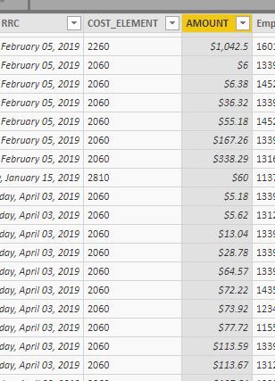
1 - Create a Column to bring the difference between Total Budget and Spend, that way you will get Two Facts Columns: One with the spend amount (I belive that is the AMOUNT column in the first pic) and another with the calc maked above.
Put the two columns in your pie chart and the magic goes on.
2 - Create a new table (virtual or not) with the summarize of the same two columns: Amount and (Total Budget-Amount), and put this tabel inside a SUMX measure.
Put the two columns in your pie chart and the magic goes on.
See the sample in the follow link: https://rebrand.ly/n6o0o8
- Mark as New
- Bookmark
- Subscribe
- Mute
- Subscribe to RSS Feed
- Permalink
- Report Inappropriate Content
Hello,
Can you inform with column in your model that separates the amount spend and the bugdet?
With this we can create a simple Calculate measure to make your pie chart possible.
- Mark as New
- Bookmark
- Subscribe
- Mute
- Subscribe to RSS Feed
- Permalink
- Report Inappropriate Content
@Anonymous
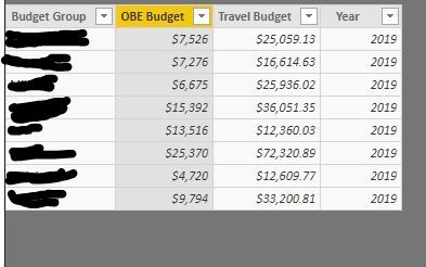
Under that experimental budget tab this is what the data looks like. It is very simple. I have a measure that adds them all up because I don't care about budget group for this visual. In a separate table I have the amount spent. Every month a new file gets added to the folder that contains more data. I have a measure that sums the amount. And a separate measure that subtracts the total budget with amount spent. You can see all of them that I did in the original post. but here are the SS's
- Mark as New
- Bookmark
- Subscribe
- Mute
- Subscribe to RSS Feed
- Permalink
- Report Inappropriate Content
Hello again!
Thx for the reply. Its easy to see data!
You need to make a option:
1 - Create a Column to bring the difference between Total Budget and Spend, that way you will get Two Facts Columns: One with the spend amount (I belive that is the AMOUNT column in the first pic) and another with the calc maked above.
Put the two columns in your pie chart and the magic goes on.
2 - Create a new table (virtual or not) with the summarize of the same two columns: Amount and (Total Budget-Amount), and put this tabel inside a SUMX measure.
Put the two columns in your pie chart and the magic goes on.
See the sample in the follow link: https://rebrand.ly/n6o0o8
- Mark as New
- Bookmark
- Subscribe
- Mute
- Subscribe to RSS Feed
- Permalink
- Report Inappropriate Content
I feel I may have jumped the gun on this post. I figured it out. I just had to create a column with a relationship between the budget and the amount spent. Worked out well. Here is a SS with how I made it look.
Helpful resources

Microsoft Fabric Learn Together
Covering the world! 9:00-10:30 AM Sydney, 4:00-5:30 PM CET (Paris/Berlin), 7:00-8:30 PM Mexico City

Power BI Monthly Update - April 2024
Check out the April 2024 Power BI update to learn about new features.

| User | Count |
|---|---|
| 106 | |
| 93 | |
| 75 | |
| 62 | |
| 50 |
| User | Count |
|---|---|
| 147 | |
| 107 | |
| 105 | |
| 87 | |
| 61 |


