- Power BI forums
- Updates
- News & Announcements
- Get Help with Power BI
- Desktop
- Service
- Report Server
- Power Query
- Mobile Apps
- Developer
- DAX Commands and Tips
- Custom Visuals Development Discussion
- Health and Life Sciences
- Power BI Spanish forums
- Translated Spanish Desktop
- Power Platform Integration - Better Together!
- Power Platform Integrations (Read-only)
- Power Platform and Dynamics 365 Integrations (Read-only)
- Training and Consulting
- Instructor Led Training
- Dashboard in a Day for Women, by Women
- Galleries
- Community Connections & How-To Videos
- COVID-19 Data Stories Gallery
- Themes Gallery
- Data Stories Gallery
- R Script Showcase
- Webinars and Video Gallery
- Quick Measures Gallery
- 2021 MSBizAppsSummit Gallery
- 2020 MSBizAppsSummit Gallery
- 2019 MSBizAppsSummit Gallery
- Events
- Ideas
- Custom Visuals Ideas
- Issues
- Issues
- Events
- Upcoming Events
- Community Blog
- Power BI Community Blog
- Custom Visuals Community Blog
- Community Support
- Community Accounts & Registration
- Using the Community
- Community Feedback
Register now to learn Fabric in free live sessions led by the best Microsoft experts. From Apr 16 to May 9, in English and Spanish.
- Power BI forums
- Forums
- Get Help with Power BI
- Desktop
- Creating a Normalized Tabled with daily rows over ...
- Subscribe to RSS Feed
- Mark Topic as New
- Mark Topic as Read
- Float this Topic for Current User
- Bookmark
- Subscribe
- Printer Friendly Page
- Mark as New
- Bookmark
- Subscribe
- Mute
- Subscribe to RSS Feed
- Permalink
- Report Inappropriate Content
Creating a Normalized Tabled with daily rows over the course of a year
I've got a table than has a date column in the left with every day going back 3 years, and this will continue into the future. Beside the date column there are about 10 columns with unique expense data as values.
What I'd like to do is create a new table with a date column as well, but just showing the day of the year without the year, then calculated columns which are the cumulative values of each of the value columns from the original table.
I'd like to do this so I can display cumulative line graphs showing the changing expense data throughout a general year.
Thanks, original table below. Wanting a cumulative table that basically looks the same but cumulative values and no years on the calendar column so I can have each column labelled as the year it took place, eg. 2015 Groceries:
Solved! Go to Solution.
- Mark as New
- Bookmark
- Subscribe
- Mute
- Subscribe to RSS Feed
- Permalink
- Report Inappropriate Content
Although I had a couple users help me out with this, no one really got me the solution I was looking for. I ended up sorting it out on my own as follows:
1. Manually (what I was trying to avoid) created a "Normalized" tab in my data source, excel and copy/pasted the data from each year into it's own column. Created a column along the left numbered 1 - 365 to represent the days of the year (there doesn't seem to be a date format allowing no year to be represented).
2. Within PowerBI generate a "Running total" measure using the category of interest and "Day of Year" which is what I'd called the numbered day column
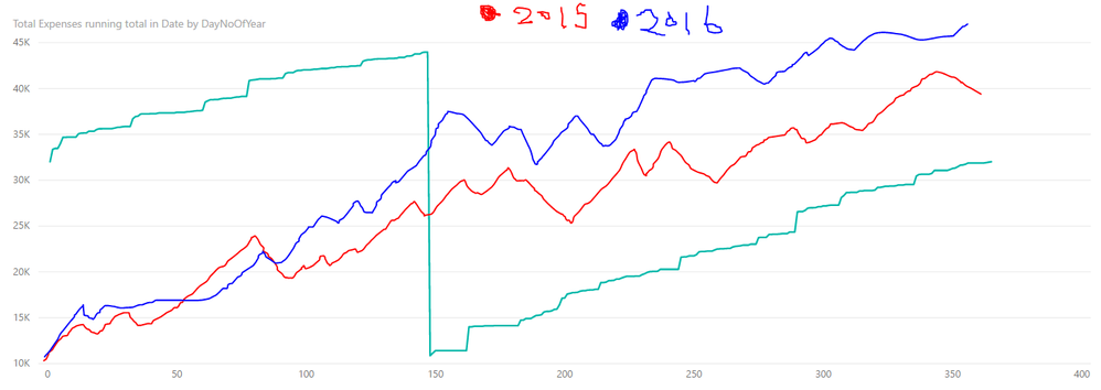
Then you are able to plot multiple categories on one graph as follows:
Idealy I'd like to have the numbers at the bottom show up more like Jan 1, Feb 1, March 1, etc. but am not sure how. For the mean time this is a 90% solution to my original problem.
- Mark as New
- Bookmark
- Subscribe
- Mute
- Subscribe to RSS Feed
- Permalink
- Report Inappropriate Content
- Mark as New
- Bookmark
- Subscribe
- Mute
- Subscribe to RSS Feed
- Permalink
- Report Inappropriate Content
Hi Bila,
Thanks for your help I think this table looks like what I'd like. I've created a NoOfYear column with my expenses table, now on the new table am I able to duplicate that column and then put the cumulative data beside it?
I'd like to relate the categorical data back to the day but grouped in columns by each year, example here:
- Mark as New
- Bookmark
- Subscribe
- Mute
- Subscribe to RSS Feed
- Permalink
- Report Inappropriate Content
I would keep this table and set a visual filter for greater than 2015 year. To remove the year if the date in hierarchial click the down arrow on the field and click Date Hierarchy then clcik the x next to year. If not you may have to create a date table and relate it to your date field.
You will have to create a measure for each Column in your table.
For cumulative I'd use the following
CALCULATE(
SUM('Table'[Column]),
FILTER(
ALLSELECTED('Table'),Table'[Date Field] <=MAX(Table'[Date Field]))
If you want the cumulative vale to start over after a period add this at the end within calculate.
,VALUES('Table'[Date Field].[Year])) the Year can be Month if you want monthly cumulatives.
- Mark as New
- Bookmark
- Subscribe
- Mute
- Subscribe to RSS Feed
- Permalink
- Report Inappropriate Content
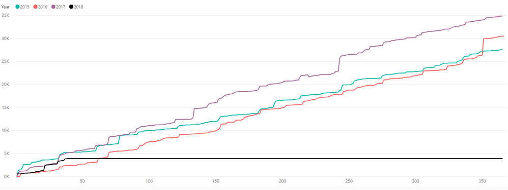
Ultimately I want to overlay each year as its own line, colored by year, so I can visualizing the changing cumulatively expenses by day (X-axis) throughout the year.
So I think setting a visual filter won't allow me to display multiple years in this way?
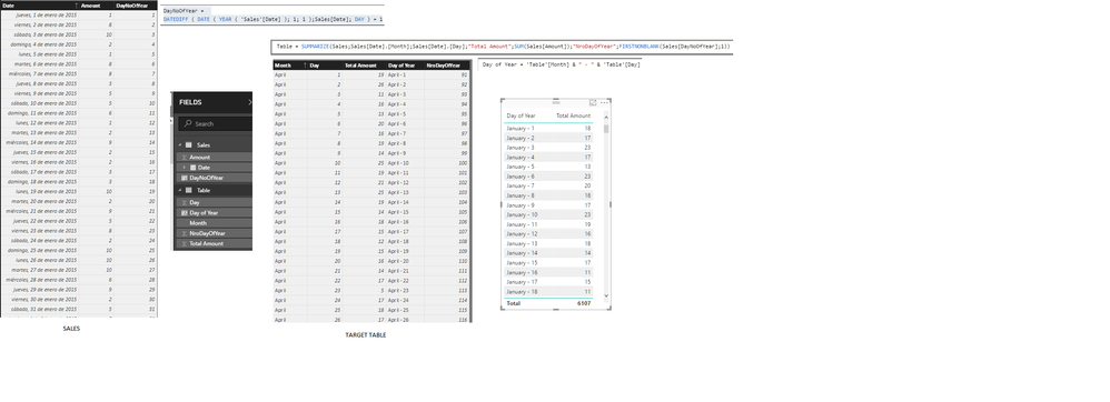
I have created a table with just a column for day of year 1 - 365 but now want to have the cumulative columns based on each year and category relating to each day. I have posted an image below in a response to BILASolution of how I think the table should look to help me achieve visualizing multiple years normalized with a line for each year. Hopefully that makes sense.
I tried the formula here but it seems I'm getting just a general sum, I need to somehow filter it to just "DayNoOFYear" for the year I'm interested in, say 2015 or 2016 so that a given columns will only have "Groceries" cumulative sums for the day number of year but within 2015 alone, so I can do this for each year and then have unique lines for visualize.
Hopefully that makes sense, thanks for your help.
- Mark as New
- Bookmark
- Subscribe
- Mute
- Subscribe to RSS Feed
- Permalink
- Report Inappropriate Content
Hi @DataGeo
Check this pbix. Tell me if this is what you're looking for
https://1drv.ms/f/s!AuU-Ye8UGM4Rko0dyKxTaxuA6pAP8A
BILASolution
- Mark as New
- Bookmark
- Subscribe
- Mute
- Subscribe to RSS Feed
- Permalink
- Report Inappropriate Content
Hi Bila,
I think this visualization is close, but what I will need to do is extract data from the original table to create the "normalized table".
One difference is I want to have separate lines with colors by each year, see example here:
- Mark as New
- Bookmark
- Subscribe
- Mute
- Subscribe to RSS Feed
- Permalink
- Report Inappropriate Content
Helpful resources

Microsoft Fabric Learn Together
Covering the world! 9:00-10:30 AM Sydney, 4:00-5:30 PM CET (Paris/Berlin), 7:00-8:30 PM Mexico City

Power BI Monthly Update - April 2024
Check out the April 2024 Power BI update to learn about new features.

| User | Count |
|---|---|
| 118 | |
| 107 | |
| 70 | |
| 70 | |
| 43 |
| User | Count |
|---|---|
| 148 | |
| 104 | |
| 104 | |
| 89 | |
| 66 |


