- Power BI forums
- Updates
- News & Announcements
- Get Help with Power BI
- Desktop
- Service
- Report Server
- Power Query
- Mobile Apps
- Developer
- DAX Commands and Tips
- Custom Visuals Development Discussion
- Health and Life Sciences
- Power BI Spanish forums
- Translated Spanish Desktop
- Power Platform Integration - Better Together!
- Power Platform Integrations (Read-only)
- Power Platform and Dynamics 365 Integrations (Read-only)
- Training and Consulting
- Instructor Led Training
- Dashboard in a Day for Women, by Women
- Galleries
- Community Connections & How-To Videos
- COVID-19 Data Stories Gallery
- Themes Gallery
- Data Stories Gallery
- R Script Showcase
- Webinars and Video Gallery
- Quick Measures Gallery
- 2021 MSBizAppsSummit Gallery
- 2020 MSBizAppsSummit Gallery
- 2019 MSBizAppsSummit Gallery
- Events
- Ideas
- Custom Visuals Ideas
- Issues
- Issues
- Events
- Upcoming Events
- Community Blog
- Power BI Community Blog
- Custom Visuals Community Blog
- Community Support
- Community Accounts & Registration
- Using the Community
- Community Feedback
Register now to learn Fabric in free live sessions led by the best Microsoft experts. From Apr 16 to May 9, in English and Spanish.
- Power BI forums
- Forums
- Get Help with Power BI
- Desktop
- Creating a Cumulative Histogram
- Subscribe to RSS Feed
- Mark Topic as New
- Mark Topic as Read
- Float this Topic for Current User
- Bookmark
- Subscribe
- Printer Friendly Page
- Mark as New
- Bookmark
- Subscribe
- Mute
- Subscribe to RSS Feed
- Permalink
- Report Inappropriate Content
Creating a Cumulative Histogram
Hi Everyone,
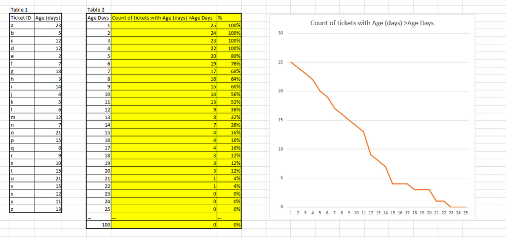
I was wondering if anyone could help me create the following visualization
Y axis = number of tickets
X axis = Age of tickets Days
Specifically I need help either creating the calculated columns highlighted in yellow or measures that would do the same thing. I've been working with Calculation, Count, and related functions but I can't seem to nail down the right combination of the three.
EDIT - Pasting Data
| Table 1 | Table 2 | ||||
| Ticket ID | Age (days) | Age Days | Count of tickets with Age (days) >Age Days | % | |
| a | 23 | 1 | 25 | 100% | |
| b | 5 | 2 | 24 | 100% | |
| c | 12 | 3 | 23 | 100% | |
| d | 12 | 4 | 22 | 100% | |
| e | 2 | 5 | 20 | 80% | |
| f | 7 | 6 | 19 | 76% | |
| g | 18 | 7 | 17 | 68% | |
| h | 3 | 8 | 16 | 64% | |
| i | 14 | 9 | 15 | 60% | |
| j | 4 | 10 | 14 | 56% | |
| k | 5 | 11 | 13 | 52% | |
| l | 6 | 12 | 9 | 36% | |
| m | 12 | 13 | 8 | 32% | |
| n | 7 | 14 | 7 | 28% | |
| o | 21 | 15 | 4 | 16% | |
| p | 15 | 16 | 4 | 16% | |
| q | 8 | 17 | 4 | 16% | |
| r | 9 | 18 | 3 | 12% | |
| s | 10 | 19 | 3 | 12% | |
| t | 15 | 20 | 3 | 12% | |
| u | 21 | 21 | 1 | 4% | |
| v | 15 | 22 | 1 | 4% | |
| x | 12 | 23 | 0 | 0% | |
| y | 11 | 24 | 0 | 0% | |
| z | 13 | 25 | 0 | 0% | |
| … | … | … | |||
| 100 | 0 | 0% |
Solved! Go to Solution.
- Mark as New
- Bookmark
- Subscribe
- Mute
- Subscribe to RSS Feed
- Permalink
- Report Inappropriate Content
Ok to achieve this we need an AGE table, which simply has a column called "Age(Days)" with a unique values from 1 to the number of days you want in the graph. Link this to Table1 in your table relationships.
Create this measure:
Cumulative Measure = VAR currentAge = max(Age[Age (Days)])
RETURN
CALCULATE(
    COUNTROWS(Table1),
    ALL(Table1),
    Table1[Age (days)] > currentAge
)
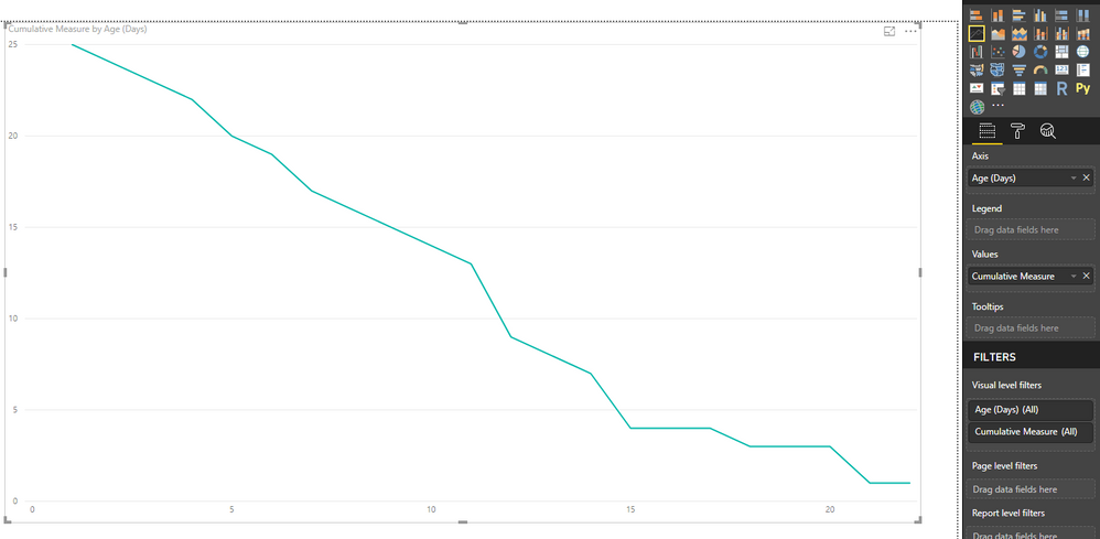
Create a line graph using these settings:
Axis - 'Age'[Age(Days)]
Values - The measure we created
You'll get this:
- Mark as New
- Bookmark
- Subscribe
- Mute
- Subscribe to RSS Feed
- Permalink
- Report Inappropriate Content
That's great! Thank you for your help 🙂
Follow up question
How would I add a bar to show the target days? When I tried the bar was horizontal instead of vertical.
I updated the proposed function to allow for outside filters.
Cumulative Measure = VAR currentAge = max(Age[Age (Days)])
RETURN
CALCULATE(
    COUNTROWS(Table1),
    ALLSELECTED(Table1),
    Table1[Age (days)] > currentAge
)
This is what I would like it to look like.
- Mark as New
- Bookmark
- Subscribe
- Mute
- Subscribe to RSS Feed
- Permalink
- Report Inappropriate Content
Great suggestion on your alteration to the code. Its great to see you getting your head around the code and tweaking it to your scenario.
I can't think of an easy way to create the line you want. Most of the trending are all hoziontal lines. Its possible to use the "Line and Clustered Column chart" to have vertical lines, so my thoughts are to using that some how.
Helpful resources

Microsoft Fabric Learn Together
Covering the world! 9:00-10:30 AM Sydney, 4:00-5:30 PM CET (Paris/Berlin), 7:00-8:30 PM Mexico City

Power BI Monthly Update - April 2024
Check out the April 2024 Power BI update to learn about new features.

| User | Count |
|---|---|
| 107 | |
| 99 | |
| 76 | |
| 64 | |
| 58 |
| User | Count |
|---|---|
| 148 | |
| 113 | |
| 97 | |
| 84 | |
| 67 |


