- Power BI forums
- Updates
- News & Announcements
- Get Help with Power BI
- Desktop
- Service
- Report Server
- Power Query
- Mobile Apps
- Developer
- DAX Commands and Tips
- Custom Visuals Development Discussion
- Health and Life Sciences
- Power BI Spanish forums
- Translated Spanish Desktop
- Power Platform Integration - Better Together!
- Power Platform Integrations (Read-only)
- Power Platform and Dynamics 365 Integrations (Read-only)
- Training and Consulting
- Instructor Led Training
- Dashboard in a Day for Women, by Women
- Galleries
- Community Connections & How-To Videos
- COVID-19 Data Stories Gallery
- Themes Gallery
- Data Stories Gallery
- R Script Showcase
- Webinars and Video Gallery
- Quick Measures Gallery
- 2021 MSBizAppsSummit Gallery
- 2020 MSBizAppsSummit Gallery
- 2019 MSBizAppsSummit Gallery
- Events
- Ideas
- Custom Visuals Ideas
- Issues
- Issues
- Events
- Upcoming Events
- Community Blog
- Power BI Community Blog
- Custom Visuals Community Blog
- Community Support
- Community Accounts & Registration
- Using the Community
- Community Feedback
Register now to learn Fabric in free live sessions led by the best Microsoft experts. From Apr 16 to May 9, in English and Spanish.
- Power BI forums
- Forums
- Get Help with Power BI
- Desktop
- Creating Measure to switch between Daily, Weekly, ...
- Subscribe to RSS Feed
- Mark Topic as New
- Mark Topic as Read
- Float this Topic for Current User
- Bookmark
- Subscribe
- Printer Friendly Page
- Mark as New
- Bookmark
- Subscribe
- Mute
- Subscribe to RSS Feed
- Permalink
- Report Inappropriate Content
Creating Measure to switch between Daily, Weekly, Monthly, Yearly
Hello,
I have temperature values coming every 15 minutes (two columns - value and time). Is it possible to create a measure that calculates the average Hourly, Daily, Weekly, Monthly and somehow incorporated into a slicer that would control a line chart?
I created separate columns for date time (Hour, Day, Week and Month), but I have troubles creating a measure that will calculate the average depending on the slider.
Any help/direction would be much appreciated.
Regards,
Laurent
Solved! Go to Solution.
- Mark as New
- Bookmark
- Subscribe
- Mute
- Subscribe to RSS Feed
- Permalink
- Report Inappropriate Content
So you would like to have the x-axis to change depending on the value chosen in the slicer? As far as I know a measure cannot be set on the axis.
One solution could be using bookmarks instead. Create the four charts for each time period above eachother and use buttons assigned with bookmarks to toggle between the charts.
- Mark as New
- Bookmark
- Subscribe
- Mute
- Subscribe to RSS Feed
- Permalink
- Report Inappropriate Content
Hi Laurent,
Maybe something like this?
Avg Temp Dynamic =
 SWITCH(
    TRUE();
    SELECTEDVALUE('Calculation'[Calculation]) = "Hourly"; [Avg Temp Hourly];
    SELECTEDVALUE('Calculation'[Calculation]) = "Daily"; [Avg Temp Daily];
    SELECTEDVALUE('Calculation'[Calculation]) = "Weekly"; [Avg Temp Weekly]
 )
In this case I created a table with the different alternatives to choose between the calculations. Then I've created the different measures seperately for each calculation and just referenced them in this dynamic measure.
Hope this helps!
- Mark as New
- Bookmark
- Subscribe
- Mute
- Subscribe to RSS Feed
- Permalink
- Report Inappropriate Content
@lrnt12 Please try using SWITCH and SELECTEDVALUE funtions...
Sample data and expected output will be helpful to provide an accurate solution.
Did I answer your question? Mark my post as a solution!
Proud to be a PBI Community Champion
- Mark as New
- Bookmark
- Subscribe
- Mute
- Subscribe to RSS Feed
- Permalink
- Report Inappropriate Content
Hi Pattem~ I will be happy if you tell me how I can create this table with that table. THank you so much.
- Mark as New
- Bookmark
- Subscribe
- Mute
- Subscribe to RSS Feed
- Permalink
- Report Inappropriate Content
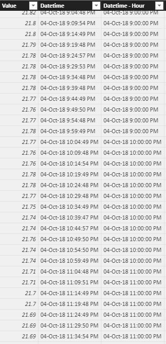
Thanks for the reply.
My data looks like this. Value and Datetime field is what I pull from the source.
The expected output should be a slicer that would control the line chart. When I select Daily, I should see the average value for each day.
Basically, instead of having to drill up and down on the line chart, I'd like to control this with a slicer.
I have tried using SWITCH and SELECTEDVALUE, but it doesn't seem to work. Or perhaps I haven't used it right.
Thanks,
Laurent
- Mark as New
- Bookmark
- Subscribe
- Mute
- Subscribe to RSS Feed
- Permalink
- Report Inappropriate Content
So you would like to have the x-axis to change depending on the value chosen in the slicer? As far as I know a measure cannot be set on the axis.
One solution could be using bookmarks instead. Create the four charts for each time period above eachother and use buttons assigned with bookmarks to toggle between the charts.
- Mark as New
- Bookmark
- Subscribe
- Mute
- Subscribe to RSS Feed
- Permalink
- Report Inappropriate Content
But I want to interact with the whole report . Then What I can do, for this case.?
- Mark as New
- Bookmark
- Subscribe
- Mute
- Subscribe to RSS Feed
- Permalink
- Report Inappropriate Content
@Anonymous ... thinking outside the box, huh? Can't belive I didn't even think about it. Thanks !!
Helpful resources

Microsoft Fabric Learn Together
Covering the world! 9:00-10:30 AM Sydney, 4:00-5:30 PM CET (Paris/Berlin), 7:00-8:30 PM Mexico City

Power BI Monthly Update - April 2024
Check out the April 2024 Power BI update to learn about new features.

| User | Count |
|---|---|
| 110 | |
| 96 | |
| 77 | |
| 63 | |
| 55 |
| User | Count |
|---|---|
| 143 | |
| 109 | |
| 89 | |
| 84 | |
| 66 |


