- Power BI forums
- Updates
- News & Announcements
- Get Help with Power BI
- Desktop
- Service
- Report Server
- Power Query
- Mobile Apps
- Developer
- DAX Commands and Tips
- Custom Visuals Development Discussion
- Health and Life Sciences
- Power BI Spanish forums
- Translated Spanish Desktop
- Power Platform Integration - Better Together!
- Power Platform Integrations (Read-only)
- Power Platform and Dynamics 365 Integrations (Read-only)
- Training and Consulting
- Instructor Led Training
- Dashboard in a Day for Women, by Women
- Galleries
- Community Connections & How-To Videos
- COVID-19 Data Stories Gallery
- Themes Gallery
- Data Stories Gallery
- R Script Showcase
- Webinars and Video Gallery
- Quick Measures Gallery
- 2021 MSBizAppsSummit Gallery
- 2020 MSBizAppsSummit Gallery
- 2019 MSBizAppsSummit Gallery
- Events
- Ideas
- Custom Visuals Ideas
- Issues
- Issues
- Events
- Upcoming Events
- Community Blog
- Power BI Community Blog
- Custom Visuals Community Blog
- Community Support
- Community Accounts & Registration
- Using the Community
- Community Feedback
Register now to learn Fabric in free live sessions led by the best Microsoft experts. From Apr 16 to May 9, in English and Spanish.
- Power BI forums
- Forums
- Get Help with Power BI
- Desktop
- Re: Creating Correlation
- Subscribe to RSS Feed
- Mark Topic as New
- Mark Topic as Read
- Float this Topic for Current User
- Bookmark
- Subscribe
- Printer Friendly Page
- Mark as New
- Bookmark
- Subscribe
- Mute
- Subscribe to RSS Feed
- Permalink
- Report Inappropriate Content
Creating Correlation
Hello,I am a statistician and i am using PowerBI for Graphs and Analysis.I want to calculate correlation.I have read other Topics tha suggets R for calculation.My point is that i want to see the number of correlation in a table and the graph as well.It will be grateful to here any suggestion.
Thank you.,
Solved! Go to Solution.
- Mark as New
- Bookmark
- Subscribe
- Mute
- Subscribe to RSS Feed
- Permalink
- Report Inappropriate Content
Thank you for your answers!I find the solution.I created the pearson correlation using DAX.Then i applied the numbers as labels in my Graph.It would be great if DAX had Correl(Excel's function) in DAX.
- Mark as New
- Bookmark
- Subscribe
- Mute
- Subscribe to RSS Feed
- Permalink
- Report Inappropriate Content
Dear Elpida,
According to your post in 2016, I would like to know how you add the correlation indicator.
In my project of world imports statistics, I want to see countries that are correlated by weights or by volume in USD.
Can we add a nice chart or indicators ?
I can send you the original file.
Thank you for your help.
Have a nice day,
Jaouad
- Mark as New
- Bookmark
- Subscribe
- Mute
- Subscribe to RSS Feed
- Permalink
- Report Inappropriate Content
Having looked at the solutions posted on Correlation in DAX, the method looks like:
Having chosen 2 fixed variables, calculate the appropriate sums of squares and differences with a long formula and then evaluate the ratio to give you Pearson's Correlation. If you have more than one variable, you will be writing custom measures for each of them. The recommendation is to use R for this, probably starting with the Correlation Plot from the Office Store.
https://store.office.com/powerbiaddininstallpage.aspx?rs=en-US&assetid=WA104380814
- Mark as New
- Bookmark
- Subscribe
- Mute
- Subscribe to RSS Feed
- Permalink
- Report Inappropriate Content
Do any of these do what you need:
- corrplot per https://community.powerbi.com/t5/R-Script-Showcase/Correlation-Plot/td-p/58462 and https://community.powerbi.com/t5/Desktop/Custom-correlations-or-visuals/td-p/84392
- chart.Correlation per http://www.sthda.com/english/wiki/correlation-matrix-a-quick-start-guide-to-analyze-format-and-visua...
https://powerbi.microsoft.com/en-us/documentation/powerbi-service-r-visuals/ has a good introduction to R in Power BI and also describes the current Known Limitations.
- Mark as New
- Bookmark
- Subscribe
- Mute
- Subscribe to RSS Feed
- Permalink
- Report Inappropriate Content
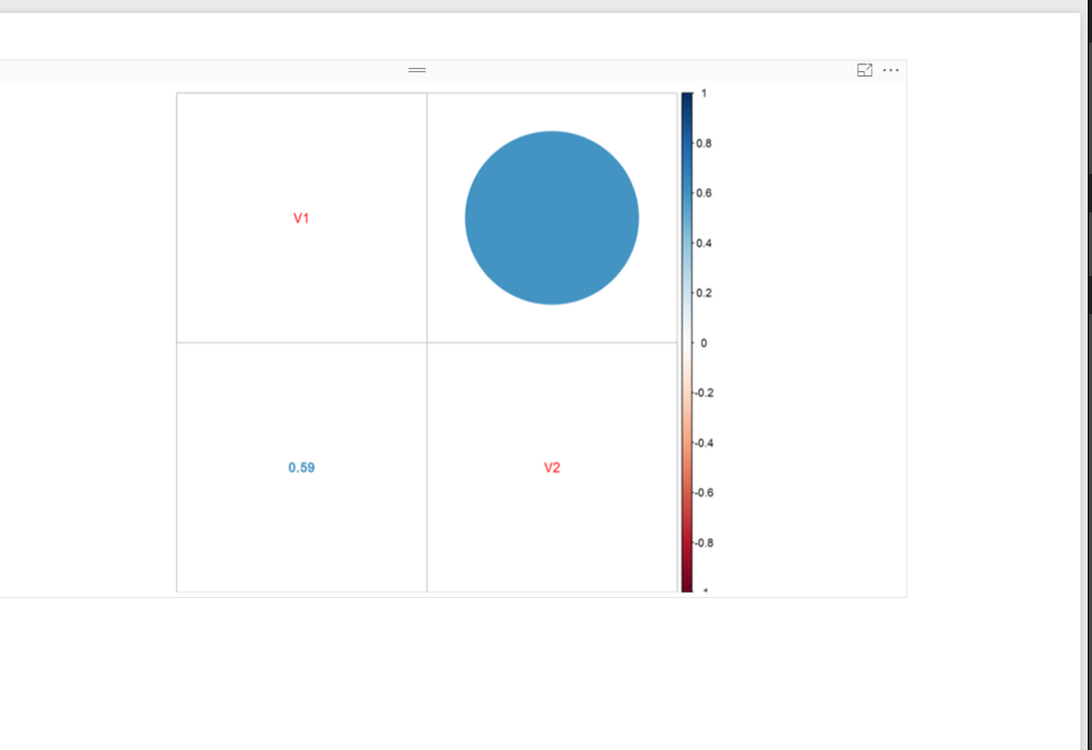
Thank you for your answer.I have created the plot in PowerBI,my main concern is to see the correlation number for every country that i have in my sample.I give you a screenshot!If there is a way to create a plot for every country.
Thank you
- Mark as New
- Bookmark
- Subscribe
- Mute
- Subscribe to RSS Feed
- Permalink
- Report Inappropriate Content
Hi @Elpida1803,
Please share us some sample data and the expected result, so that we can make further analysis.
Regards,
Charlie Liao
- Mark as New
- Bookmark
- Subscribe
- Mute
- Subscribe to RSS Feed
- Permalink
- Report Inappropriate Content
I'm not exactly sure what dataset you're working from or what end result you need and I'm no statistician, but the following may help "group" within corrplot: http://stackoverflow.com/questions/33615112/run-corrplot-to-a-data-frame-by-group
There's also some discussion on techniques here: http://stackoverflow.com/questions/5453336/plot-correlation-matrix-into-a-graph
Good luck!
Helpful resources

Microsoft Fabric Learn Together
Covering the world! 9:00-10:30 AM Sydney, 4:00-5:30 PM CET (Paris/Berlin), 7:00-8:30 PM Mexico City

Power BI Monthly Update - April 2024
Check out the April 2024 Power BI update to learn about new features.

| User | Count |
|---|---|
| 106 | |
| 93 | |
| 75 | |
| 62 | |
| 50 |
| User | Count |
|---|---|
| 147 | |
| 107 | |
| 105 | |
| 87 | |
| 61 |

