- Power BI forums
- Updates
- News & Announcements
- Get Help with Power BI
- Desktop
- Service
- Report Server
- Power Query
- Mobile Apps
- Developer
- DAX Commands and Tips
- Custom Visuals Development Discussion
- Health and Life Sciences
- Power BI Spanish forums
- Translated Spanish Desktop
- Power Platform Integration - Better Together!
- Power Platform Integrations (Read-only)
- Power Platform and Dynamics 365 Integrations (Read-only)
- Training and Consulting
- Instructor Led Training
- Dashboard in a Day for Women, by Women
- Galleries
- Community Connections & How-To Videos
- COVID-19 Data Stories Gallery
- Themes Gallery
- Data Stories Gallery
- R Script Showcase
- Webinars and Video Gallery
- Quick Measures Gallery
- 2021 MSBizAppsSummit Gallery
- 2020 MSBizAppsSummit Gallery
- 2019 MSBizAppsSummit Gallery
- Events
- Ideas
- Custom Visuals Ideas
- Issues
- Issues
- Events
- Upcoming Events
- Community Blog
- Power BI Community Blog
- Custom Visuals Community Blog
- Community Support
- Community Accounts & Registration
- Using the Community
- Community Feedback
Register now to learn Fabric in free live sessions led by the best Microsoft experts. From Apr 16 to May 9, in English and Spanish.
- Power BI forums
- Forums
- Get Help with Power BI
- Desktop
- Re: Create single measure for frequency distributi...
- Subscribe to RSS Feed
- Mark Topic as New
- Mark Topic as Read
- Float this Topic for Current User
- Bookmark
- Subscribe
- Printer Friendly Page
- Mark as New
- Bookmark
- Subscribe
- Mute
- Subscribe to RSS Feed
- Permalink
- Report Inappropriate Content
Create single measure for frequency distribution comparison
I am working with a trip data set that identifies when trips start & end. There are 2 users in scope: member & casual.
I am trying to create a distribution graph to show the differences in trip start/end behavior by comparing member vs casual users.
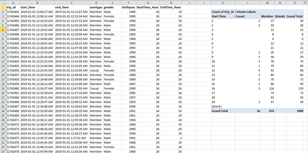
Here is a sample of the data table & a pivot table to summarize the data characteristics.
I am trying to create a calculated measure that I can use to compare casual vs member.
I tried using 'count rows' to aggregate ride data, but this does not work because I do not have equal # of data points for both casual & member rides.
I think I need to compute % of total rides done to identify in which hour people are riding in a day and then visualize this on a line graph. Any suggestions?
I tried asking the same question in a different post but wasn't able to resolve it: https://community.powerbi.com/t5/Desktop/Normalize-multiple-values-to-show-relative-comparison/m-p/2...
Solved! Go to Solution.
- Mark as New
- Bookmark
- Subscribe
- Mute
- Subscribe to RSS Feed
- Permalink
- Report Inappropriate Content
Hi @JJH_
If possible, until then you can provide pbix files, which do not contain sensitive data. Or a table rather than a screenshot.
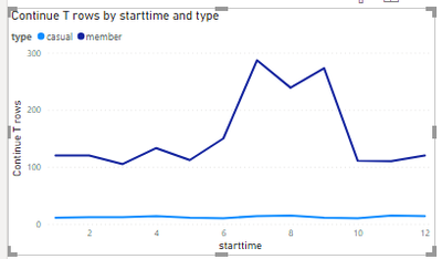
I have created some aggregated data based on your table. to show the method I am using.
When not using measure it shows similar results to the visual you have in another post.
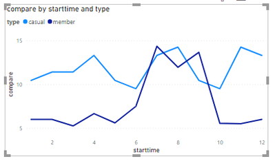
And try this measure:
compare =
VAR _member =
    SUM( 'Table'[Continue T rows] ) * 0.05
VAR _casual =
    SUM( 'Table'[Continue T rows] ) * 0.95
RETURN
    IF( MAX( 'Table'[type] ) = "member", _member, _casual )
And the result:
If you want to create a table to calculate the number of people appearing over a period of time based on a time duration table, this is a post you can refer to.
I put my pbix file in the attional you can reference.
Best Regards
Community Support Team _ chenwu zhu
If this post helps, then please consider Accept it as the solution to help the other members find it more quickly.
- Mark as New
- Bookmark
- Subscribe
- Mute
- Subscribe to RSS Feed
- Permalink
- Report Inappropriate Content
@JJH_
Since you have high and very low numbers to compare for absolute values, % of the total is better.
Create 2 measures, % of total hours for each hour for Casual and Member. Then, you can visualize the % on a column or line chart
⭕ Subscribe and learn Power BI from these videos
⚪ Website ⚪ LinkedIn ⚪ PBI User Group
Helpful resources

Microsoft Fabric Learn Together
Covering the world! 9:00-10:30 AM Sydney, 4:00-5:30 PM CET (Paris/Berlin), 7:00-8:30 PM Mexico City

Power BI Monthly Update - April 2024
Check out the April 2024 Power BI update to learn about new features.

| User | Count |
|---|---|
| 107 | |
| 96 | |
| 77 | |
| 66 | |
| 53 |
| User | Count |
|---|---|
| 144 | |
| 104 | |
| 100 | |
| 86 | |
| 64 |


