- Power BI forums
- Updates
- News & Announcements
- Get Help with Power BI
- Desktop
- Service
- Report Server
- Power Query
- Mobile Apps
- Developer
- DAX Commands and Tips
- Custom Visuals Development Discussion
- Health and Life Sciences
- Power BI Spanish forums
- Translated Spanish Desktop
- Power Platform Integration - Better Together!
- Power Platform Integrations (Read-only)
- Power Platform and Dynamics 365 Integrations (Read-only)
- Training and Consulting
- Instructor Led Training
- Dashboard in a Day for Women, by Women
- Galleries
- Community Connections & How-To Videos
- COVID-19 Data Stories Gallery
- Themes Gallery
- Data Stories Gallery
- R Script Showcase
- Webinars and Video Gallery
- Quick Measures Gallery
- 2021 MSBizAppsSummit Gallery
- 2020 MSBizAppsSummit Gallery
- 2019 MSBizAppsSummit Gallery
- Events
- Ideas
- Custom Visuals Ideas
- Issues
- Issues
- Events
- Upcoming Events
- Community Blog
- Power BI Community Blog
- Custom Visuals Community Blog
- Community Support
- Community Accounts & Registration
- Using the Community
- Community Feedback
Register now to learn Fabric in free live sessions led by the best Microsoft experts. From Apr 16 to May 9, in English and Spanish.
- Power BI forums
- Forums
- Get Help with Power BI
- Desktop
- Create custom matrix visualization
- Subscribe to RSS Feed
- Mark Topic as New
- Mark Topic as Read
- Float this Topic for Current User
- Bookmark
- Subscribe
- Printer Friendly Page
- Mark as New
- Bookmark
- Subscribe
- Mute
- Subscribe to RSS Feed
- Permalink
- Report Inappropriate Content
Create custom matrix visualization
Hello everyone,
I am new to developing analytical solutions using Power BI. I'm going to introduce the context and what I want to do.
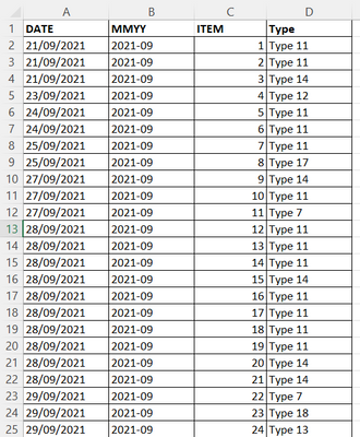
I have an excel with this data:
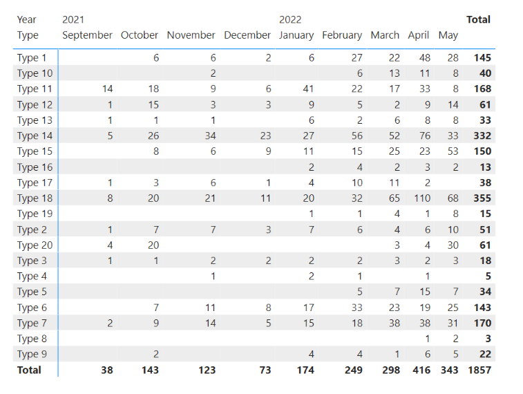
This table has items with some dates and some category types. I want to construct a matrix or pivot table with types in rows and months/year in columns. In the data pane, I need to do a distinct count from rows of item columns. But, I need to add some extra columns at the last of this matrix, these columns are the difference between the current month and last month. Another column has a trend from the current month. The trend is a calculation based on current labor days and total labor days of the current month. Another column is the percentage of variation between the trend and last month. The last column is the total sum of all the months only. The resulting matrix done in excel must look like this:
I want to do this in Power BI. I have used the matrix visualization that shows correctly the first part of a matrix (types and months data). But I don't know how to incorporate or add the rest of the measures/metrics. I have created some metrics, but when I add in the "Values" section, it plots a measure for all months.
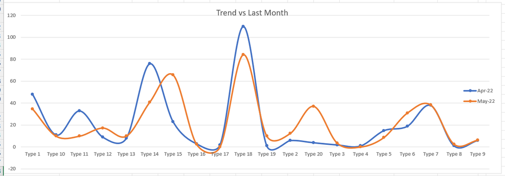
Also, I need to show a line chart graph comparison between last month and the trend
* The current date or month must be relative or calculated and It must be obtained as a maximum of a column DATE
All the files related are in this link
Could someone help me by giving me some tips or ideas about how to build the report that I need to do?
I am free to use any visualization or element. I think I have no restrictions.
Thanks in advanced.
- Mark as New
- Bookmark
- Subscribe
- Mute
- Subscribe to RSS Feed
- Permalink
- Report Inappropriate Content
"I want to do this in Power BI. I have used the matrix visualization that shows correctly the first part of a matrix (types and months data). But I don't know how to incorporate or add the rest of the measures/metrics. I have created some metrics, but when I add in the "Values" section, it plots a measure for all months."
Yes, that's how Power BI is designed. Your desire to add summary columns at the end of a matrix clashes with the design principles for matrix visuals.
Couple options:
- disable column word wrap and then hide columns you don't want
- create a fully custom matrix visual with independent measures for all the value columns
- rethink your approach and use two separate matrix visuals.
Helpful resources

Microsoft Fabric Learn Together
Covering the world! 9:00-10:30 AM Sydney, 4:00-5:30 PM CET (Paris/Berlin), 7:00-8:30 PM Mexico City

Power BI Monthly Update - April 2024
Check out the April 2024 Power BI update to learn about new features.

| User | Count |
|---|---|
| 113 | |
| 97 | |
| 84 | |
| 67 | |
| 60 |
| User | Count |
|---|---|
| 150 | |
| 120 | |
| 99 | |
| 87 | |
| 68 |


