- Power BI forums
- Updates
- News & Announcements
- Get Help with Power BI
- Desktop
- Service
- Report Server
- Power Query
- Mobile Apps
- Developer
- DAX Commands and Tips
- Custom Visuals Development Discussion
- Health and Life Sciences
- Power BI Spanish forums
- Translated Spanish Desktop
- Power Platform Integration - Better Together!
- Power Platform Integrations (Read-only)
- Power Platform and Dynamics 365 Integrations (Read-only)
- Training and Consulting
- Instructor Led Training
- Dashboard in a Day for Women, by Women
- Galleries
- Community Connections & How-To Videos
- COVID-19 Data Stories Gallery
- Themes Gallery
- Data Stories Gallery
- R Script Showcase
- Webinars and Video Gallery
- Quick Measures Gallery
- 2021 MSBizAppsSummit Gallery
- 2020 MSBizAppsSummit Gallery
- 2019 MSBizAppsSummit Gallery
- Events
- Ideas
- Custom Visuals Ideas
- Issues
- Issues
- Events
- Upcoming Events
- Community Blog
- Power BI Community Blog
- Custom Visuals Community Blog
- Community Support
- Community Accounts & Registration
- Using the Community
- Community Feedback
Register now to learn Fabric in free live sessions led by the best Microsoft experts. From Apr 16 to May 9, in English and Spanish.
- Power BI forums
- Forums
- Get Help with Power BI
- Desktop
- Create bar charts from multiple columns
- Subscribe to RSS Feed
- Mark Topic as New
- Mark Topic as Read
- Float this Topic for Current User
- Bookmark
- Subscribe
- Printer Friendly Page
- Mark as New
- Bookmark
- Subscribe
- Mute
- Subscribe to RSS Feed
- Permalink
- Report Inappropriate Content
Create bar charts from multiple columns
Hi everyone,
I am having sales data in the following form:
| Unit | Group | Company | Sales |
| A1 | A | C | 3 |
| A2 | A | C | 4 |
| B1 | B | C | 2 |
| B2 | B | C | 7 |
| B3 | B | C | 4 |
As you can see company C is divided into groups A and B and these groups are comprised of units A1, A2, B1, B2 and B3.
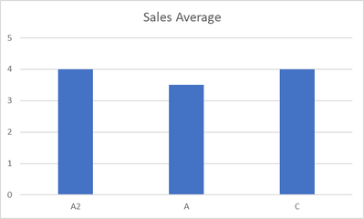
I want to create a dashboard on unit basis where I would like to show a bar chart that benchmarks the average sales of a specific unit with the performance of the corresponding group and the company in general. It should look like this:
"Note, that I am using average sales figures here. In other words, I am not using the table above directly, but use the last column for a measure value. So it is not a question of simply unpivot the table above)
I am unsure how to order my data in order to use the PBI bar chart visual to have my (average) sales figures displayed like this. I tried using three seperate bar charts next to each other but PBI would not allow me to modify their design so that their base line are perfectly aligned like in the Excel-chart that you see above.
I am currently thinking about creating a new table where I would use a measure calculating the average sales (depending on the set time frame) on unit, group and company level and let it fill out a new table with "Business Level" and "Average Sales" i.e. something akin to this:
| Business Level | Avg. Sales |
| C | 4 |
| A | 3.5 |
| B | 4.3 |
| A1 | 3 |
| A2 | 4 |
| B1 | 2 |
| B2 | 7 |
| B3 | 4 |
However, I am not sure how to create a table that is being filled with measure values that respond to a time slicer that restricts the average sales figure to a specific time frame.
Does anyone know how to accomplish this?
- Mark as New
- Bookmark
- Subscribe
- Mute
- Subscribe to RSS Feed
- Permalink
- Report Inappropriate Content
@ThomasSan , refer if this approach can help
Show Grand total row or Avg Grand total row in Visual: https://youtu.be/OSwRZ4GUhxc
or unpivot all three column in power query and use
https://radacad.com/pivot-and-unpivot-with-power-bi
Microsoft Power BI Learning Resources, 2023 !!
Learn Power BI - Full Course with Dec-2022, with Window, Index, Offset, 100+ Topics !!
Did I answer your question? Mark my post as a solution! Appreciate your Kudos !! Proud to be a Super User! !!
- Mark as New
- Bookmark
- Subscribe
- Mute
- Subscribe to RSS Feed
- Permalink
- Report Inappropriate Content
Hi @amitchandak,
thank you for your reply. I thought unipivot would not help me with changing measures. Or am I mistaken here?
Also, I watched your videos but are not quite sure how to apply it to my problem case. Could you please give me more input on how to adapt your solution to my problem?
Helpful resources

Microsoft Fabric Learn Together
Covering the world! 9:00-10:30 AM Sydney, 4:00-5:30 PM CET (Paris/Berlin), 7:00-8:30 PM Mexico City

Power BI Monthly Update - April 2024
Check out the April 2024 Power BI update to learn about new features.

| User | Count |
|---|---|
| 108 | |
| 100 | |
| 78 | |
| 64 | |
| 58 |
| User | Count |
|---|---|
| 148 | |
| 111 | |
| 94 | |
| 84 | |
| 67 |

