- Power BI forums
- Updates
- News & Announcements
- Get Help with Power BI
- Desktop
- Service
- Report Server
- Power Query
- Mobile Apps
- Developer
- DAX Commands and Tips
- Custom Visuals Development Discussion
- Health and Life Sciences
- Power BI Spanish forums
- Translated Spanish Desktop
- Power Platform Integration - Better Together!
- Power Platform Integrations (Read-only)
- Power Platform and Dynamics 365 Integrations (Read-only)
- Training and Consulting
- Instructor Led Training
- Dashboard in a Day for Women, by Women
- Galleries
- Community Connections & How-To Videos
- COVID-19 Data Stories Gallery
- Themes Gallery
- Data Stories Gallery
- R Script Showcase
- Webinars and Video Gallery
- Quick Measures Gallery
- 2021 MSBizAppsSummit Gallery
- 2020 MSBizAppsSummit Gallery
- 2019 MSBizAppsSummit Gallery
- Events
- Ideas
- Custom Visuals Ideas
- Issues
- Issues
- Events
- Upcoming Events
- Community Blog
- Power BI Community Blog
- Custom Visuals Community Blog
- Community Support
- Community Accounts & Registration
- Using the Community
- Community Feedback
Register now to learn Fabric in free live sessions led by the best Microsoft experts. From Apr 16 to May 9, in English and Spanish.
- Power BI forums
- Forums
- Get Help with Power BI
- Desktop
- Re: Create bar chart by aggregating on string valu...
- Subscribe to RSS Feed
- Mark Topic as New
- Mark Topic as Read
- Float this Topic for Current User
- Bookmark
- Subscribe
- Printer Friendly Page
- Mark as New
- Bookmark
- Subscribe
- Mute
- Subscribe to RSS Feed
- Permalink
- Report Inappropriate Content
Create bar chart by aggregating on string values
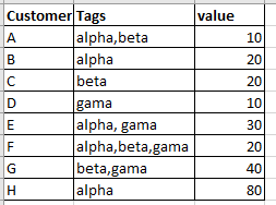
I am new to PowerBI and I need to create 2 visualization(bar chart) which will show the following:
Chart1--- 3 bars for each of the tag strings(alpha, beta, gama) and the count of customers for each tag string(alpha=5, beta=4, gama=4).
Chart2 --- 3 bars for each of the tag strings(alpha, beta, gama) and the total of value for each tag string(alpha=160, beta=90, gama=100).
Please, help me with how to get this two charts with tutorial. Thanks in advance.
Solved! Go to Solution.
- Mark as New
- Bookmark
- Subscribe
- Mute
- Subscribe to RSS Feed
- Permalink
- Report Inappropriate Content
@Anonymous , You can split the column using row split
https://www.tutorialgateway.org/how-to-split-columns-in-power-bi/
Or create a new table in power query using customer and Tags and then split in a new table and join back with customer id.
1. Copy the table and remove columns
2. Select column, Right-click last option, create a new query, and convert to a table.
Microsoft Power BI Learning Resources, 2023 !!
Learn Power BI - Full Course with Dec-2022, with Window, Index, Offset, 100+ Topics !!
Did I answer your question? Mark my post as a solution! Appreciate your Kudos !! Proud to be a Super User! !!
- Mark as New
- Bookmark
- Subscribe
- Mute
- Subscribe to RSS Feed
- Permalink
- Report Inappropriate Content
Hi @Anonymous ,
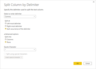
Follow the steps below:
- Select the column Tags
- Split columns
- Advance Rows:
Now just do the charts with the tags on the axis.
Check PBIX file attach and code below:
let
    Source = Table.FromRows(Json.Document(Binary.Decompress(Binary.FromText("i45WclTSUXLMKchI1FFwSi1JBPIMDZRidaKVnGASQNoIIuQMZEIVQUVcgEz3xFwkba4I86ASxhAJN1SL4NJQk9yhZsPFTSDiHkjOsAAKxQIA", BinaryEncoding.Base64), Compression.Deflate)), let _t = ((type nullable text) meta [Serialized.Text = true]) in type table [Customer = _t, Tags = _t, Value = _t]),
    #"Changed Type" = Table.TransformColumnTypes(Source,{{"Customer", type text}, {"Tags", type text}, {"Value", Int64.Type}}),
    #"Split Column by Delimiter" = Table.ExpandListColumn(Table.TransformColumns(#"Changed Type", {{"Tags", Splitter.SplitTextByDelimiter(",", QuoteStyle.Csv), let itemType = (type nullable text) meta [Serialized.Text = true] in type {itemType}}}), "Tags"),
    #"Changed Type1" = Table.TransformColumnTypes(#"Split Column by Delimiter",{{"Tags", type text}}),
    #"Replaced Value" = Table.ReplaceValue(#"Changed Type1"," ","",Replacer.ReplaceText,{"Tags"})
in
    #"Replaced Value"
Regards
Miguel Félix
Did I answer your question? Mark my post as a solution!
Proud to be a Super User!
Check out my blog: Power BI em Português- Mark as New
- Bookmark
- Subscribe
- Mute
- Subscribe to RSS Feed
- Permalink
- Report Inappropriate Content
@Anonymous - Best thing to do would be to split your column by comma in Power Query Editor. Then, unpivot the three resulting columns. At that point, things should be very easy.
@ me in replies or I'll lose your thread!!!
Instead of a Kudo, please vote for this idea
Become an expert!: Enterprise DNA
External Tools: MSHGQM
YouTube Channel!: Microsoft Hates Greg
Latest book!: The Definitive Guide to Power Query (M)
DAX is easy, CALCULATE makes DAX hard...
- Mark as New
- Bookmark
- Subscribe
- Mute
- Subscribe to RSS Feed
- Permalink
- Report Inappropriate Content
@Anonymous , You can split the column using row split
https://www.tutorialgateway.org/how-to-split-columns-in-power-bi/
Or create a new table in power query using customer and Tags and then split in a new table and join back with customer id.
1. Copy the table and remove columns
2. Select column, Right-click last option, create a new query, and convert to a table.
Microsoft Power BI Learning Resources, 2023 !!
Learn Power BI - Full Course with Dec-2022, with Window, Index, Offset, 100+ Topics !!
Did I answer your question? Mark my post as a solution! Appreciate your Kudos !! Proud to be a Super User! !!
- Mark as New
- Bookmark
- Subscribe
- Mute
- Subscribe to RSS Feed
- Permalink
- Report Inappropriate Content
@amitchandak can you please help me show tutorial on how to create the two visualization. I am having the problem with charts.
- Mark as New
- Bookmark
- Subscribe
- Mute
- Subscribe to RSS Feed
- Permalink
- Report Inappropriate Content
@Anonymous ,Can you share sample data and sample output in a table format?
covered as thrid item in video -https://www.youtube.com/watch?v=1_XlyzV-PcY&t=31s
Microsoft Power BI Learning Resources, 2023 !!
Learn Power BI - Full Course with Dec-2022, with Window, Index, Offset, 100+ Topics !!
Did I answer your question? Mark my post as a solution! Appreciate your Kudos !! Proud to be a Super User! !!
Helpful resources

Microsoft Fabric Learn Together
Covering the world! 9:00-10:30 AM Sydney, 4:00-5:30 PM CET (Paris/Berlin), 7:00-8:30 PM Mexico City

Power BI Monthly Update - April 2024
Check out the April 2024 Power BI update to learn about new features.

| User | Count |
|---|---|
| 112 | |
| 100 | |
| 76 | |
| 74 | |
| 49 |
| User | Count |
|---|---|
| 145 | |
| 108 | |
| 107 | |
| 89 | |
| 61 |


